
The complete guide to decorating with green — and making it the most beautiful, most intentional decision you ever made for your living room.
There is a moment that happens when you first commit to green in your living room.
You step back, look at the room, and realize that the color has completely changed the energy of the space. It feels calmer. It feels richer. It feels like the room finally has a point of view. Green does that. No other color in the entire interior design spectrum creates that particular combination of warmth, depth, and connection to the natural world the way green does — and in 2026, it is doing it in every shade from the softest whisper of sage to the most dramatic, jewel-like emerald you have ever seen in a living room.
The good news is that green is also one of the most forgiving colors to work with. It pairs naturally with warm tones like terracotta and brass, with cool tones like navy and grey, and even with other greens in tonal layering schemes that create rooms of genuine complexity and beauty. Whether you are working with a rental apartment and a strict no-paint policy or a forever home where you can do whatever you want to every wall, there is a version of the green living room that works for you.
This guide covers 50 green living room ideas for 2026 — organized by shade, by style, and by approach — so you can find exactly the look you want and actually know how to pull it off.
Table of Contents
- Why Green Is the Defining Living Room Color of 2026
- Understanding Green Shades: Your Complete 2026 Color Guide
- Sage Green Living Room Ideas — Ideas 1 to 10
- Emerald Green Living Room Ideas — Ideas 11 to 20
- Olive Green Living Room Ideas — Ideas 21 to 28
- Forest Green Living Room Ideas — Ideas 29 to 36
- Green Living Room Ideas by Design Style — Ideas 37 to 44
- Quick-Fire Green Living Room Inspiration — Ideas 45 to 50
- Green Living Room Color Combinations That Always Work
- 5 Designer Rules for Styling a Green Living Room
- FAQ Section
Why Green Is the Defining Living Room Color of 2026
Interior designers and color forecasters have been watching green quietly dominate for years. But 2026 is the year it fully takes over — and the reason is not simply that a trend has arrived. The reason is that green works on every level at once. It works aesthetically, psychologically, and practically in ways that few other colors can claim.
Studies in environmental psychology consistently show that green tones lower cortisol levels and reduce feelings of anxiety. That makes the living room — a space designed specifically for rest, connection, and unwinding — one of the most logical places in the entire home to use it. Bedrooms have always been associated with calming colors. In 2026, living rooms are catching up.
Beyond the wellness angle, green is the most versatile pseudo-neutral that exists in interior design. Unlike actual neutrals — beige, cream, grey — green has presence. It makes a statement. But it does so without closing off your other options the way a bright red or a deep navy might. Green plays well with almost every other color in the spectrum. It is warm enough to pair with terracotta and brass. It is cool enough to work alongside slate and navy. It is earthy enough to harmonize with wood, rattan, and natural stone. And it is rich enough to hold its own in rooms filled with pattern, art, and layered textiles.
The other reason green has taken over in 2026 is staying power. A sage sofa bought today will look just as intentional and considered in five years as it does right now. Unlike some trend colors that date quickly and obviously, green is anchored in the natural world — which means it ages with the same quiet elegance as natural materials rather than dating the way fashion-forward colors tend to do.
Understanding Green Shades: Your Complete 2026 Color Guide
Before you pick a paint tin or a sofa fabric, you need to understand the green family. These shades behave very differently from each other in a room, and choosing the wrong one for your light conditions or existing décor can make even a beautifully executed room feel slightly off. Here is what every major green shade actually does when you live with it.
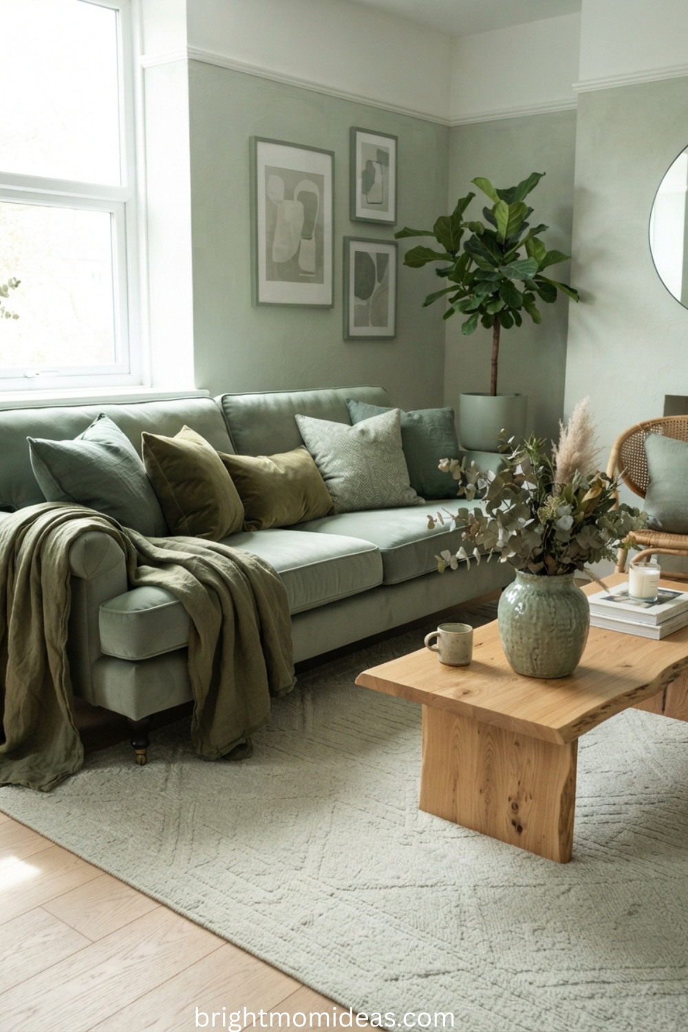
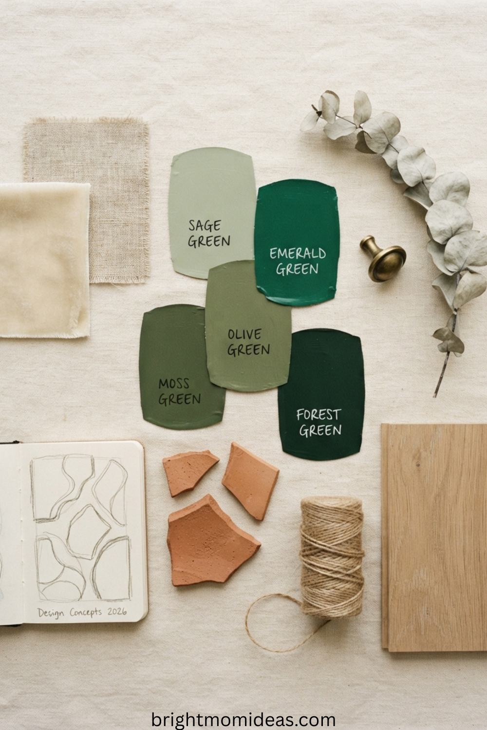
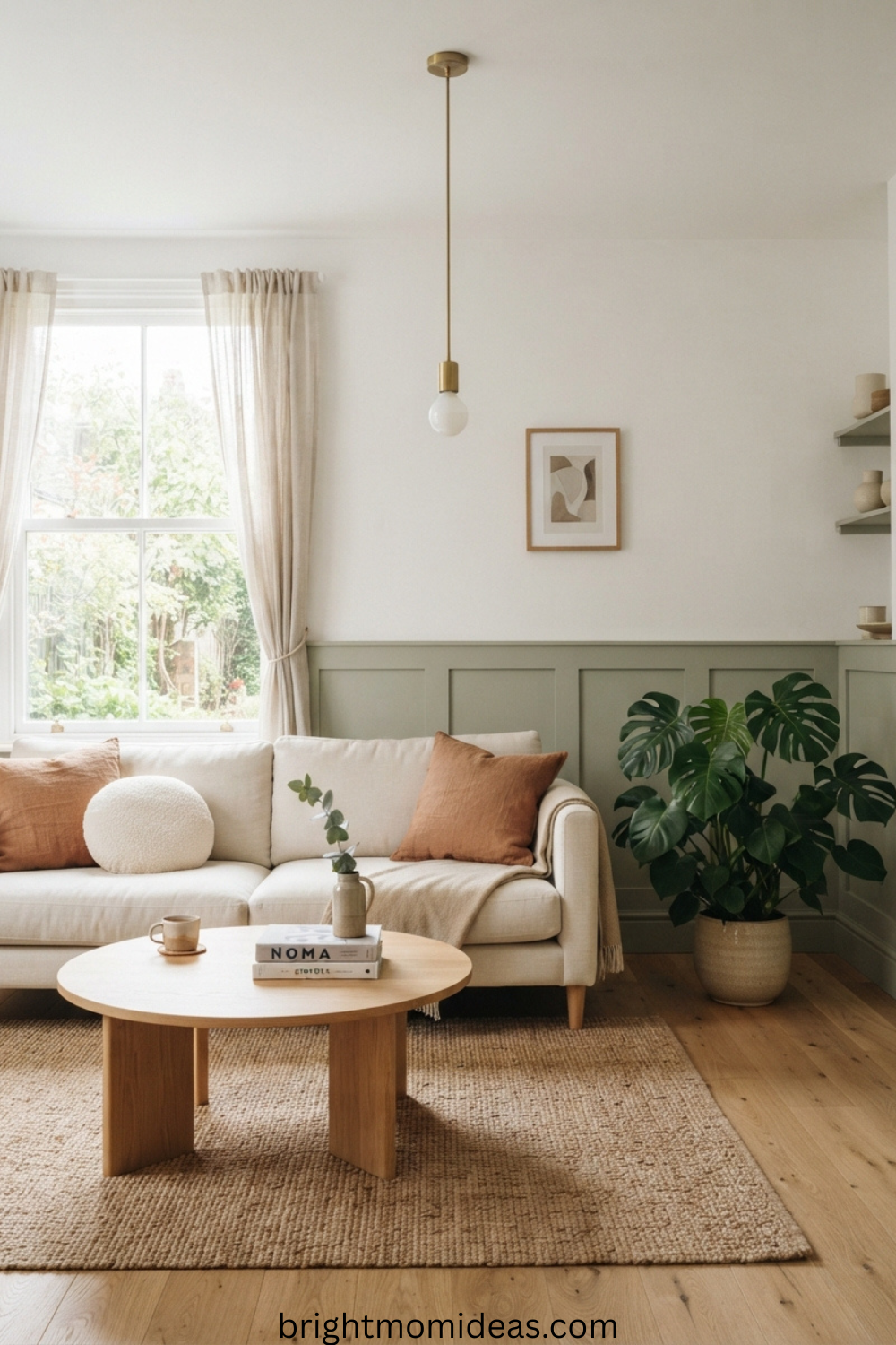
Sage green is the reigning color of 2026 living rooms. It reads as grey-green in cool north-facing light and as warm, muted green in golden afternoon light — which makes it endlessly adaptable. It is the gateway green for first-timers because it is soft enough to feel safe but distinctive enough to make a real design statement. Pair it with warm whites, natural linens, brass accents, and terracotta for the most complete sage living room look.
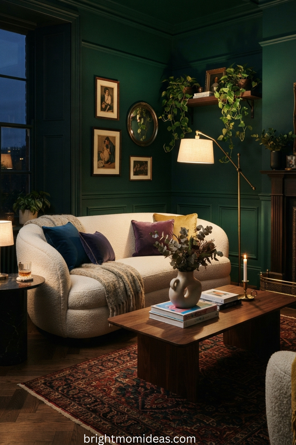
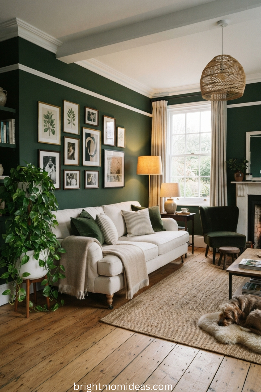
Emerald and hunter green are for the committed and the bold. These deep jewel-toned shades create rooms that feel like luxury hotel suites, moody literary studies, or maximalist designer showrooms. They require full commitment to execute well, but they reward that commitment with spaces that stop people in their tracks. They work best in rooms with good natural light or layered warm artificial lighting, and they need lighter-toned furniture or metallic accents to prevent the room from feeling heavy.
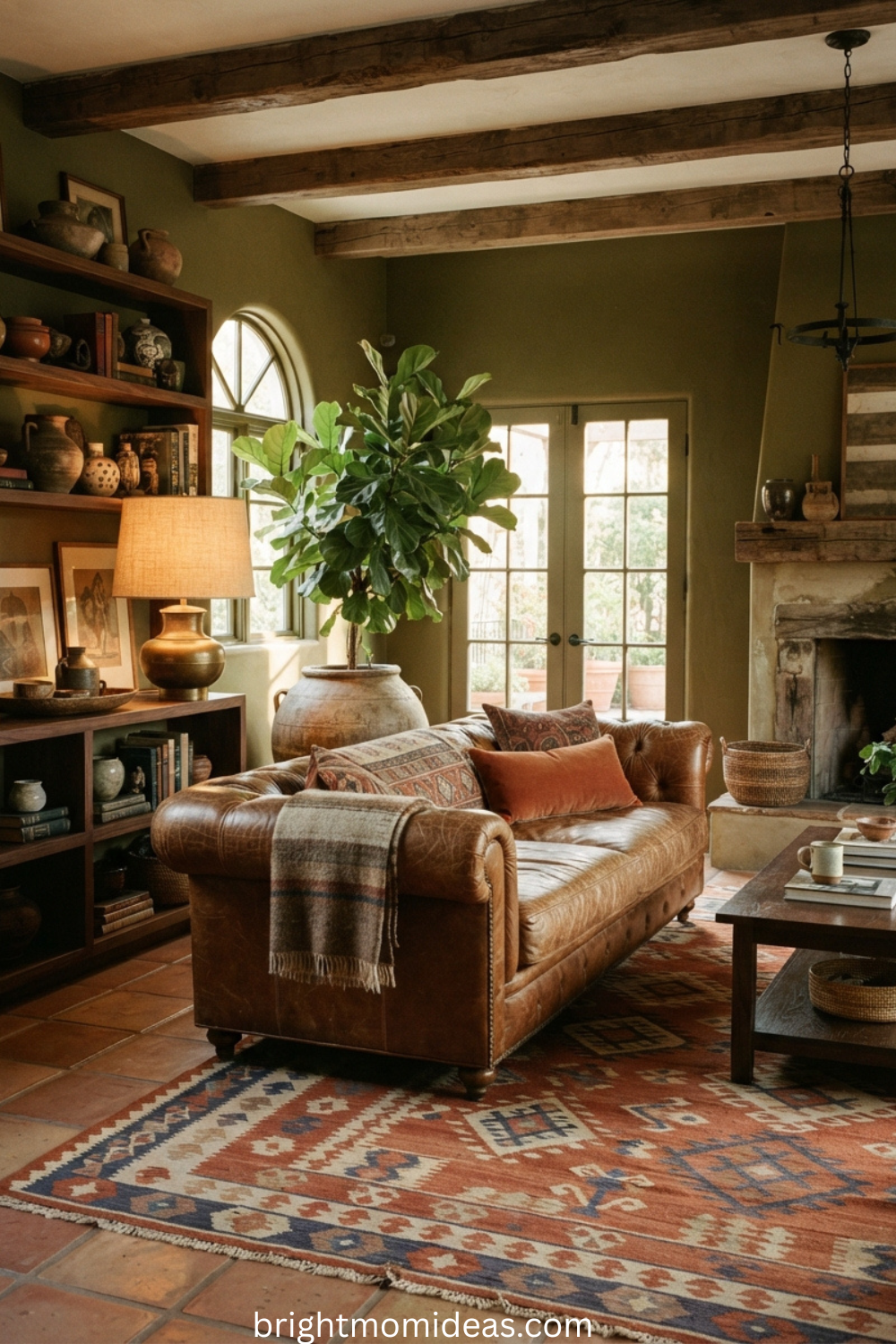
Olive green straddles the line between green and brown, making it the warmest and most earth-toned member of the family. Olive is the green for people who love natural materials — aged leather, warm rattan, woven wool, and terracotta ceramics all look extraordinary alongside olive. It is forgiving in a wide range of lighting conditions and feels completely at home in Mediterranean, Scandi-rustic, and mid-century modern interiors alike.
Moss and fern green bring the outdoors inside most literally. These are the greens of forest floors and old botanical illustrations — slightly more saturated than sage but softer than emerald. They layer beautifully with other greens and work especially well in cottagecore, maximalist, and biophilic-inspired living rooms where the goal is a room that looks like it grew organically over years rather than being styled in a weekend.
Sage Green Living Room Ideas — Ideas 1 to 10
Sage is where most green living room journeys begin, and for good reason. It is calming, versatile, and works in rooms of almost any size and light orientation. These ten ideas cover the full range of ways to use sage — from full wall paint to soft furnishings to architectural details that cost very little but change everything.
1. Sage Walls with a Natural Linen Sofa
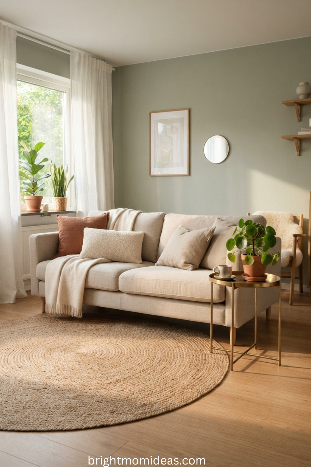
Pair sage-painted walls with a natural linen sofa in oat or warm white. Add brass side tables and terracotta cushions to bring warmth to the cool green backdrop without competing with it. This is the three-ingredient recipe of 2026 living room design — simple, grounded, and genuinely beautiful. It works in rooms of every size and suits both minimalist and relaxed decorating styles.
2. Sage and White Panelled Walls
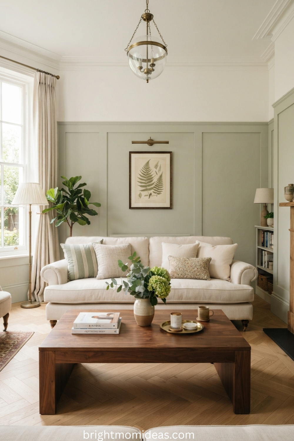
Paint wall panelling in sage while keeping the upper wall in crisp warm white. This two-tone approach adds architectural interest and keeps the room feeling bright even in north-facing rooms with limited natural light. The visual division between sage panel and white wall naturally draws the eye downward and makes ceilings appear higher than they actually are — a genuinely useful trick in rooms with average ceiling height.
3. A Sage Velvet Sofa as Your Statement Piece
If painting feels like too large a commitment, a sage velvet sofa against white or pale grey walls is the perfect entry point into green. Velvet fabric catches light in a way that makes the color look richer and more dimensional than flat paint. The pile compresses slightly where you sit, creating subtle tonal variation that gives the sofa a quality that flatweave and microfiber fabrics simply cannot replicate.
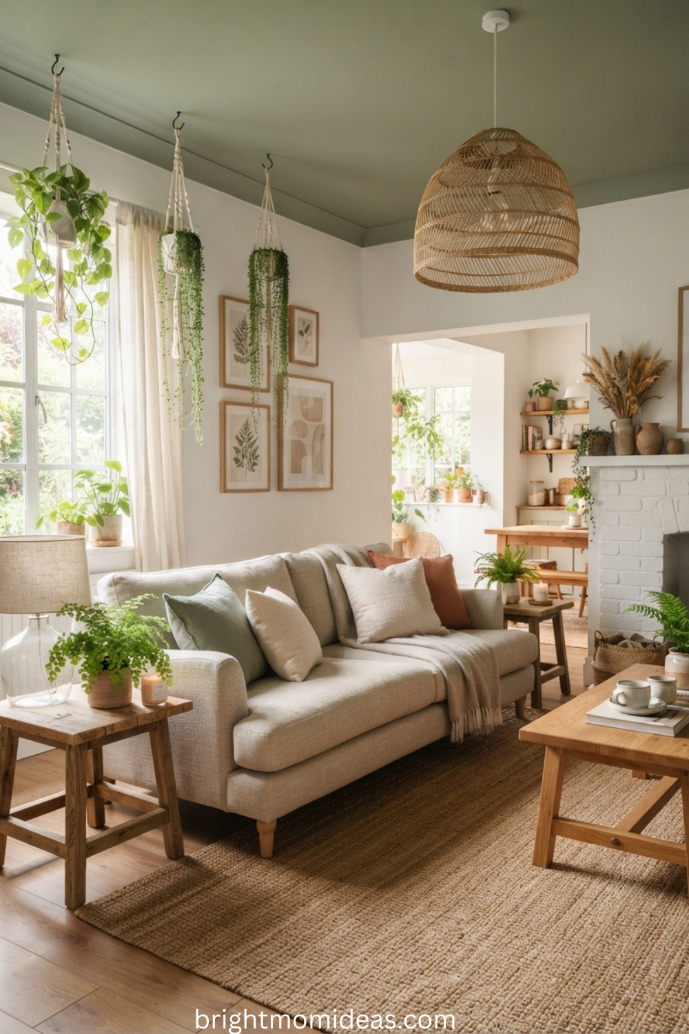
4. Paint the Ceiling Sage and Leave the Walls White
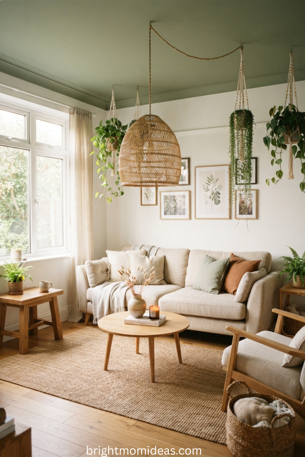
The fifth wall is having its moment in 2026. A sage-painted ceiling above crisp white walls creates a canopy effect that is simultaneously cosy and creative. Style the room with hanging plants, rattan pendant lights, and linen furniture to lean fully into the organic, nature-inspired feel. This approach works especially well in rooms where the ceiling is the most prominent architectural feature.
5. Sage, Cream, and Walnut — The 2026 Living Room Trifecta
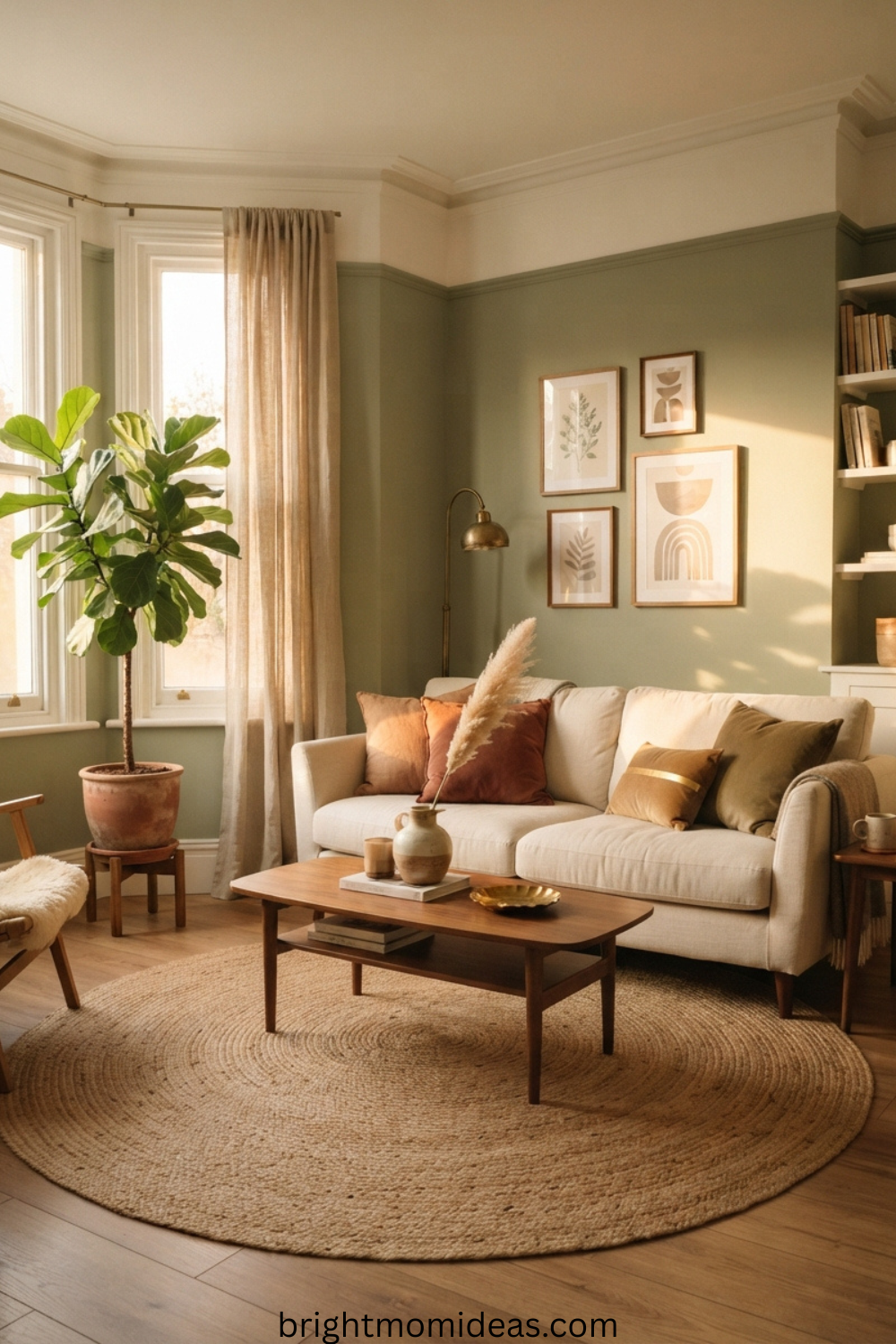
This is the combination defining the most sophisticated living rooms of 2026. Sage walls, cream upholstery, and walnut or dark oak furniture create a warm, layered palette that translates effortlessly from Scandinavian minimalism to mid-century modern to transitional design. The three elements share warm undertones that make the room feel cohesive without feeling matchy.
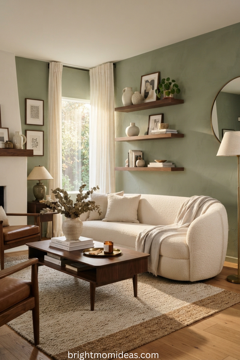
6. Sage Linen Curtains Floor to Ceiling
In rental spaces or rooms where painting is not an option, sage linen curtains hung floor to ceiling bring the color in without any permanence. Choose wide panels and let them pool slightly on the floor for a relaxed, French-inspired look that feels effortlessly expensive. The soft fall of the linen adds texture to the window and makes the ceiling height feel generous regardless of what it actually is.
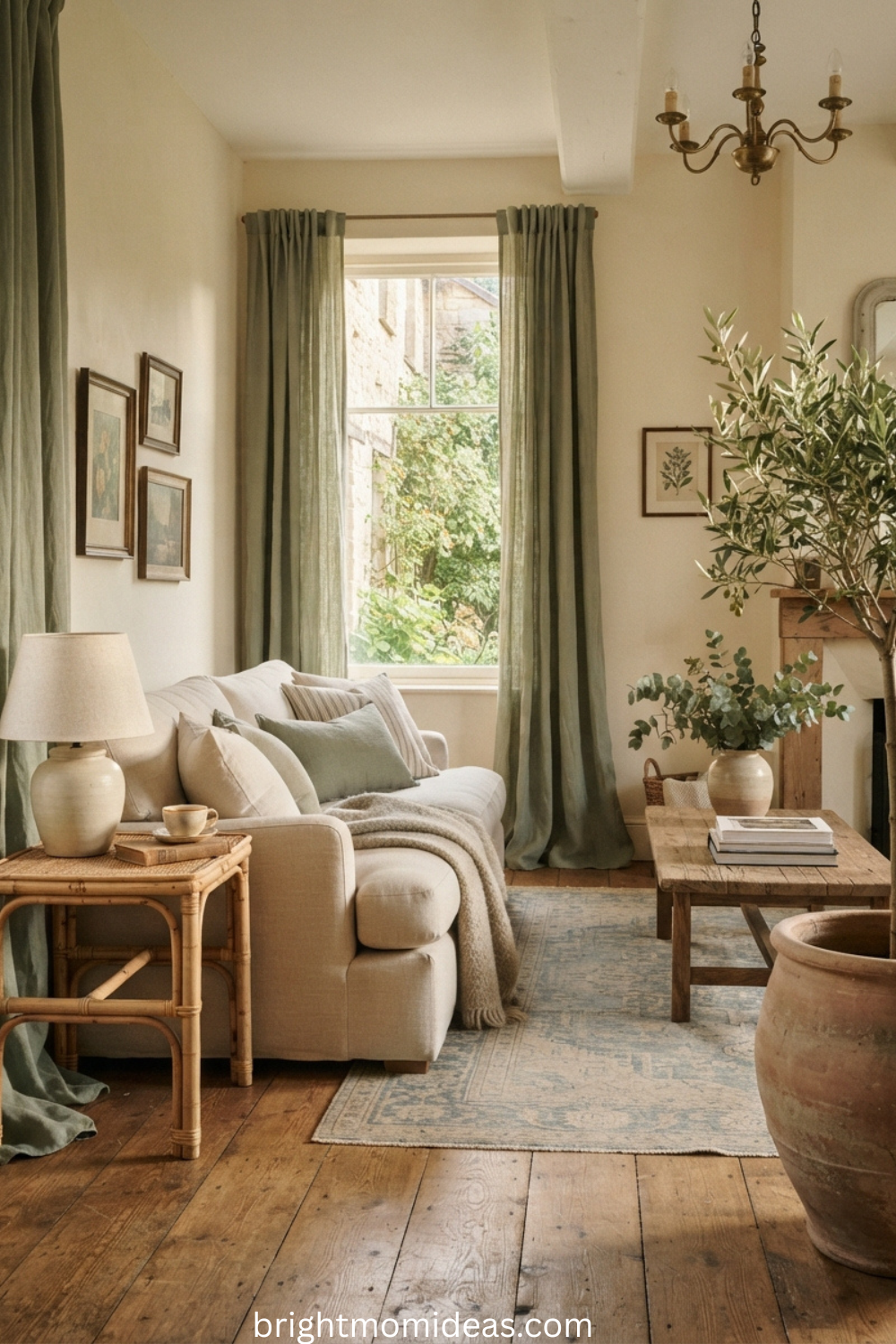
7. Sage Feature Wall With a Gallery of Warm-Toned Art
Paint a single feature wall behind the sofa in sage and use it as the backdrop for a curated gallery of art. Mix frame finishes — raw wood, antique gold, matte black — for a collection that looks built up over time rather than purchased as a coordinated set. The sage wall acts as a gentle color background that makes warm-toned art pop without the stark contrast that a white wall creates.
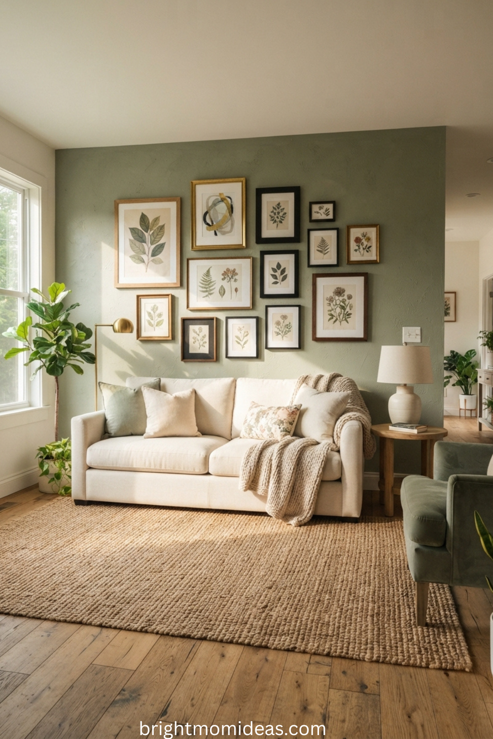
8. Sage and Blush Pink — The Sophisticated Unexpected Duo
Sage walls paired with blush pink or dusty rose soft furnishings create a palette that feels both refined and feminine without ever tipping into sweetness. Balance with warm wood tones and white ceramics. Add brass lamps and a cream rug. This combination performs exceptionally well in interior design editorial photography and on Pinterest because it photographs with a warmth and softness that other palettes rarely achieve.
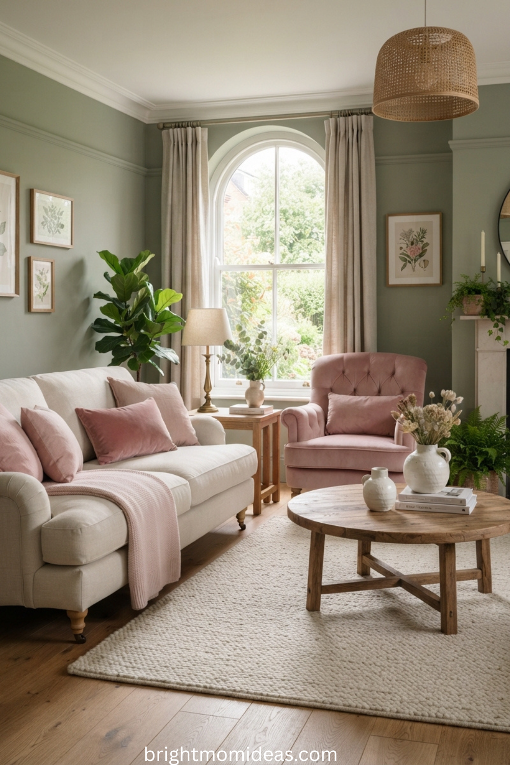
9. Sage Roman Blinds With Sheer White Curtains
Layer sage Roman blinds with sheer white curtains for a window treatment that gives you complete control over light while adding two textures to the window simultaneously. The blinds draw up to reveal the sheers during the day. In the evening, both layers closed together create a soft green texture at the window that warms the room without darkening it. This is one of the best window treatments for living rooms that get strong afternoon sun.
10. Tonal Sage Layering — Cushions, Throws, and Rug in Three Different Sage Tones
Tonal layering — using three or four different shades of the same color family — is one of the most sophisticated decorating techniques available, and sage is the ideal color for it. A pale sage rug. A mid-tone sage velvet sofa. Deeper sage cushions at the back. A sage-toned ceramic vase on the coffee table. The room feels monochromatic but endlessly textured, which is the visual language of genuinely expensive interior design.
Emerald Green Living Room Ideas — Ideas 11 to 20
Emerald demands commitment — but it gives back in direct proportion to what you invest. A living room done well in emerald green is the kind of space that makes guests stop at the door. These ten ideas range from single statement moments to full immersive rooms.
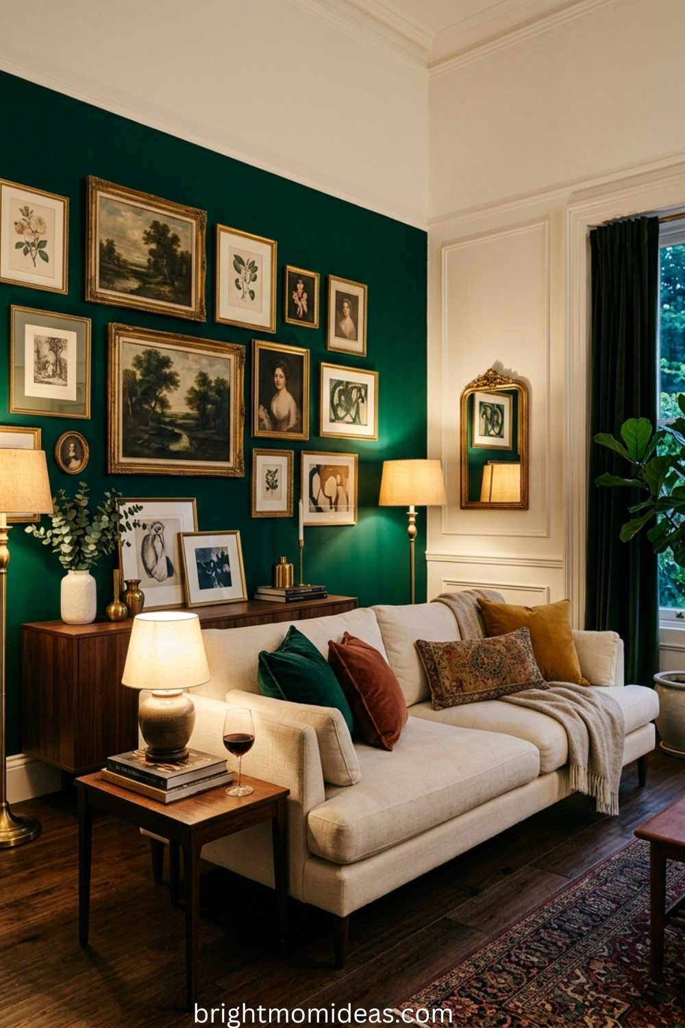
11. Emerald Accent Wall With a Brass Gallery
Paint a single wall in deep emerald and mount a curated gallery of art in warm brass or gold leaf frames. Keep the surrounding walls in warm white. The contrast between the dark jewel-toned wall and the warm metallic frames is the kind of combination that looks like it took a professional interior designer to execute but is actually achievable in a single weekend with a single pot of paint.
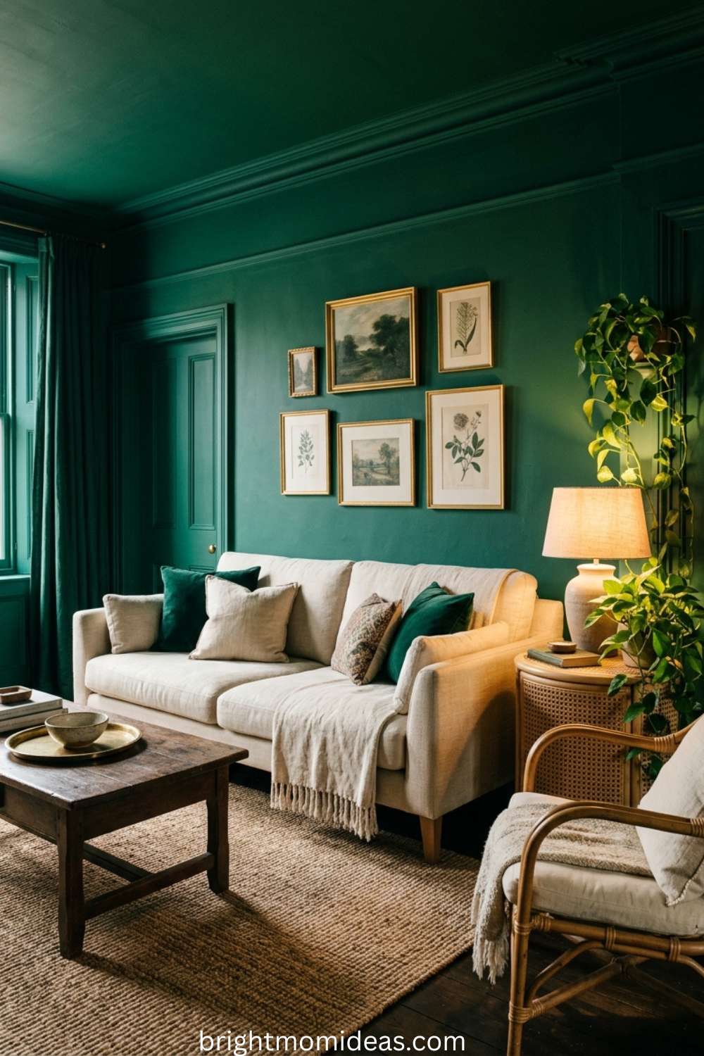
12. Go All-In on an Immersive Emerald Room
Paint the walls, ceiling, and trim in the same deep emerald shade for a jewel-box effect that has defined the most talked-about living rooms of 2025 and 2026. The all-in monochromatic approach removes the visual boundaries between surfaces and makes the room feel like a destination rather than just a space. Balance the richness with natural materials — rattan armchairs, cane side tables, unbleached linen throws — to keep the room from feeling oppressive.
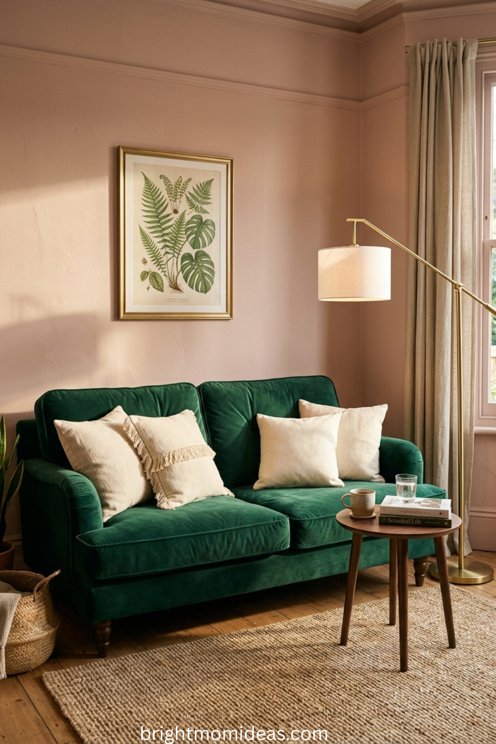
13. An Emerald Sofa Against Blush Pink Walls
The color pairing that interior designers are obsessing over in 2026. A jewel-toned emerald sofa against dusty pink or plaster-blush walls creates a combination that feels both bold and refined simultaneously. The pink walls soften the intensity of the emerald while the emerald sofa prevents the pink from reading as feminine or sweet. Add gold lamp bases and cream cushions to complete the picture.
14. Emerald Built-In Shelving as Art and Storage Combined
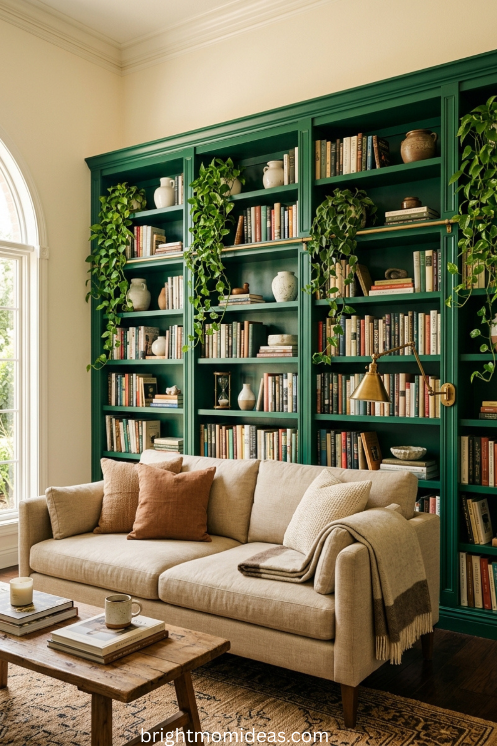
Painting built-in shelving or floor-to-ceiling cabinetry in emerald while keeping the surrounding walls light creates a focal point that functions as furniture, art, and color moment all at once. Style the shelves with a mix of books, ceramics, trailing plants, and meaningful objects. The emerald shelving becomes the visual anchor of the entire room and everything else can stay simple around it.
15. Emerald and Gold — Art Deco Glamour for 2026
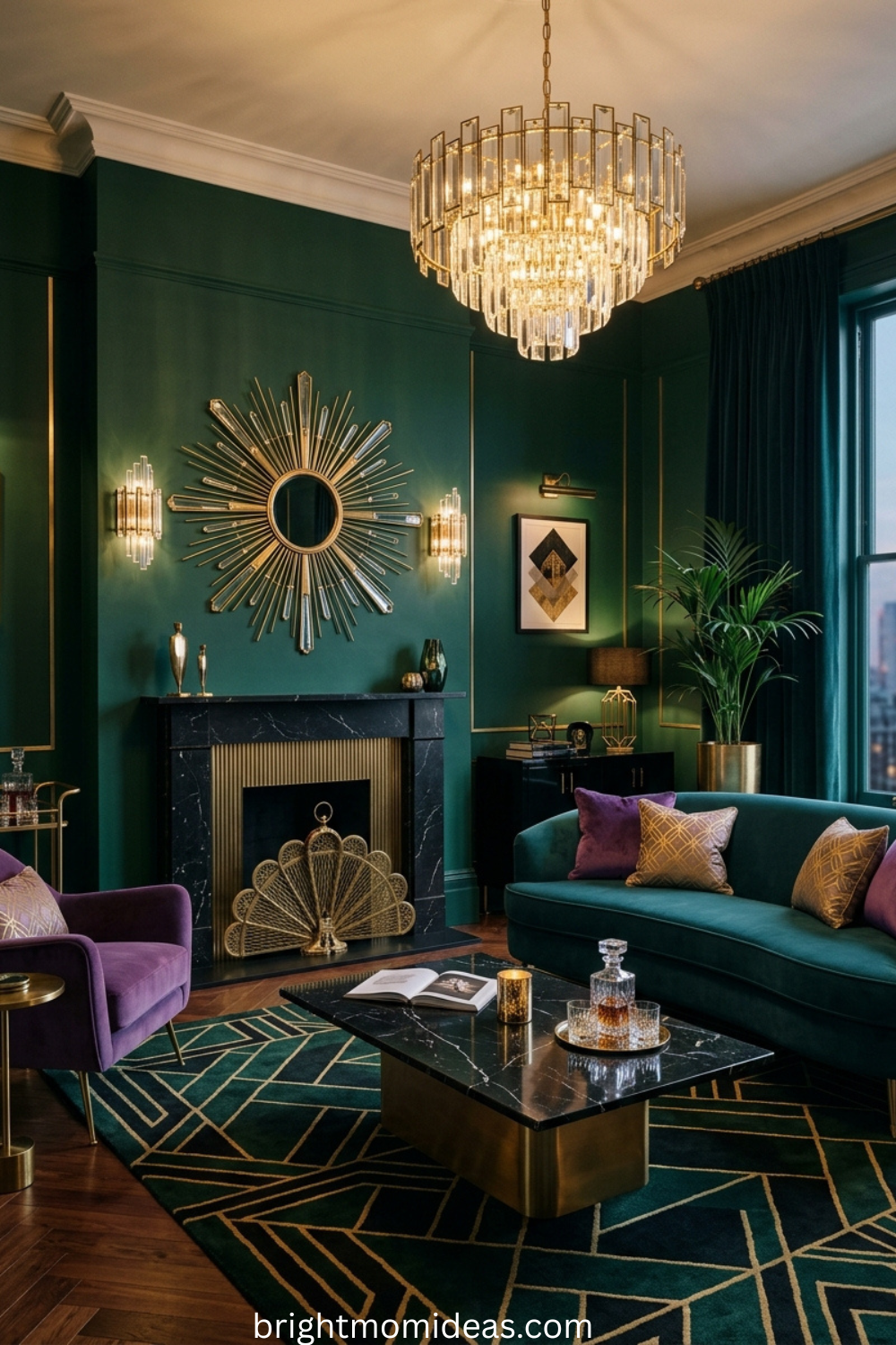
Emerald walls, gold geometric mirrors, velvet cushions in jewel tones, and a statement chandelier channel 1920s Art Deco glamour in the most wearable, contemporary way. A black marble coffee table adds edge and prevents the look from tipping into costume. This is one of the most visually striking living room combinations possible, and it works because the gold and the emerald have both been used together in luxury contexts for over a century.
16. Paint the Fireplace Surround in Emerald Only
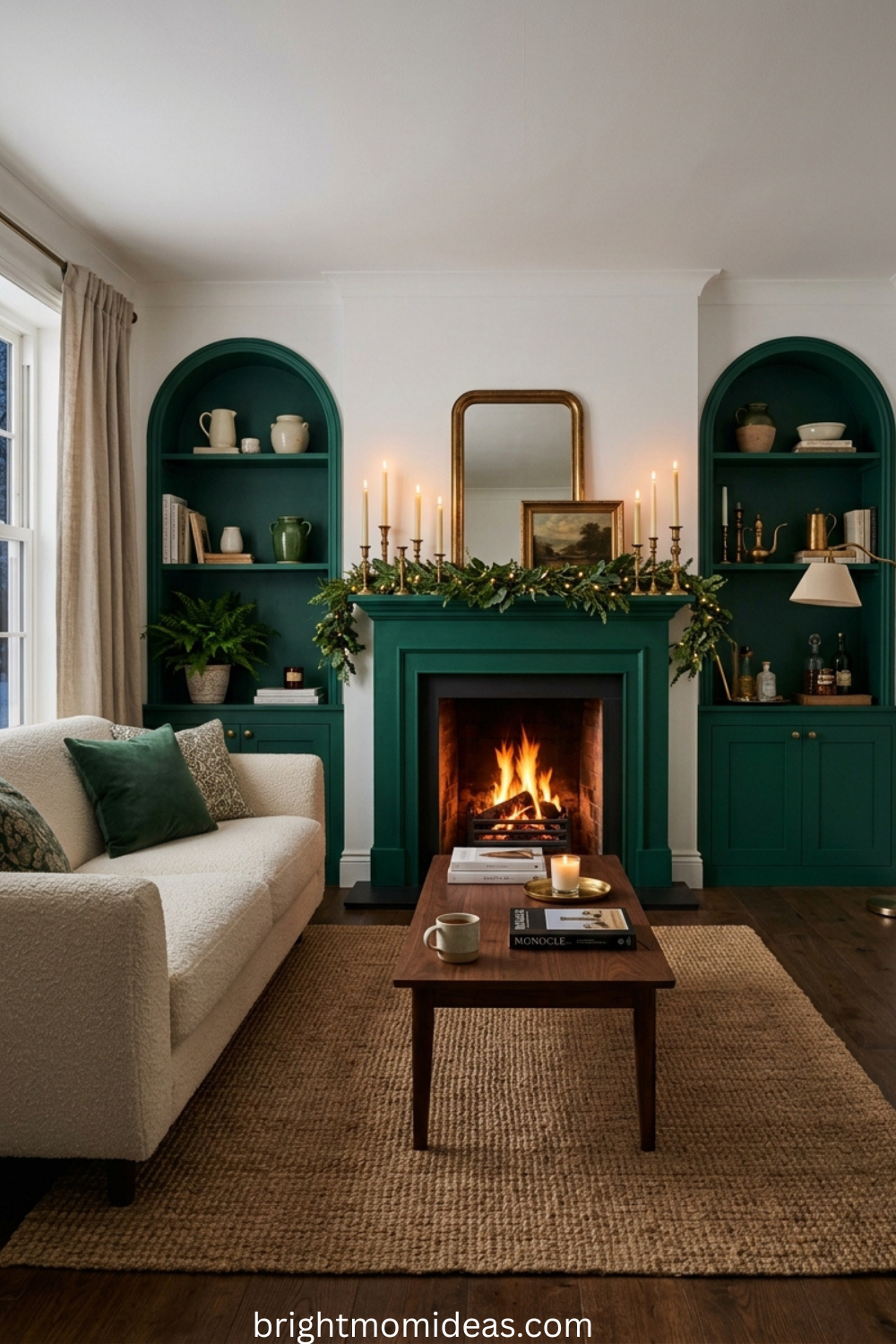
Paint the fireplace surround and the flanking alcoves in emerald while leaving the rest of the room in white or warm cream. This concentrates the drama exactly where the room already has its natural architectural anchor. The fireplace becomes a genuine focal moment that looks professionally designed without requiring a full room commitment to a dark color.
17. Emerald Botanical Wallpaper
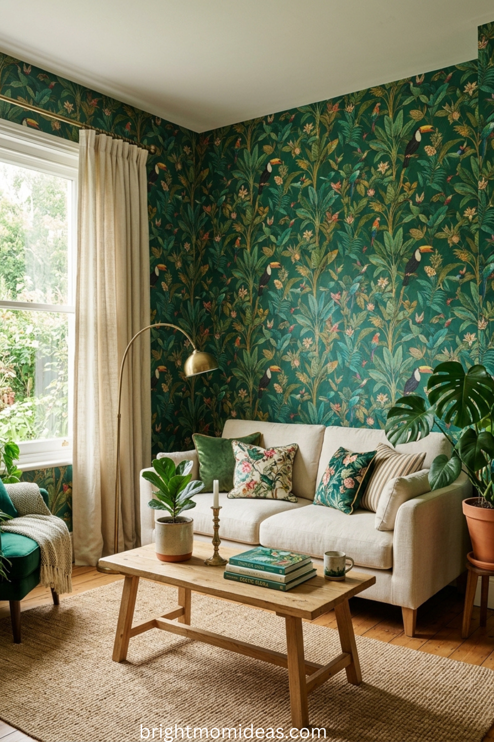
A botanical-pattern wallpaper with an emerald or deep forest green background brings extraordinary depth and visual storytelling to a living room. Choose a pattern with illustrated plants, birds, or foliage — something that rewards closer looking. Use it on all four walls for complete immersion or on the chimney breast alone for a more restrained version of the same idea.
18. Emerald Walls With Terracotta and Warm Rust Accents
Pair emerald walls with terracotta-toned soft furnishings — cushions, throws, lampshades — for a color pairing that feels simultaneously rich and earthy. The warmth of the terracotta prevents the emerald from reading as cold or corporate. The combination creates a room that feels like it belongs in a boutique hotel in a warm climate — Marrakech, Lisbon, or somewhere equally beautiful.
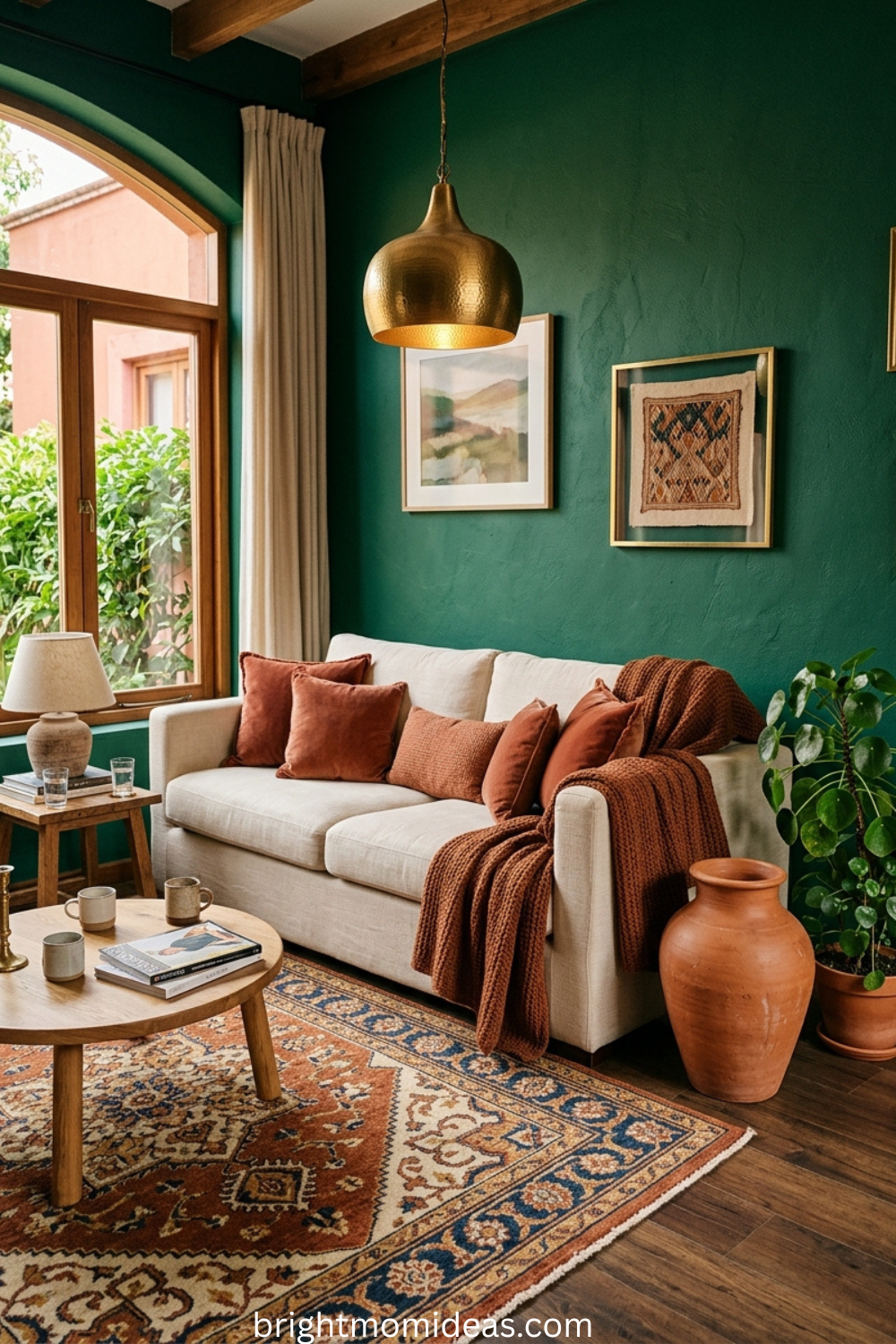
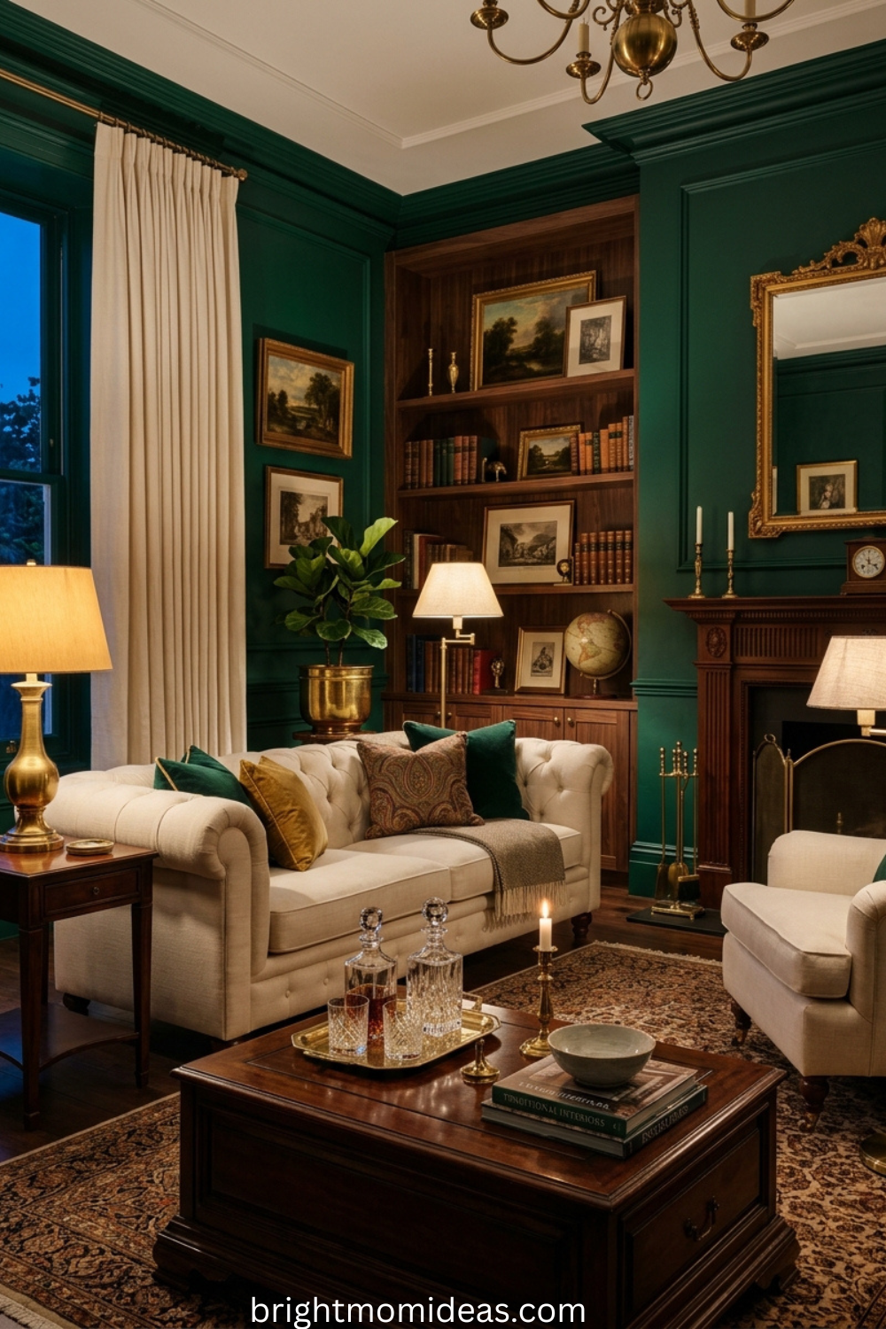
19. Emerald Green With Warm Cream Upholstery and Dark Wood
The simplest and most reliable emerald living room formula. Deep emerald walls, cream or ivory upholstery on the sofa and armchair, and dark walnut or mahogany wood furniture throughout. The three elements work together without any element competing with the others. The emerald provides the drama. The cream provides relief. The dark wood provides grounding weight.
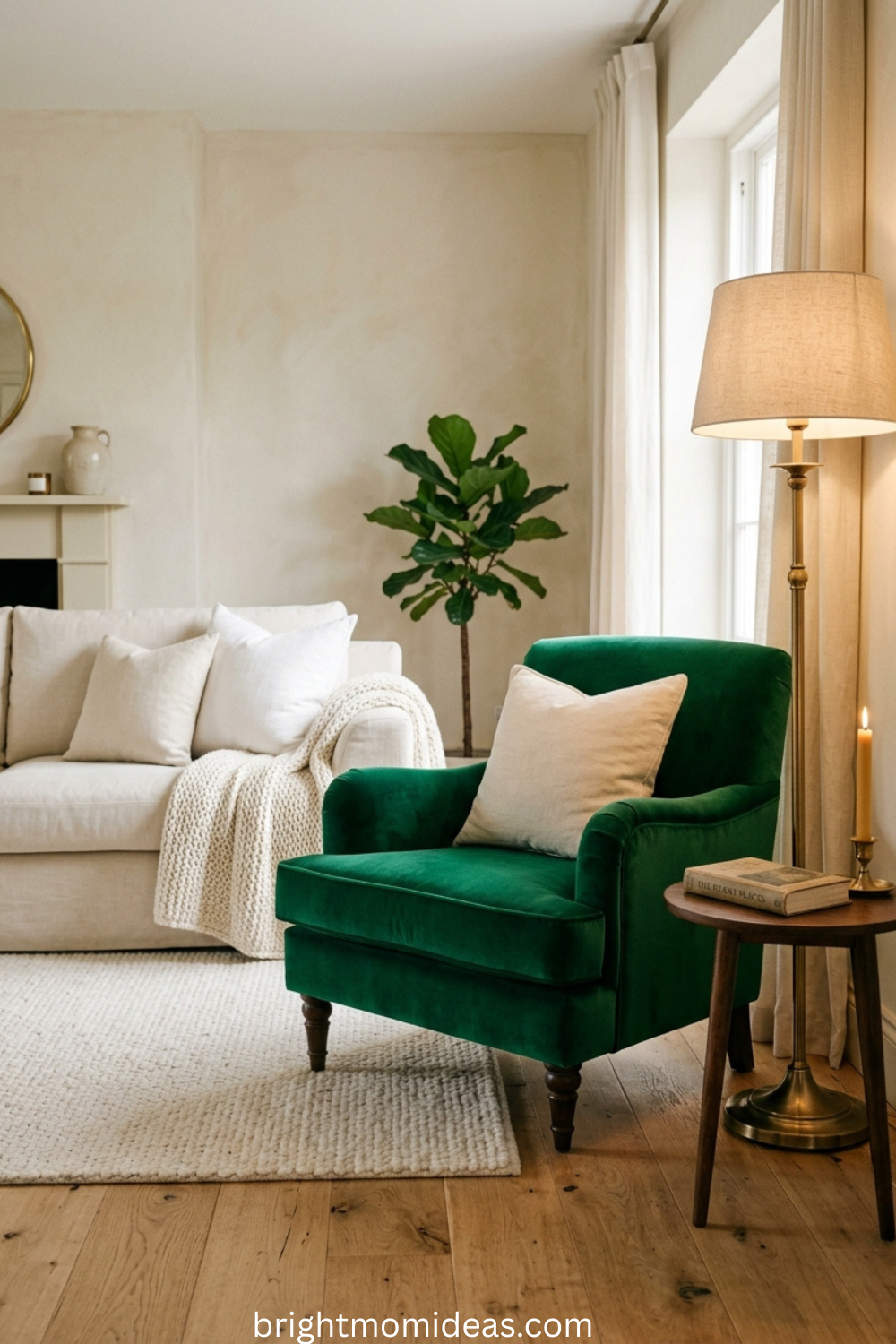
20. A Single Emerald Armchair in a Neutral Room
If a full commitment to emerald feels too bold, a single emerald velvet armchair in an otherwise neutral room is the perfect introduction. Position it beside a brass floor lamp and style it with one cream cushion. The armchair becomes the hero of the room — the element that makes guests ask what it is and where you found it.
Olive Green Living Room Ideas — Ideas 21 to 28
Olive is the warmest and most earth-toned member of the green family. It belongs in rooms filled with natural materials — aged leather, warm wood, woven textiles, and terracotta ceramics. These eight ideas show olive’s full range of personality.
21. Olive Walls With Aged Leather Furniture
Warm olive walls are the perfect backdrop for a cognac or tobacco leather sofa. Add kilim or Persian-style rugs in warm reds and oranges, chestnut wood side tables, and antique brass lamps. The result is a room that feels genuinely collected and globally inspired — the kind of space that looks like it was built up over decades of thoughtful living rather than assembled in a single shopping weekend.
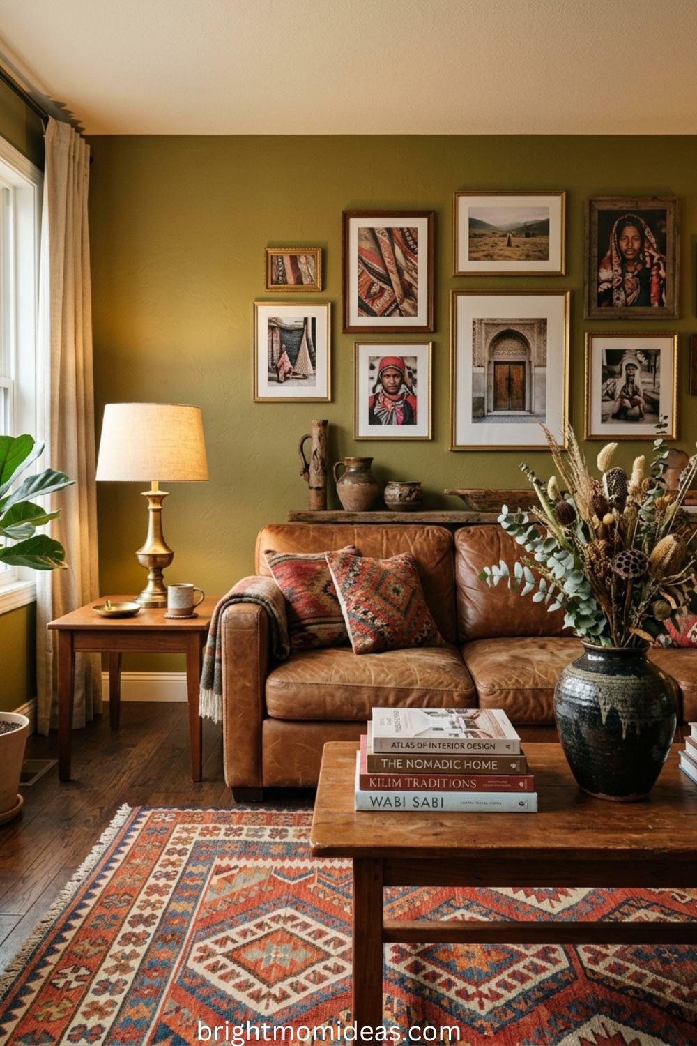
22. Olive and Terracotta — The Earthiest Palette of 2026
These two tones come from the same earthy palette and never fight each other. Use olive as the dominant wall color and bring terracotta in through ceramic vases, throw cushions, a large terracotta pot for a fiddle leaf fig, or even a terracotta-toned area rug. The effect evokes a Tuscan farmhouse or a Moroccan riad without being literal or costume-like about it.
23. An Oversized Olive Sectional Sofa
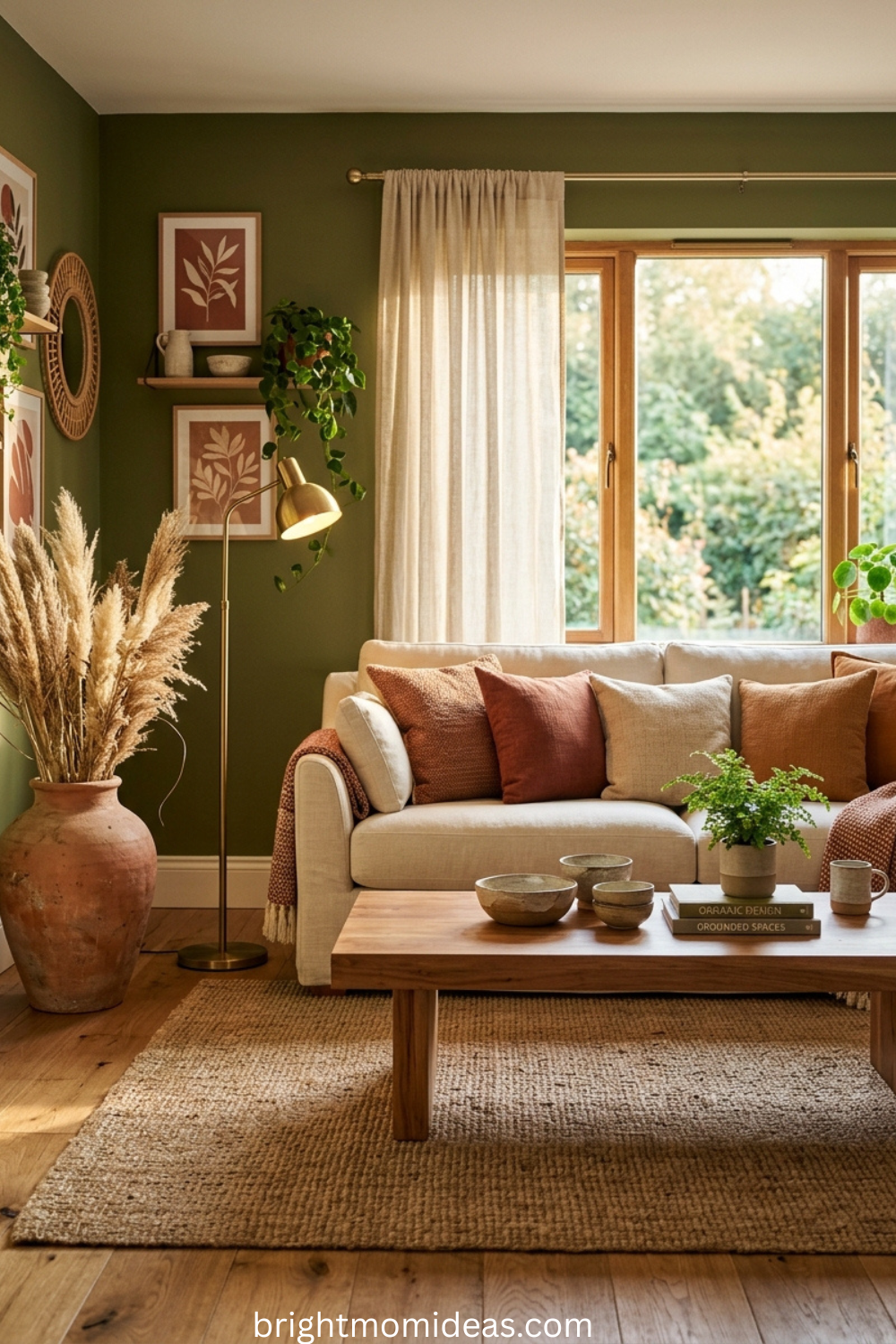
An oversized olive-toned sectional is one of the defining furniture pieces of 2026. Keep the walls in pale plaster or warm cream. Layer the sofa with cream throws and natural fibre cushions in warm white and rust. Finish with dark wood flooring or a large jute rug for grounding contrast. The room feels generous, comfortable, and completely at ease with itself.
24. Olive Connecting an Open-Plan Kitchen and Living Room
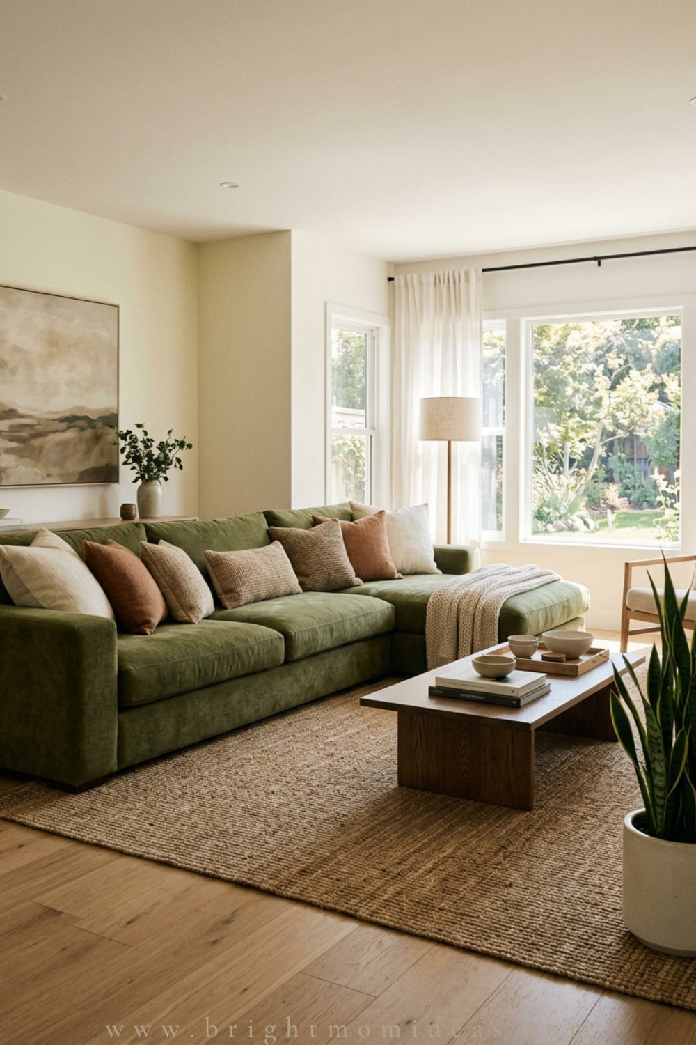
In open-plan spaces, using olive as the connecting color between kitchen cabinetry and living area soft furnishings creates a visual flow that makes the entire floor feel intentionally designed rather than like two separate rooms sharing a space. This is particularly effective in family homes where visual unity between zones matters for both aesthetics and functionality.
25. An Olive Painted Coffee Table in an Otherwise Neutral Room
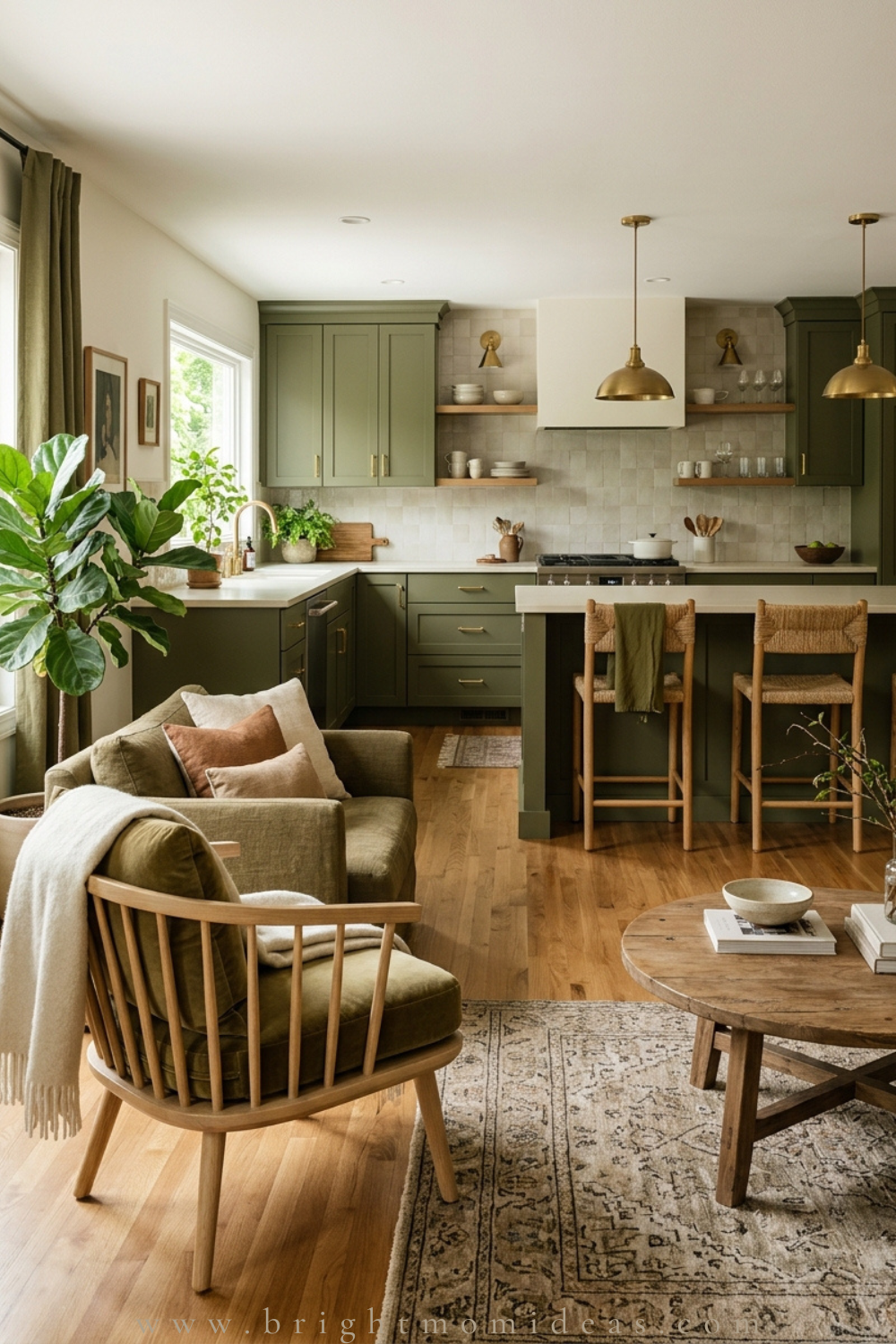
Rather than committing to olive on the walls, paint a single wooden coffee table in olive and leave everything else neutral. This is a low-commitment, high-reward approach to bringing green into a room — completely reversible, completely affordable, and surprisingly impactful as a grounding earthy color note in a neutral living room.
26. Olive and Rust in a Bohemian Living Room
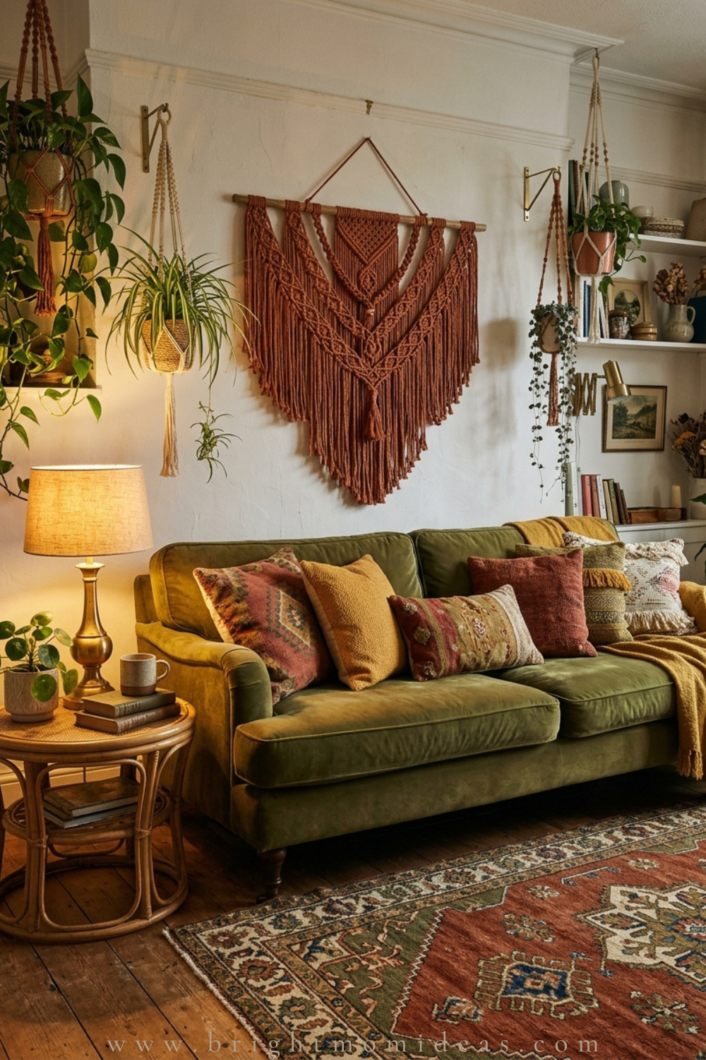
Combine olive and rust in a bohemian living room through layered textiles — an olive velvet sofa, a rust macramé wall hanging, mixed-pattern cushions in warm tones, and a vintage-style rug with both colors woven through. The result feels warm, worldly, and entirely personal — the opposite of the perfectly coordinated showroom aesthetic that has dominated aspirational interiors for the past decade.
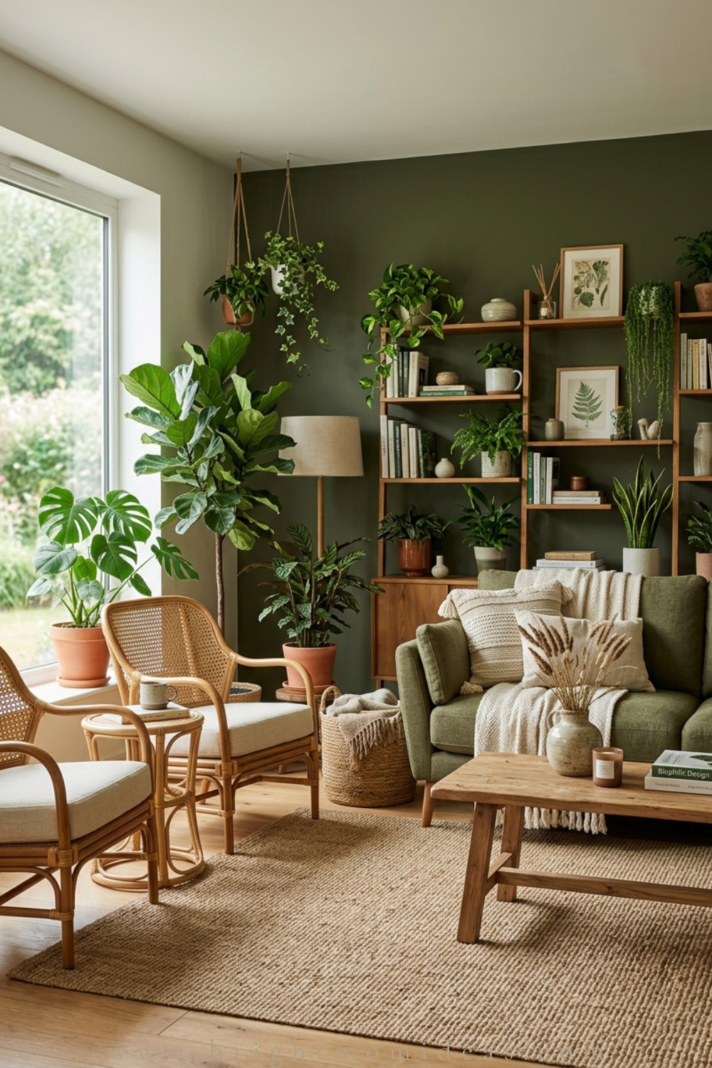
27. Olive Green With Natural Wood and Woven Rattan
Olive walls or an olive sofa paired with natural wood furniture and woven rattan accent pieces creates one of the most grounded, biophilic living room aesthetics available. Everything in the room relates to the natural world — the earthy green, the warm wood grain, the organic texture of rattan — creating a space that feels like it exists in genuine dialogue with the outdoors.
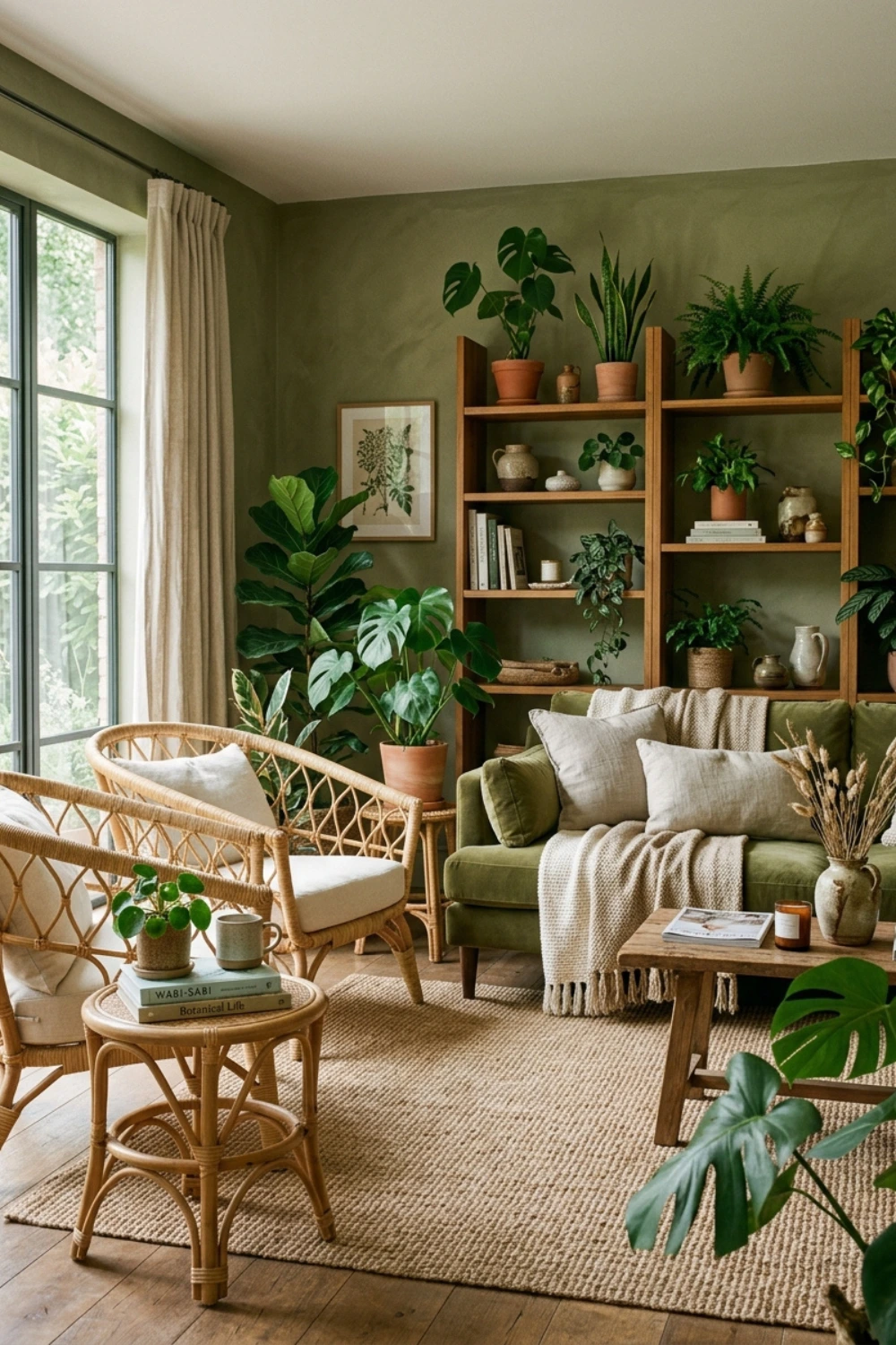
28. Olive Grasscloth Wallcovering
Olive grasscloth wallcovering is a texture-rich alternative to flat paint that is particularly effective in formal living rooms or rooms where you want warmth without heaviness. The natural woven fibers add depth and dimension to the walls, and the slight variation in tone across the surface gives the room an organic quality that no painted finish can replicate.
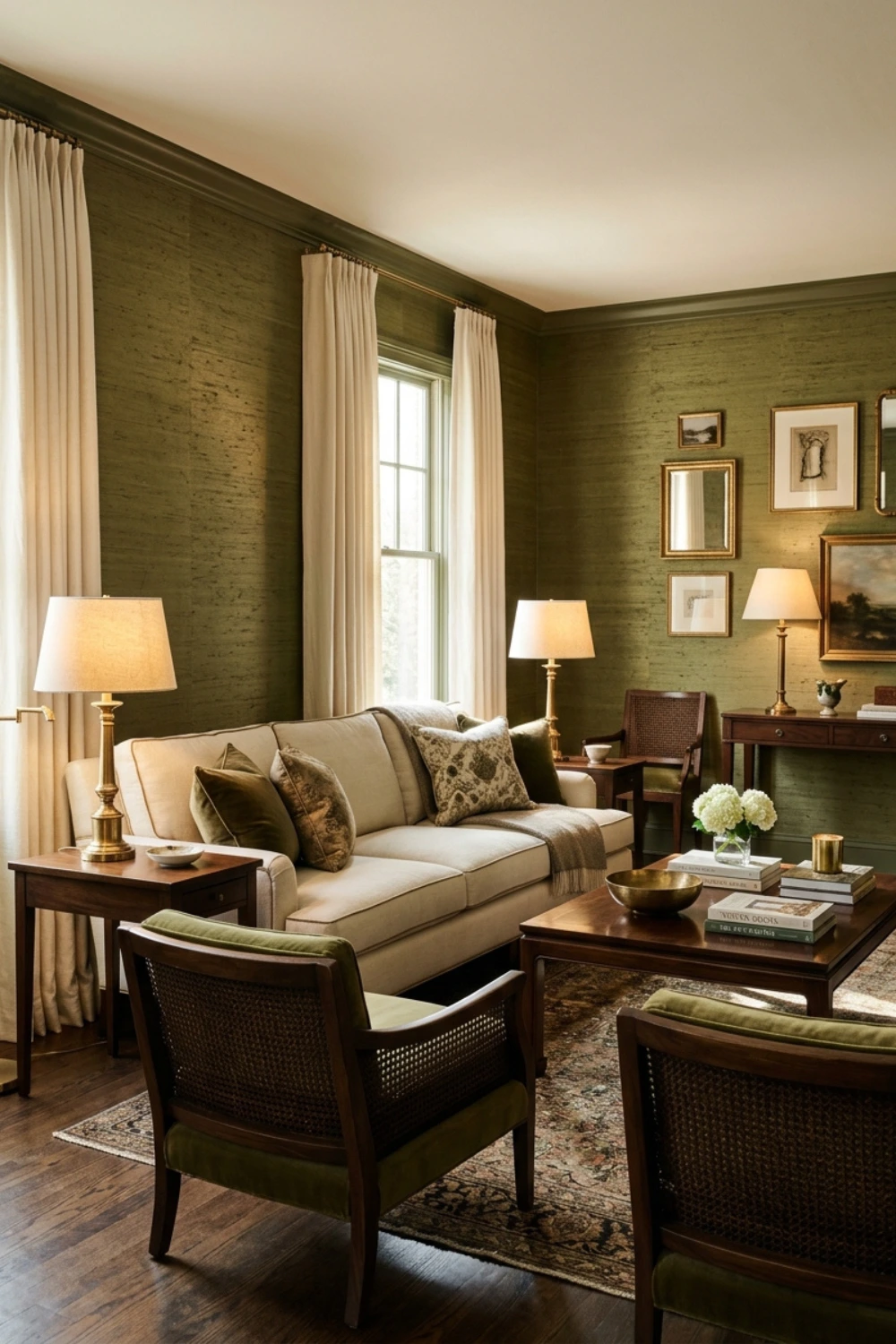
Forest Green Living Room Ideas — Ideas 29 to 36
Forest green sits between olive’s warmth and emerald’s drama. It is deeply rooted, organic, and completely at home in traditional, country house, and modern rustic interiors. These eight ideas cover everything from classic architectural pairings to unexpected material combinations.
29. Forest Green Walls With Crisp White Trim
The most classic combination in the entire green living room playbook. Deep forest green walls with crisp white architraves, skirting boards, and window frames. The contrast creates clean definition and makes both colors work harder than they would on their own. Add warm wood floors, cream upholstery, and brass hardware, and the room immediately feels like a considered country house living room that has been thoughtfully updated for the present moment.
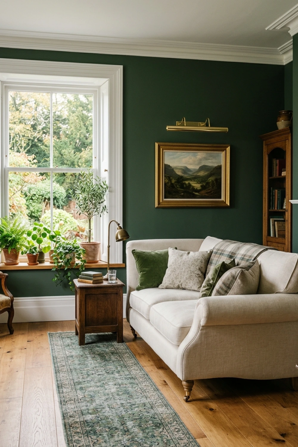
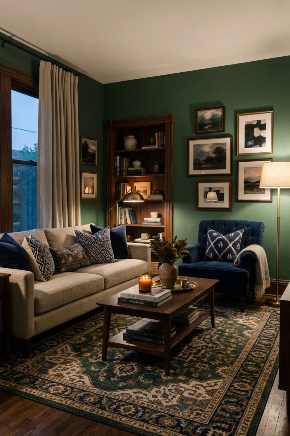
30. Forest Green and Navy Blue Together
Deep green and navy are color siblings — they share darkness and depth without sharing the same undertone, which creates a combination that is layered rather than monotonous. Use forest green as the dominant wall color and bring navy in through cushions, a statement armchair, or a patterned rug that contains both tones. The effect is richly complex without ever feeling busy.
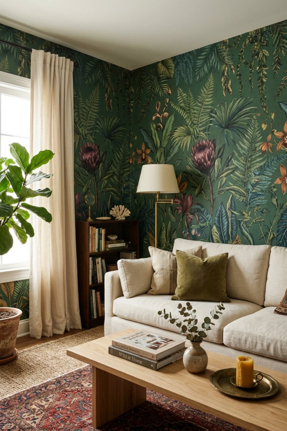
31. Forest Green Botanical Wallpaper on All Four Walls
A botanical wallpaper with a forest green background brings extraordinary depth and narrative to a living room. Choose a pattern with illustrated plants, birds, or tropical foliage — something with enough detail to reward closer looking over time. Furnish the room simply so the wallpaper can be the statement. One good sofa, a natural wood coffee table, and cream linen curtains is all you need.
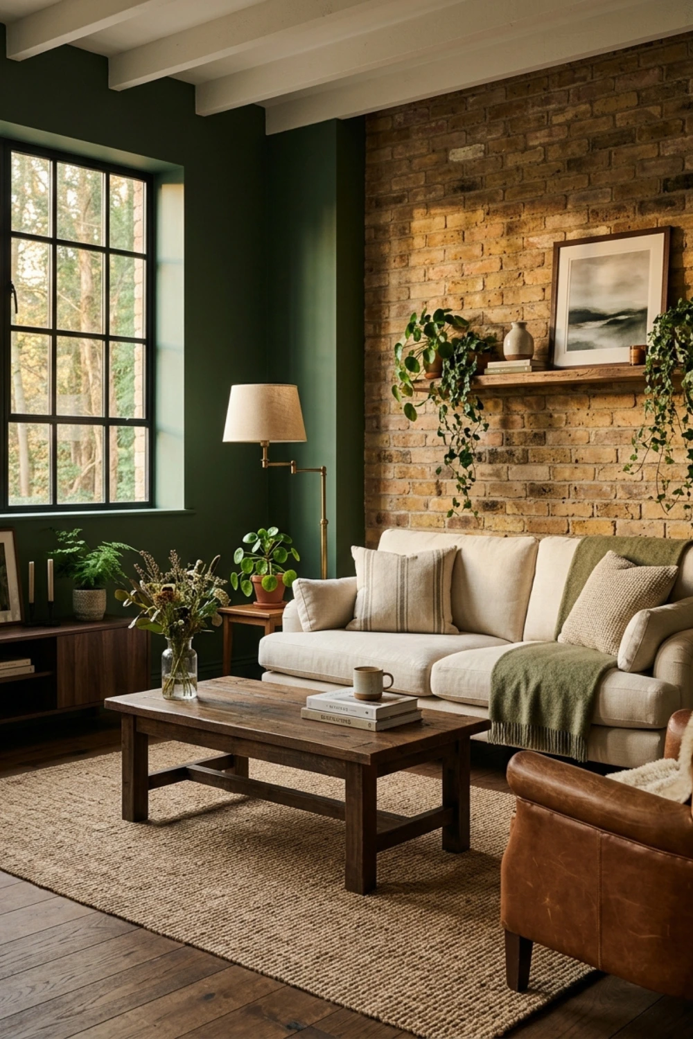
32. Forest Green With Exposed Brick or Stone
Industrial and modern rustic rooms benefit enormously from forest green set against exposed brick or natural stone walls. The organic green color softens the raw materials and makes them feel warmer and more welcoming. The combination bridges the gap between industrial edge and domestic comfort in a way that is difficult to achieve with any other wall color.
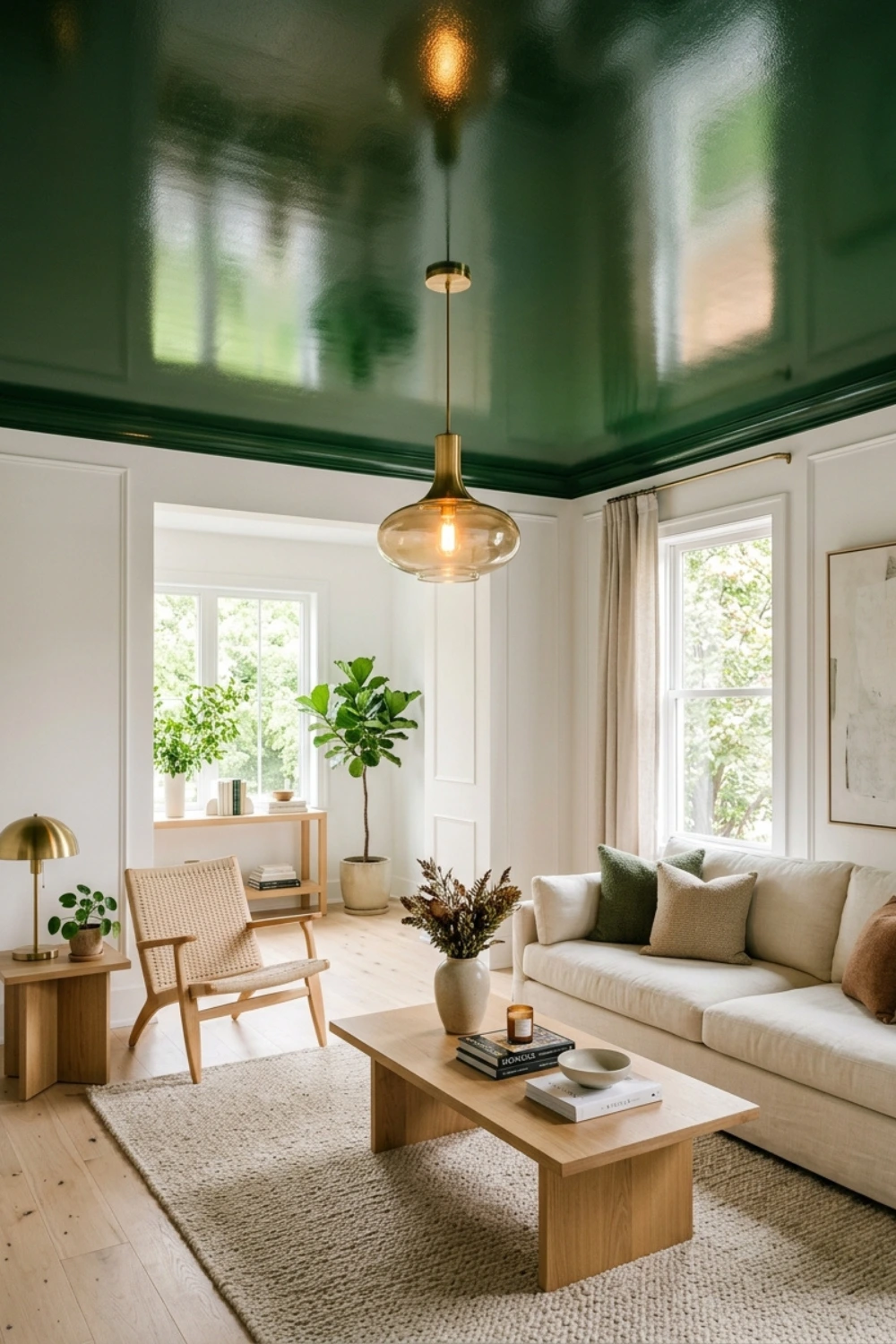
33. A Forest Green Lacquered Ceiling
A forest green lacquered or eggshell ceiling above white walls and pale wood floors creates an unexpected luxury hotel feel that is entirely achievable in a domestic setting. Lacquer and eggshell finishes reflect light rather than absorbing it, giving the green a luminous quality that flat paint simply cannot produce. The effect is unusual enough to be memorable and considered enough to feel intentional.
34. Forest Green With Rattan and Natural Fibre Throughout
Forest green paired with rattan furniture, seagrass rugs, and woven cotton throws creates the most grounded and biophilic version of the green living room. Every material in the room relates to the natural world — the green, the warm rattan, the organic fiber of the rug — creating a space that feels genuinely calm and genuinely connected to something beyond the four walls.
35. Forest Green With Black Steel Window Frames
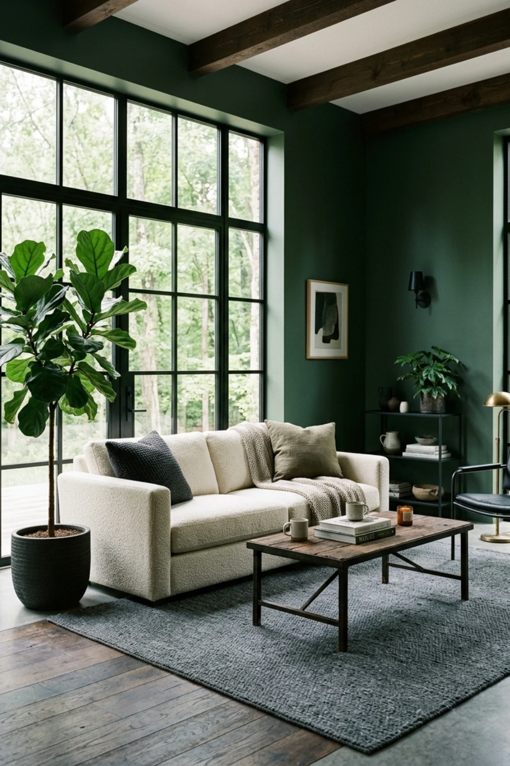
In rooms with black steel-framed windows or doors — a feature increasingly common in both new builds and Victorian conversions — forest green is the single most effective wall color complement. The black steel and the deep green are both dark, both organic, and both rooted in the same kind of industrial-meets-natural aesthetic that defines the most admired interiors of the decade.
36. Forest Green as the Color of Your Built-In Window Seat
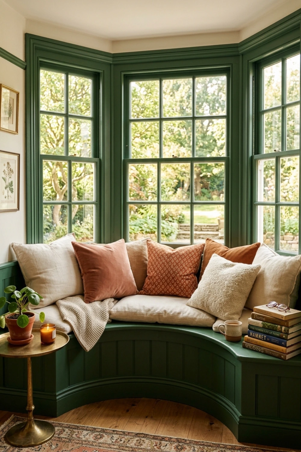
If your living room has a bay window or a recessed alcove, painting the built-in window seat and its surrounding structure in forest green makes it feel like a contained space within the room — a room within a room. Add cushions in cream and terracotta, pile them generously, and the window seat becomes the most sought-after spot in the entire house.
Green Living Room Ideas by Design Style — Ideas 37 to 44
Your design style matters as much as your color choice. Here is how green translates across the most popular living room aesthetics in 2026 — with specific ideas for each.
37. Scandi-Modern: Sage, Birch, and Linen
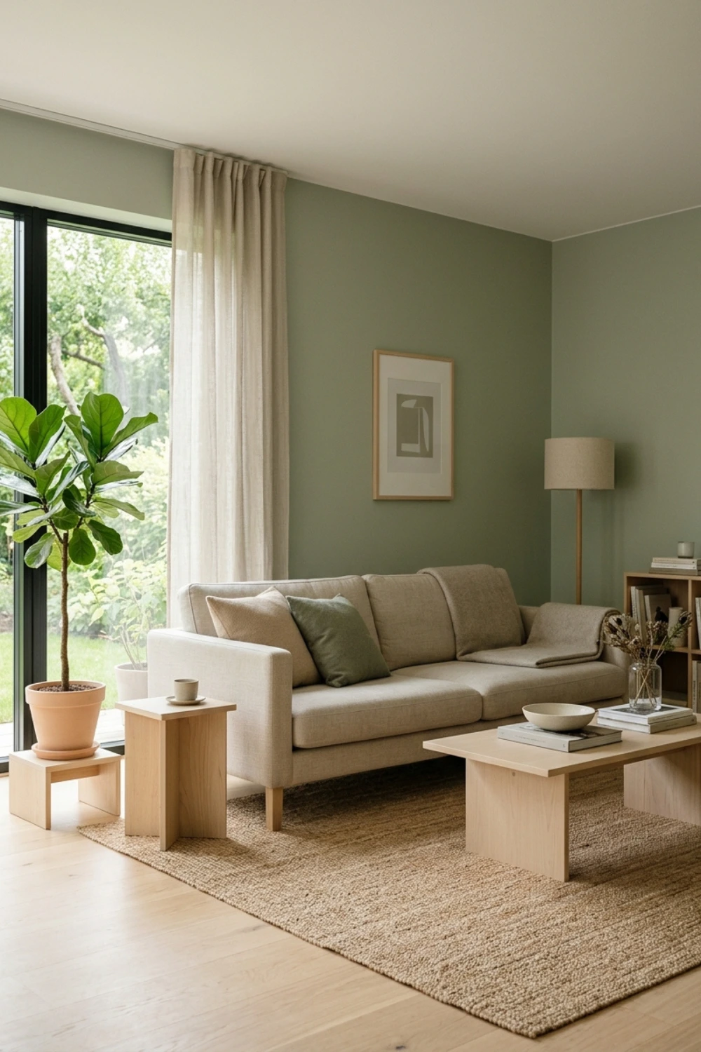
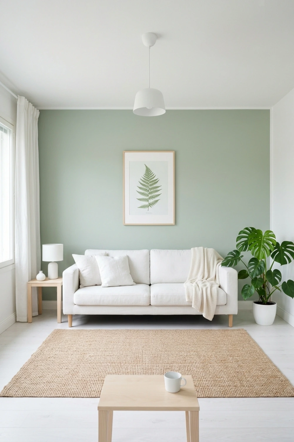
Scandinavian design is built on restraint, natural materials, and functional beauty. In 2026, sage green is replacing the all-white Scandi palette that dominated the 2010s. The formula is simple: sage walls, birch or light ash furniture, linen sofas in oat or warm white, and a complete absence of unnecessary decoration. Plants are the art. The rug is jute. The room breathes with a calm that no other style can fully replicate.
38. Scandi: A Single Sage Accent Wall and Everything Else White
For a truly Scandinavian interpretation of green, paint one wall in pale sage while keeping the rest of the room entirely white. Choose one piece of green-toned art for that wall. The restraint is the luxury. In Scandinavian design, the decision to stop decorating is as important as the decision to start.
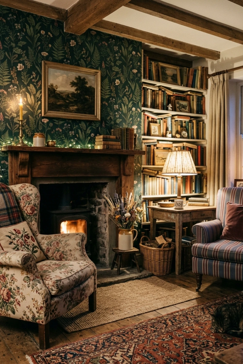
39. Cottagecore: Deep Green Botanical Wallpaper With Mismatched Vintage Furniture
The cottagecore aesthetic is about rooms that look collected rather than curated — spaces that appear to have grown organically over years. A maximal botanical print wallpaper in deep green combined with mismatched vintage furniture, overfilled bookshelves, and soft lamplight creates exactly that quality. The room should feel lived-in, layered, and full of personal meaning.
40. Cottagecore: Green Walls and Living Plants as the Entire Decorating Scheme
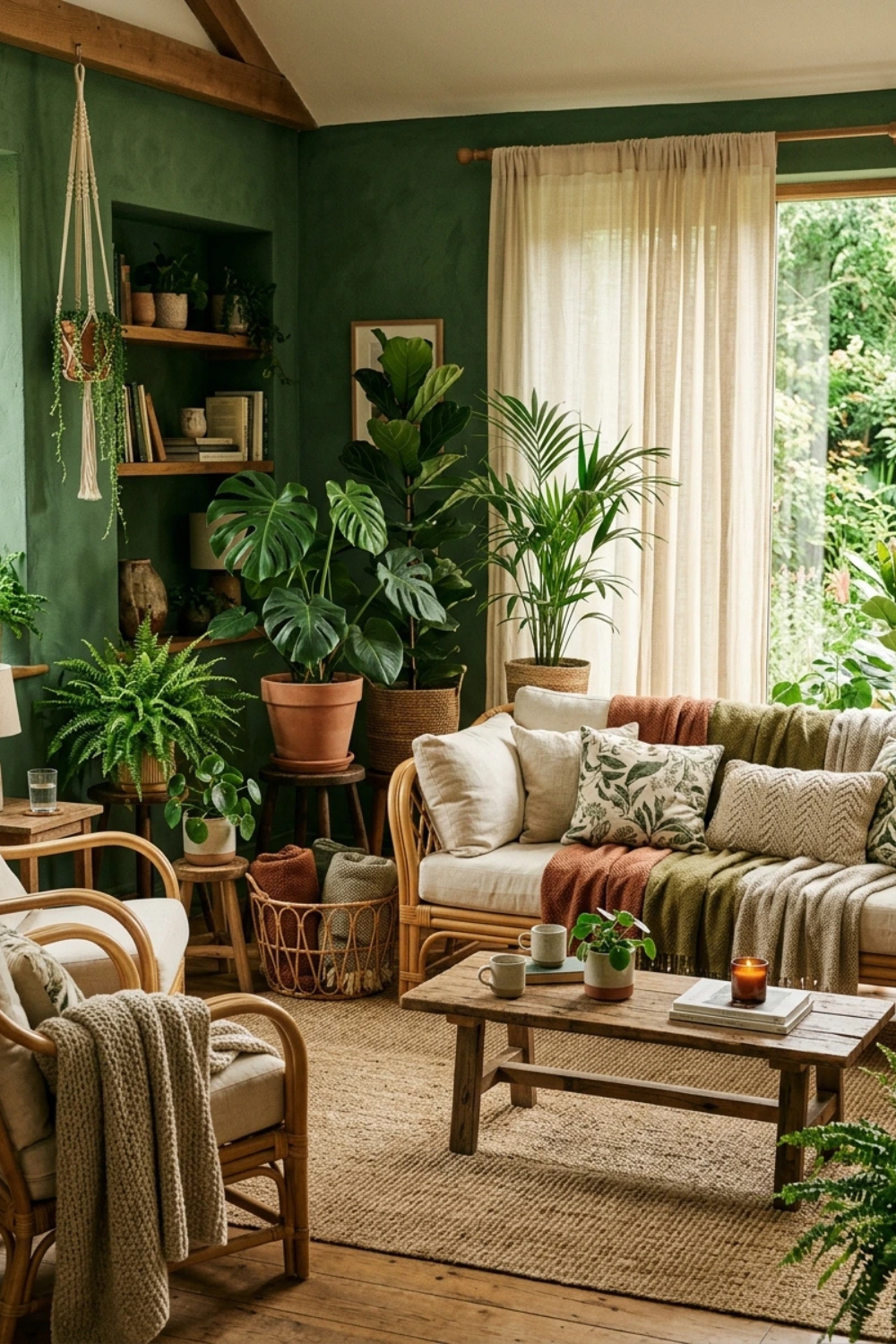
In a green-painted living room, living plants stop being accessories and become part of the color scheme itself. Layer different foliage heights, leaf shapes, and green intensities — fiddle-leaf figs, monsteras, pothos, trailing ivy, and small ferns on every surface. The room becomes genuinely alive in a way that styled objects never achieve.
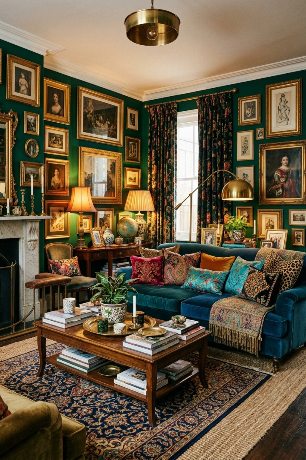
41. Maximalist: Emerald Walls as the Grounding Backdrop for a Room Full of Everything
Deep green walls act as the perfect grounding backdrop for maximalist interiors. Against emerald or forest green, artwork, patterned textiles, layered rugs, and collected objects pop rather than compete with each other. The green gives the room a coherence that white walls cannot provide when there is this much happening in the space. More really can be more when the base is this controlled.
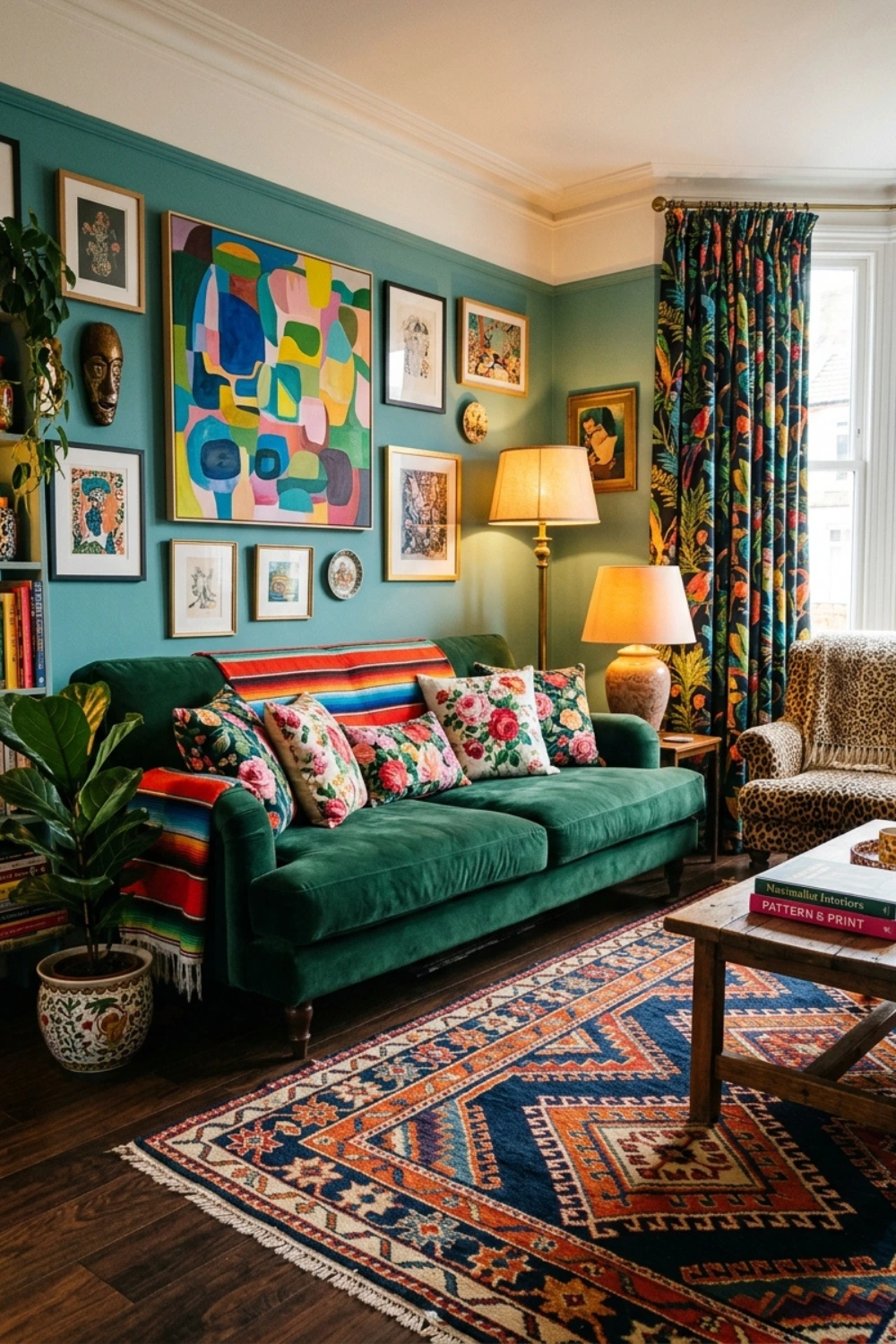
42. Maximalist: Pattern Clash With Green as the Anchor
For the truly adventurous, clashing patterned textiles — a Moroccan rug, English floral cushions, a geometric throw, and an abstract artwork — create joyful visual richness that only reads as intentional when a strong green grounds the room underneath everything. The green is the thread that ties the pattern mixing together.
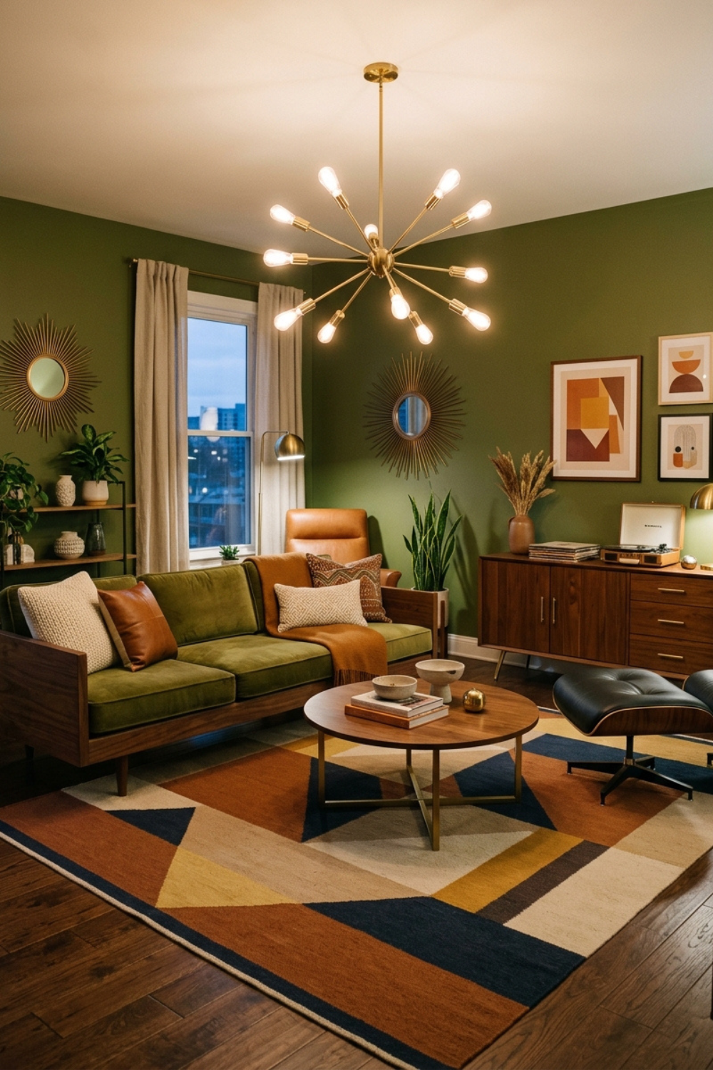
43. Mid-Century Modern: Olive Green and Walnut Wood
Mid-century modern design is built on organic forms, warm wood tones, and bold color moments. Olive green is the perfect mid-century color — warm, earthy, and reminiscent of the avocado-toned interiors of the 1960s and 70s, now completely recontextualized for contemporary sensibility. Pair with walnut furniture, a statement pendant lamp, and a low-profile sofa in cream or cognac.
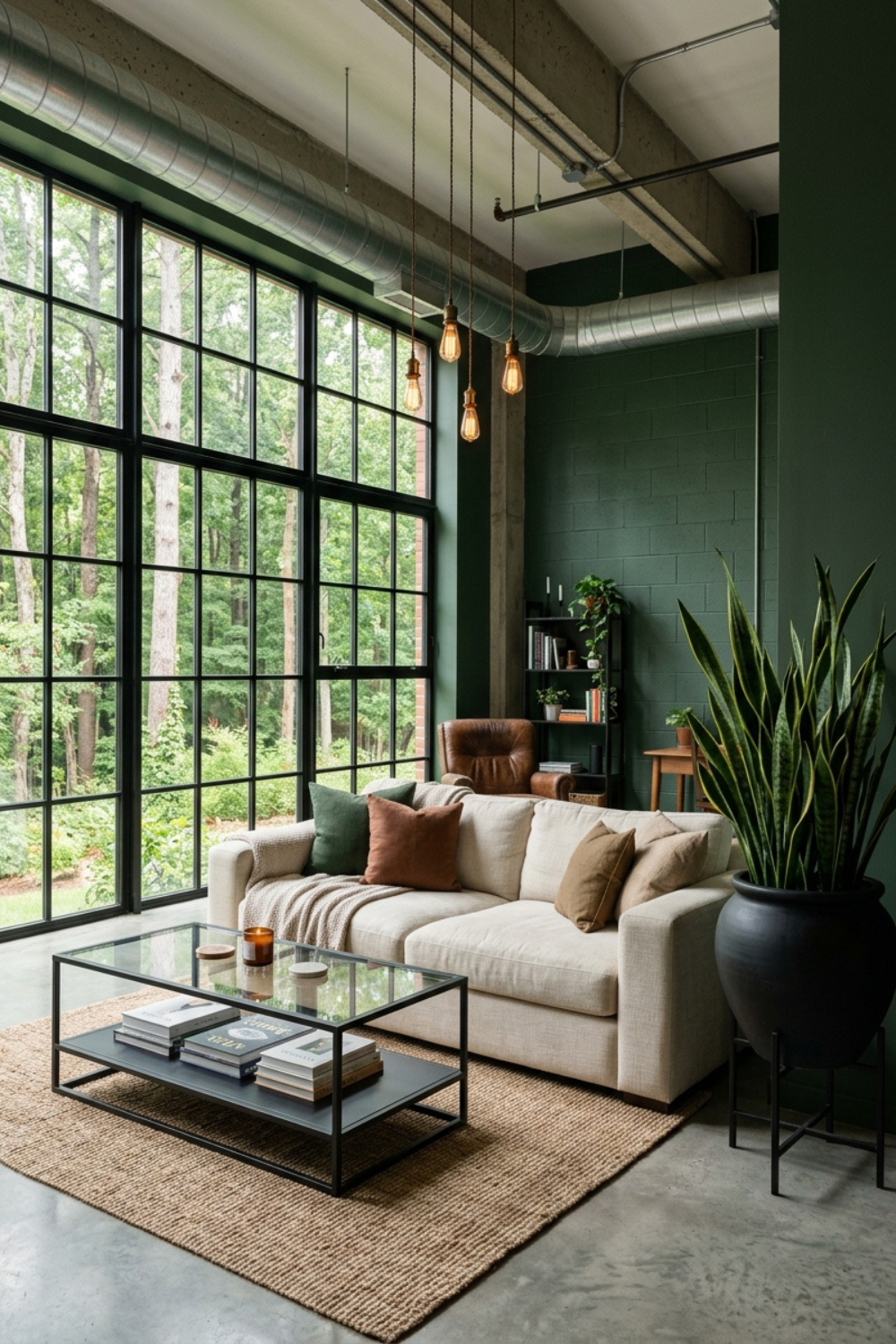
44. Industrial: Forest Green Against Exposed Concrete and Black Steel
Industrial-style living rooms often struggle with warmth. Forest green is the single most effective solution. Against polished concrete floors and black steel window frames, forest green walls create a color bridge between the raw and the organic — making a typically stark aesthetic feel genuinely liveable without losing any of its distinctive character.
Quick-Fire Green Living Room Inspiration — Ideas 45 to 50
And here are the final six ideas — each one a fully realized concept, delivered simply.
Idea 45 — Dark green shiplap accent wall behind floating shelves styled with white ceramics, trailing plants, and a curated collection of vintage books. The horizontal lines of shiplap add architectural texture that painted drywall cannot replicate, and the styling on the shelves keeps the dark wall from feeling heavy.
Idea 46 — An oversized floor mirror in a gold leaf frame leaning against an emerald wall. The mirror doubles the available light, reflects the green back into the room, and makes a small living room feel dramatically larger and more considered.
Idea 47 — A sage green fireplace surround painted in an otherwise neutral room. This is the single cheapest and fastest green living room transformation available — one afternoon, one pot of paint, and the entire character of the room shifts.
Idea 48 — A tonal green gallery wall mixing artwork where green is the dominant note across every piece, displayed in frames of different finishes — antique gold, raw oak, and matte black. The unifying color across the art creates cohesion even when the frames and prints have nothing else in common.
Idea 49 — A green velvet day bed used as the primary seating in a studio flat or small living room. The proportions are more compact than a full sofa but the visual impact — especially in a deep sage or forest green velvet — is significantly larger than the footprint suggests.
Idea 50 — Sage-to-emerald gradient layering achieved entirely through furniture and textiles, with the lightest sage tones positioned near the windows and progressively deeper greens anchoring the back wall and corners. No paint required. The room shifts shade as your eye moves through it.
Green Living Room Color Combinations That Always Work
Understanding how green pairs with other colors is the difference between a room that looks styled and one that looks uncertain. These are the combinations interior designers return to again and again when working with green.
Green and Warm White. The safest and most versatile pairing. Warm white — not bright, cool-toned white — stops green from reading cold and creates an airy, effortless backdrop that lets the green take center stage without any competition. When in doubt, warm white walls and green everything else is always the right decision.
Green and Brass or Gold. Metallic warmth enhances green’s natural richness in a way that cool silver or chrome never can. Whether through brass lighting fixtures, antique gold picture frames, or copper side tables, warm metals give green rooms a finish and glamour that marks the difference between a room that is pretty and a room that looks expensive.
Green and Terracotta or Rust. Earth tones are green’s most natural partners. These colors share the same roots in the natural world — literally, the colors of leaves and the clay beneath them. Terracotta cushions, rust throws, or burnt orange ceramics alongside any shade of green create a palette that feels warm, grounded, and entirely of the present moment in 2026.
Green and Black. For maximum editorial contrast, pair deep greens with matte black accents. Black iron coffee tables, black-framed windows, black lamp bases against emerald or forest green walls — the combination is bold, graphic, and grown-up in the best possible way.
Green and Navy. Two of nature’s richest colors used together in a tonal pairing. Use green as the primary color and navy as the depth accent — in a rug, in an armchair, in a set of cushions — and the combination lands as sophisticated and grounded rather than dark or heavy.
5 Designer Rules for Styling a Green Living Room
Regardless of which of the 50 ideas above you choose to implement, these five principles apply across every green living room in every style and at every budget.
Always commit to a single shade family and build around its undertones. The most common mistake in green living rooms is mixing green undertones without intention. Sage is grey-green. Olive is yellow-green. Emerald is blue-green. Pick one family and align every other element in the room with those undertones. Mixing them without a plan creates visual discomfort that is difficult to name but impossible to ignore.
Always balance green with at least one warm material. Even warm olive can read cool in rooms with north-facing light or predominantly light-colored flooring. Counter this with a timber floor, a brass lamp, a terracotta cushion, or a jute rug. That warmth prevents the room from feeling clinical.
Always use plants strategically, not randomly. Living plants in a green room should reinforce the color scheme rather than simply echo it. Choose plants with varied foliage tones — olive-green, deep green, bright chartreuse — to add depth and tonal variation rather than flat repetition of a single green note.
Always treat lighting as part of the color palette. Warm-toned bulbs at 2700K enhance green’s earthy, botanical quality. Cool daylight bulbs can make the same shade feel flat or institutional. Layer your light sources — ceiling, floor lamp, table lamp, candles — to give the room shifting quality and atmosphere through the day.
Always layer at least four different textures. A single-texture green room looks flat regardless of how well-chosen the shade is. Mix a smooth sofa fabric, a chunky rug, a natural wood surface, and a wall finish that differs from your furniture. Texture is the primary visual language of luxury in interior design, and a green room without texture is a missed opportunity.
FAQ Section
What is the best shade of green for a small living room?
For small living rooms, sage green is consistently the best choice. Its grey-green tone reflects light rather than absorbing it, which makes walls appear to recede slightly and the room feel larger than its actual dimensions. Avoid very dark shades like emerald or hunter green in genuinely small spaces unless you are deliberately going for an intimate jewel-box effect — and even then, limit the dark green to one wall only. Pair sage with warm white ceilings, pale wood flooring, and at least one large mirror to maximize every perception of space.
Does green go with grey furniture in a living room?
Yes, and it works very well when you match undertones. Sage green is the ideal match for grey furniture because both colors share cool grey-green undertones, creating a cohesive and contemporary palette. For warmer greys with beige tones — sometimes called greige — olive green or moss green work better because they share the same warm-neutral quality. The key principle is to ensure your green and your grey are pulling in the same undertone direction, then bring in a warm metallic accent like brass or copper to prevent the combination from feeling too cool or too similar in temperature throughout.
What colors go best with a green living room sofa?
A green sofa is more versatile than it might initially seem. Against white or cream walls, any shade of green sofa looks fresh and considered. Against warm terracotta or dusty pink walls, an emerald or deep green sofa creates a sophisticated jewel-tone pairing that is defining living room interiors in 2026. For accessories, use brass metallics, natural wood tones, and cream or oat textiles to ground the green without simply repeating it. Cushions in rust, burnt orange, or dusty pink add warmth. Navy or matte black accents add drama and visual weight.
Is green a good color for a living room in 2026?
Absolutely — green is arguably the defining living room color of 2026. It has been building momentum for several years, moving gradually from accent choice to full-room commitment, and this year it has fully arrived. Beyond the trend dimension, green has genuine staying power because of its psychological benefits, its versatility across design styles, and its ability to pair with almost every other color family. Unlike trend colors that date quickly and obviously, a well-executed green living room ages beautifully because the color is anchored in the natural world rather than in a particular cultural moment.
How do I stop a dark green living room from feeling gloomy?
Dark green walls absorb light in ways that require deliberate counter-strategies to manage well. The most effective approaches are: layering warm artificial lighting throughout the room using 2700K bulbs in ceiling fixtures, floor lamps, and table lamps simultaneously; bringing in warm metallic surfaces that actively reflect light; choosing lighter-toned furniture in cream, oat, or natural wood to create contrast against the dark walls; incorporating at least one large mirror to double available light; and keeping window treatments minimal so maximum natural light enters during the day. With good lighting and the right material balance, dark green rooms feel intimate, enveloping, and genuinely luxurious rather than heavy or gloomy.
Can I mix different shades of green in one living room?
Yes — and when done well, tonal layering with multiple greens is one of the most sophisticated decorating techniques available. The key is to stay within the same undertone family. Sage, moss, and fern all share cool-to-neutral undertones and mix harmoniously together. Olive, khaki, and warm fern share warmer yellow-green undertones and work equally well as a group. What you want to avoid is mixing cool-undertone greens with warm-undertone greens without a clear strategy, as this creates a palette that reads as accidental rather than curated. Vary the textures significantly across your different green shades — a sage velvet sofa, an olive woven rug, and a forest green throw can all coexist beautifully when the textures are doing the work of differentiating them.
What accent colors work best with emerald green walls?
Emerald green walls are deep, rich, and jewel-toned, which means they pair best with colors that either complement their depth or provide strong visual contrast. Gold and brass are the classic partner — the warmth of the metal makes the cool blue-green of emerald vibrate with richness. Warm white or cream upholstery provides essential contrast without competing. For bolder combinations, dusty pink or blush soft furnishings against emerald walls create a striking and unexpected pairing that defines some of the most admired living rooms of 2026. Matte black accents add edge and graphic contrast. Avoid pairing emerald with other deeply saturated colors like cobalt blue or burgundy without considerable space and light to work with — the combination can be extraordinary, but it requires room to breathe.
Save this post to your Pinterest living room boards and share it with anyone who is thinking about going green in 2026. 📌