The complete guide to modern retro lounge design — covering every era, every budget, and every reason why this is the living room aesthetic that refuses to go out of style.
Table of Contents
- Why Retro Style Living Rooms Are Dominating in 2026
- What Is Retro Style — And How Is It Different From Vintage
- The Retro Living Room Color Palette
- Mid-Century Modern Retro Living Room Ideas
- 1970s Retro Lounge Ideas
- Modern Retro Living Room Ideas for Today’s Homes
- The Retro Style Living Room Furniture Guide
- Retro Living Room on a Budget
- How to Create a Retro Lounge Atmosphere
- Common Retro Living Room Mistakes to Avoid
- FAQ Section
Nobody planned for retro to come back the way it has.
It crept in slowly — a mustard yellow sofa here, a sunburst mirror there, a shag rug someone found at an estate sale that looked too good to leave behind. And then one day you looked around and realized that the most interesting living rooms you had seen in the past two years all had something in common. They felt like they existed somewhere outside of time. Not old. Not trendy. Just deeply, confidently themselves.
That is what retro style living room design does when it is done well. It creates a space that does not look like it was assembled in a furniture store showroom last Tuesday. It looks like it was built by someone with actual taste over actual time — someone who knew what they loved and was not particularly interested in what was fashionable.
This guide is going to show you how to create exactly that. Whether you are starting from scratch or working with what you already have, whether your budget is generous or extremely real, and whether you are drawn to the clean lines of mid-century modern or the warm earthy chaos of a proper 1970s lounge — this is everything you need to know about retro style living room ideas in 2026.
Why Retro Style Living Rooms Are Dominating in 2026
There is a specific reason why retro style living room ideas are the most searched, most saved, and most talked-about interior design aesthetic right now — and it has nothing to do with nostalgia for its own sake.
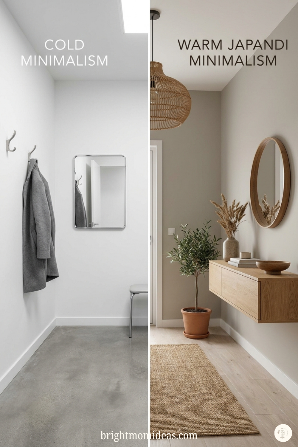
People are tired of rooms that do not feel like anyone lives in them.
The past decade of minimalism produced a lot of very beautiful, very cold living rooms. Rooms where everything was grey and nothing had texture and the only thing on the coffee table was a single artfully placed candle. Rooms that looked stunning in photographs and felt slightly oppressive to actually exist inside.
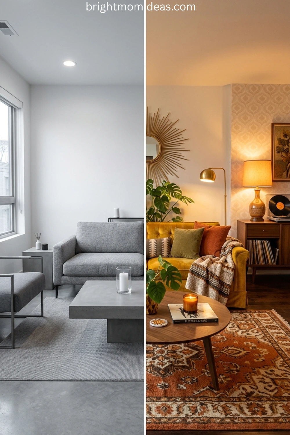
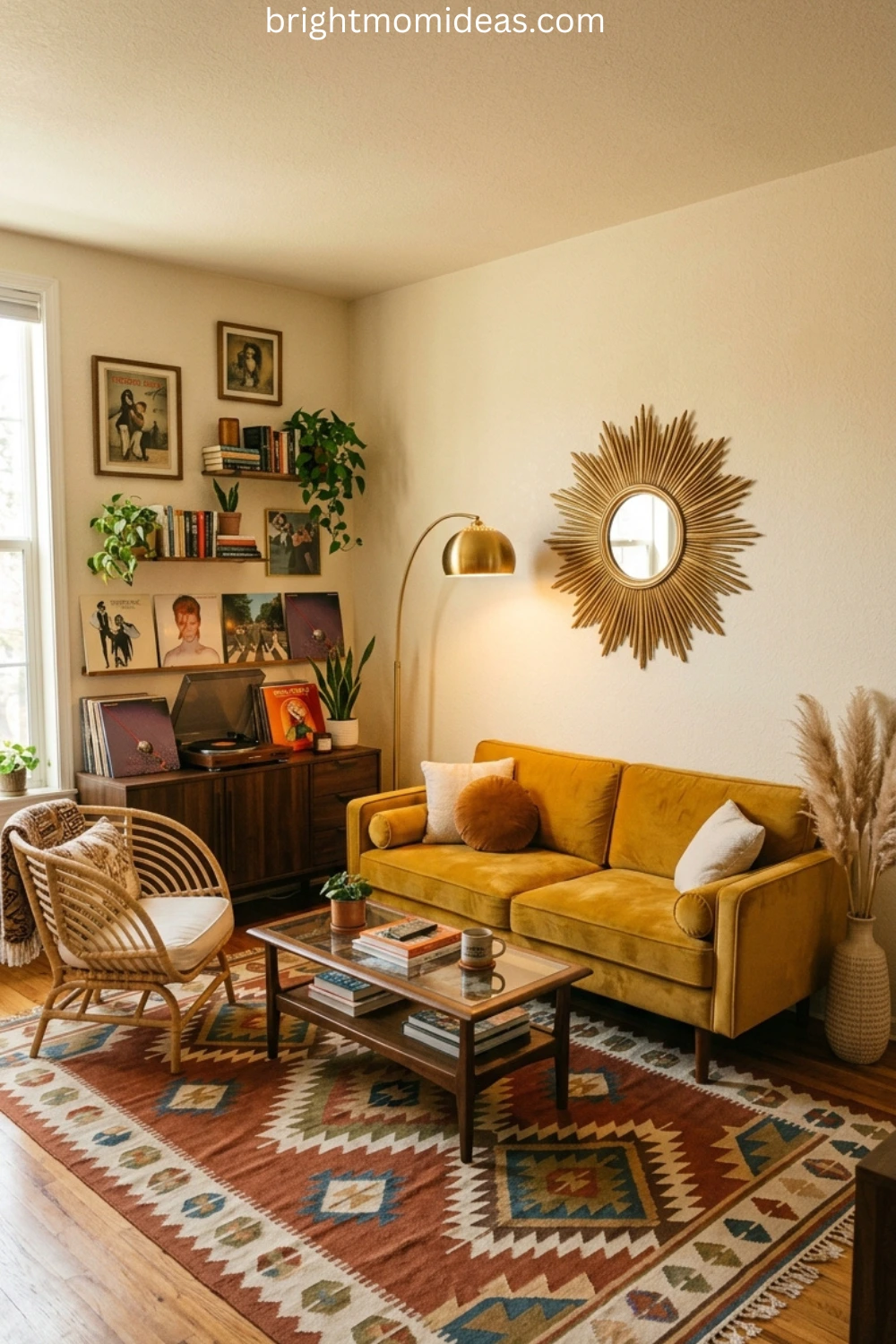
In 2026, retro design is making a confident comeback — blending nostalgic silhouettes with modern polish. Think curved sofas, warm wood tones, bold patterns, and statement lighting that nod to the past while still feeling fresh and livable. It is vintage charm with a contemporary twist.
The reason it resonates so strongly right now is precisely because it is the opposite of everything cold minimalism offered. Retro style living rooms are warm. They are layered. They have opinions. The furniture has personality — curved arms and tapered legs and upholstery in colors that were chosen because they are beautiful rather than because they photograph well on a neutral background.
And perhaps most importantly, retro style living rooms feel like someone actually chose everything in them. Not because it matched a trend, but because they genuinely liked it. That quality — call it intentionality, call it personality, call it taste — is the rarest and most appealing quality a living room can have right now.
What Is Retro Style — And How Is It Different From Vintage
This is the question that confuses most people before they start decorating, so it is worth answering clearly before we get into specific retro style living room ideas.
Retro design takes inspiration from past decades — typically the 1950s through the 1980s — without attempting to perfectly recreate them. It borrows the shapes, the color sensibilities, and the general spirit of those eras and reinterprets them for modern life. You can use contemporary furniture with retro lines. You can buy a brand new sofa with a mid-century silhouette. The decade is the inspiration, not the instruction manual.
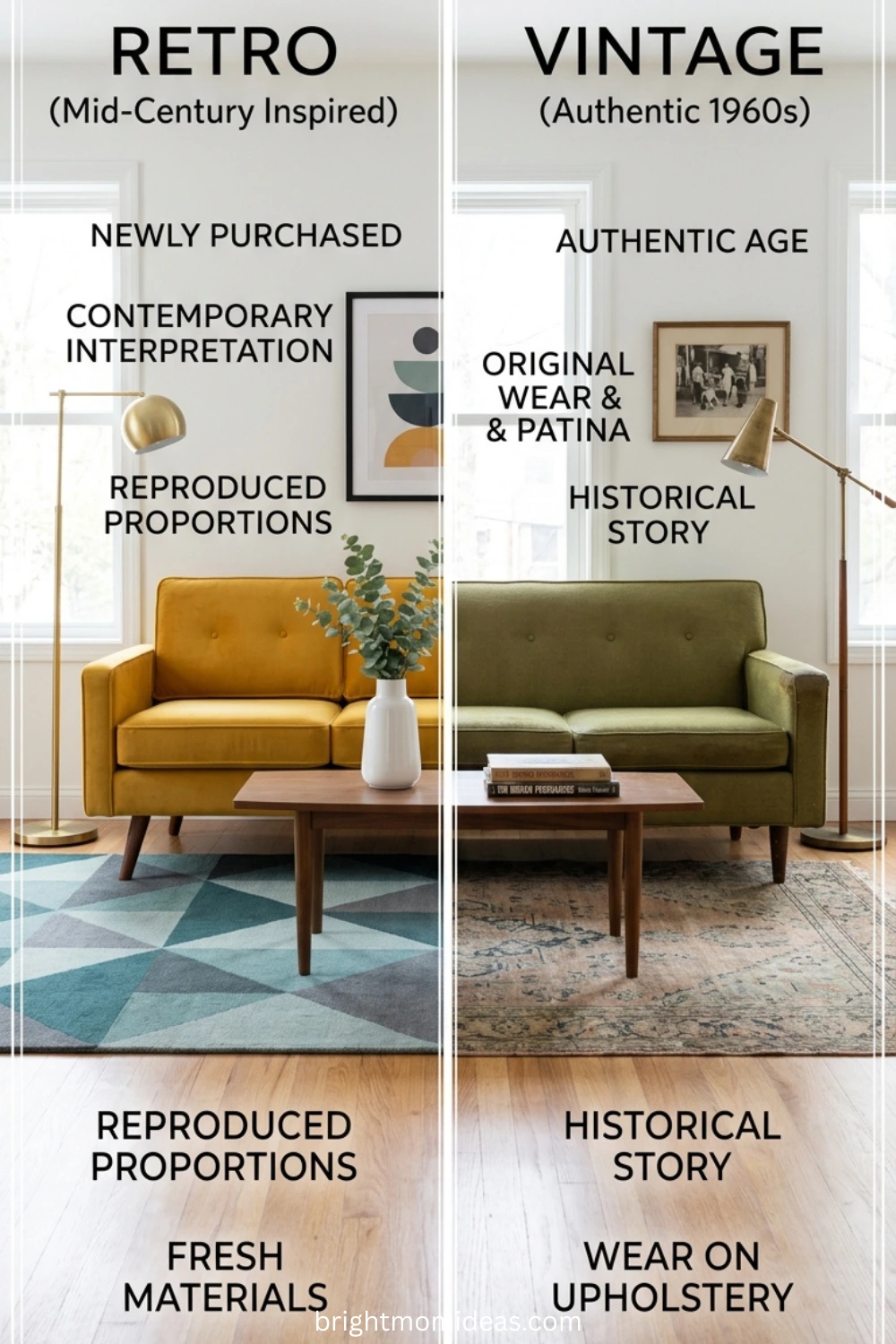
Vintage design, by contrast, refers specifically to actual objects from a past era. A genuine 1968 Eames lounge chair is vintage. A new chair inspired by that design is retro.
The practical difference matters enormously for decorating. Retro is accessible. You can find retro-inspired pieces at IKEA, at Target, at Amazon, and at virtually every furniture retailer in the country. But you do not need a budget for estate sales or the patience for antique hunting to create a beautiful retro style living room. You need an eye for the right shapes, colors, and materials — and that is exactly what this guide is going to give you.
The Retro Living Room Color Palette
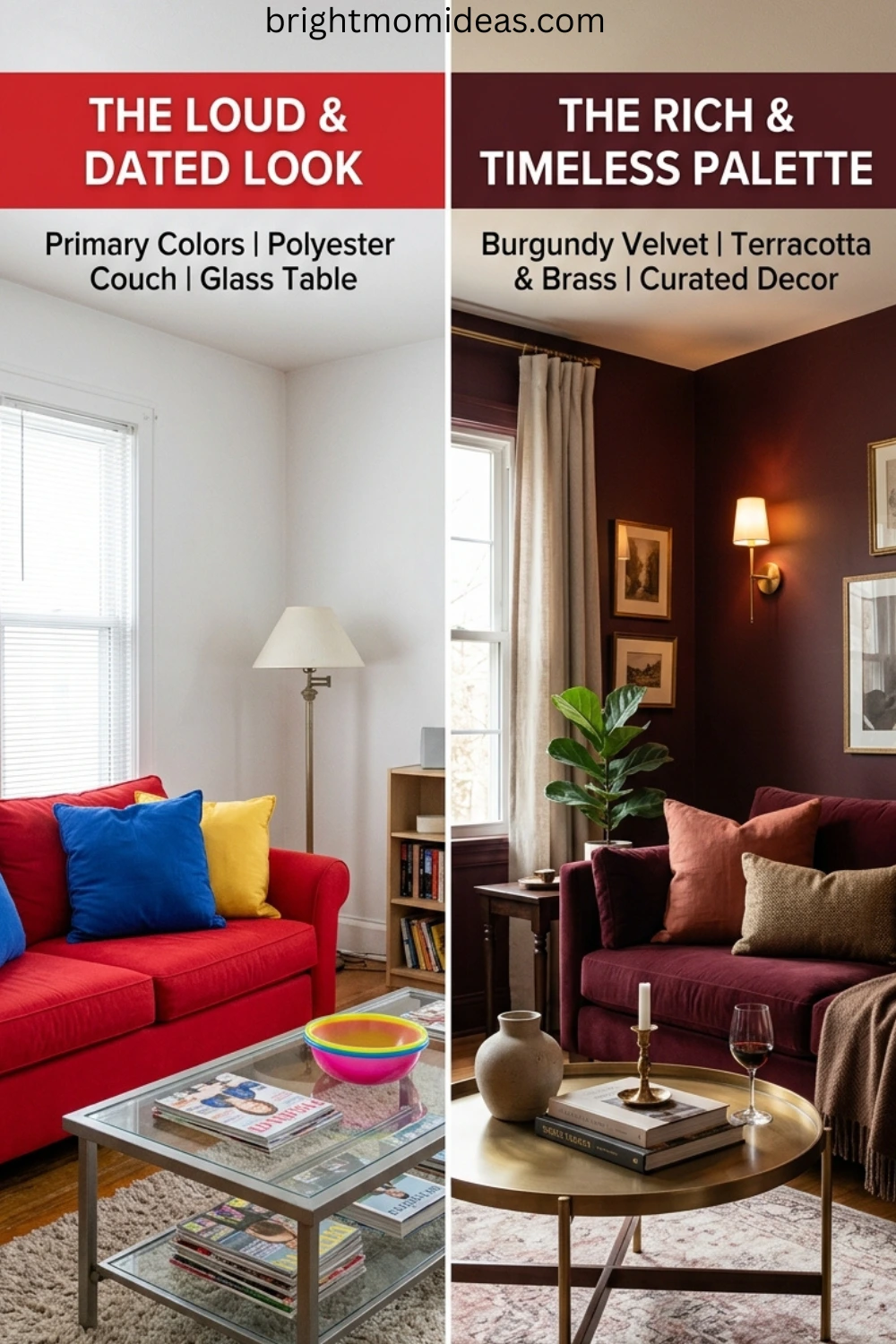
Color is where retro style living rooms either succeed completely or fall apart entirely. Get the palette right and the whole room feels cohesive and considered. Get it wrong and it looks like a costume rather than a design choice.
The colors that define retro living rooms fall into two distinct families depending on which decade you are drawing from.
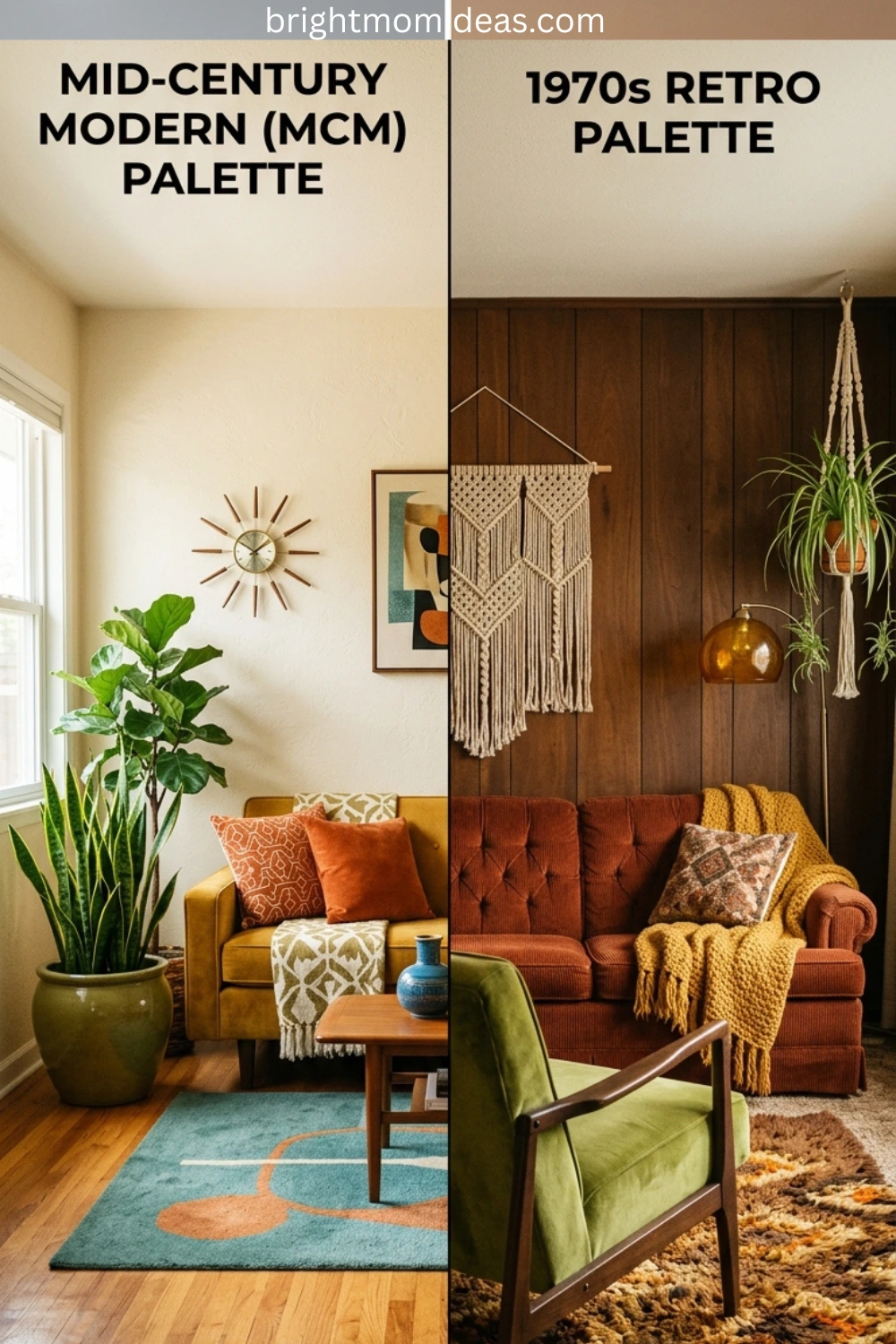
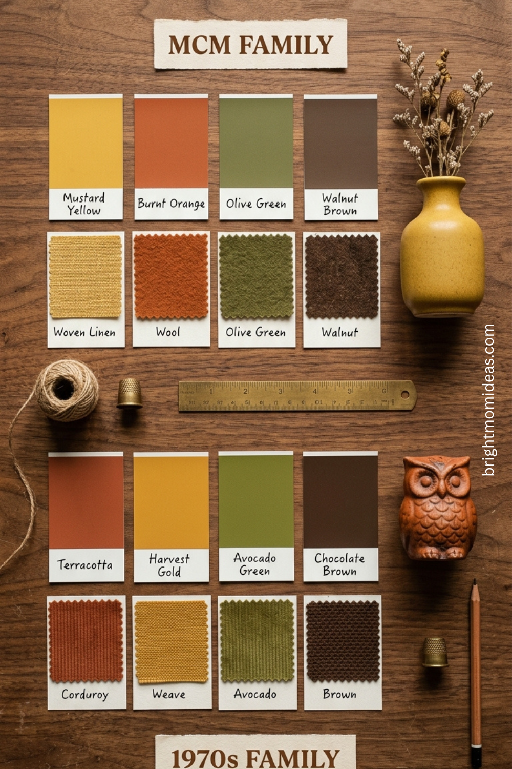
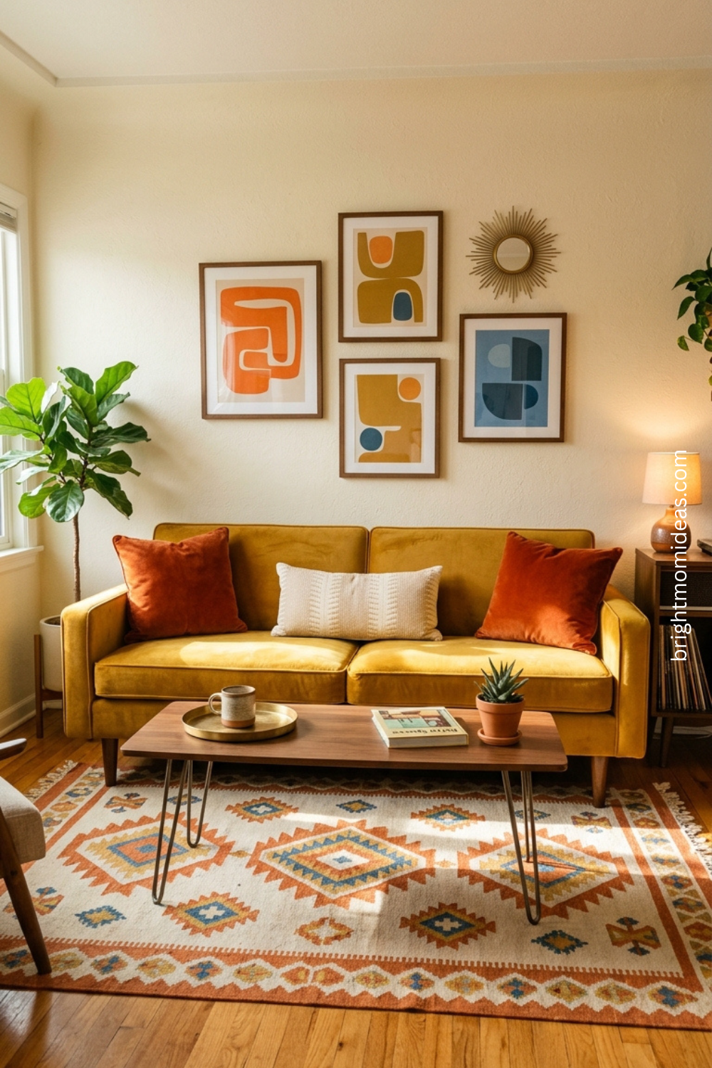
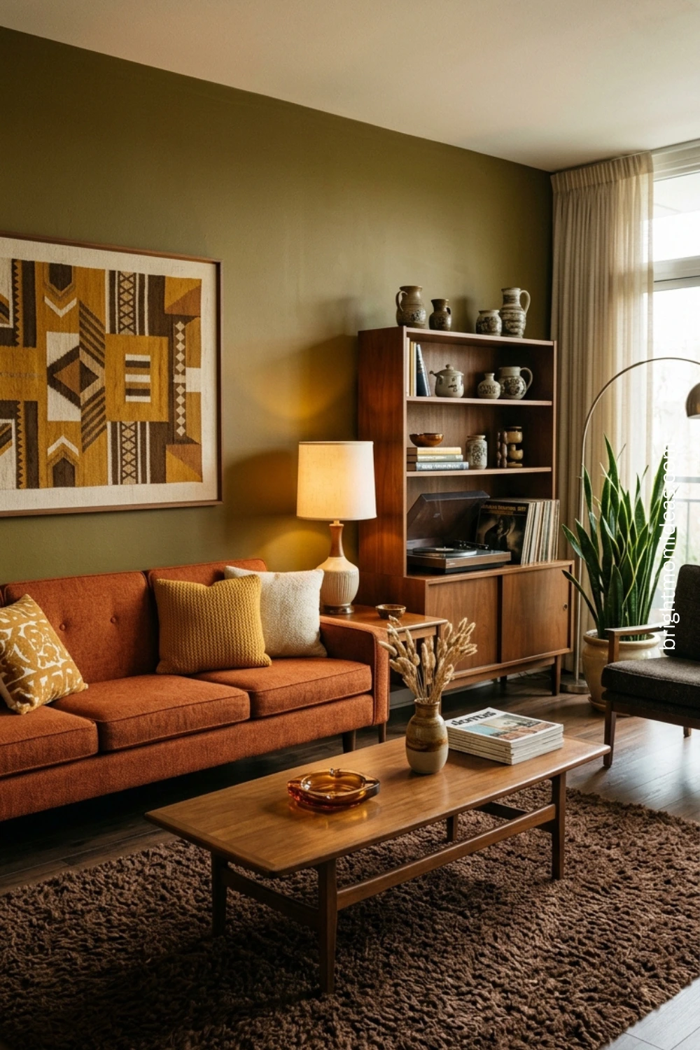
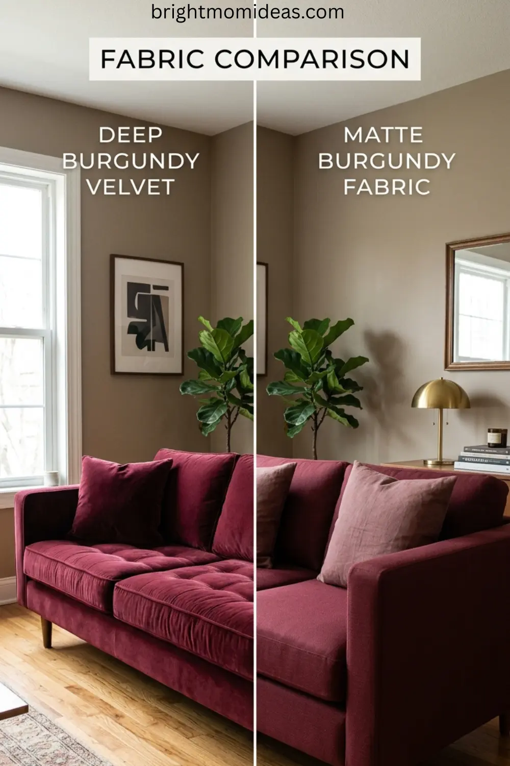
Mid-century modern colors lean toward warm but restrained tones — mustard yellow, burnt orange, olive green, warm walnut brown, and cream. These are sophisticated colors that work well with clean-lined furniture and do not overwhelm a room when used consistently.
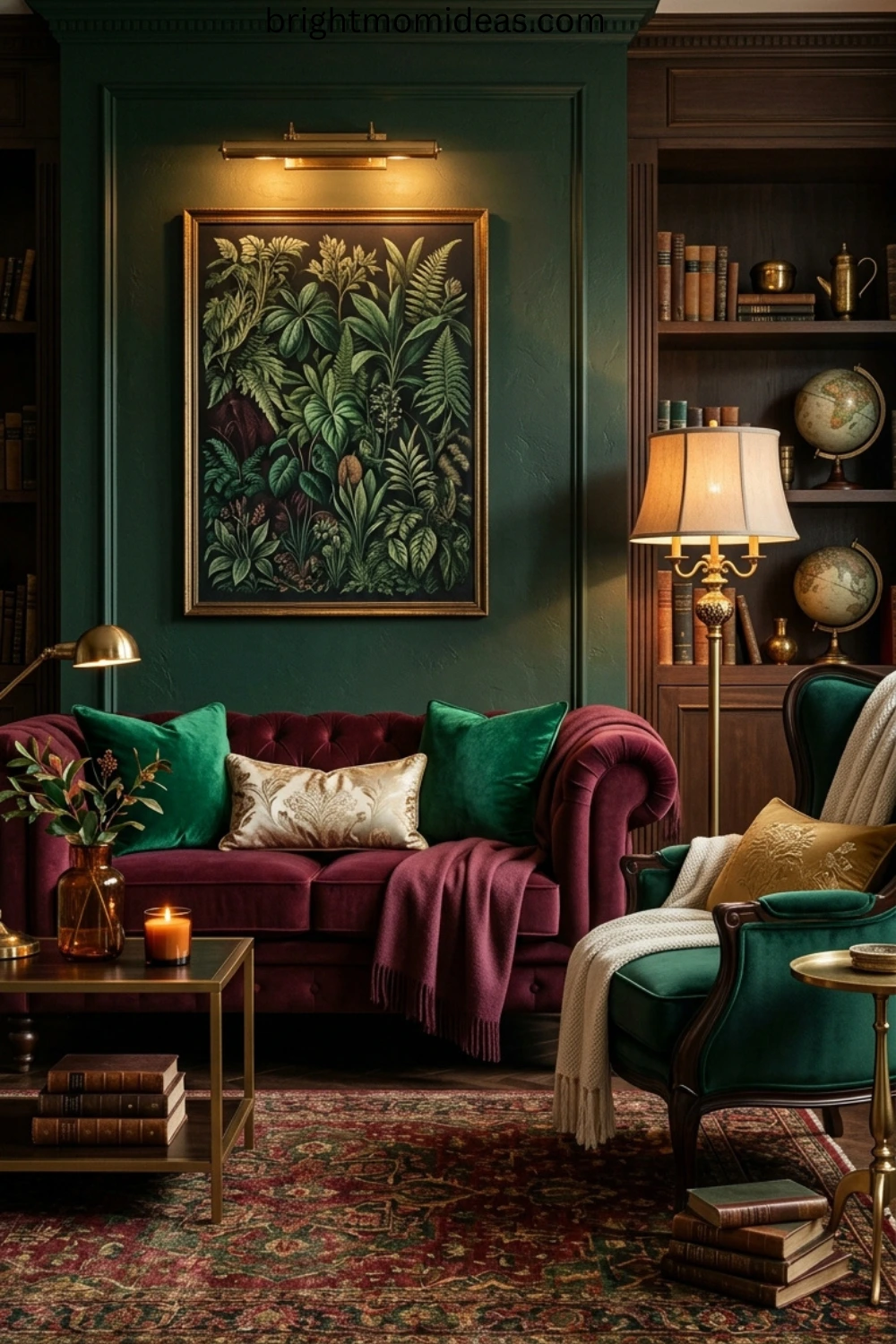
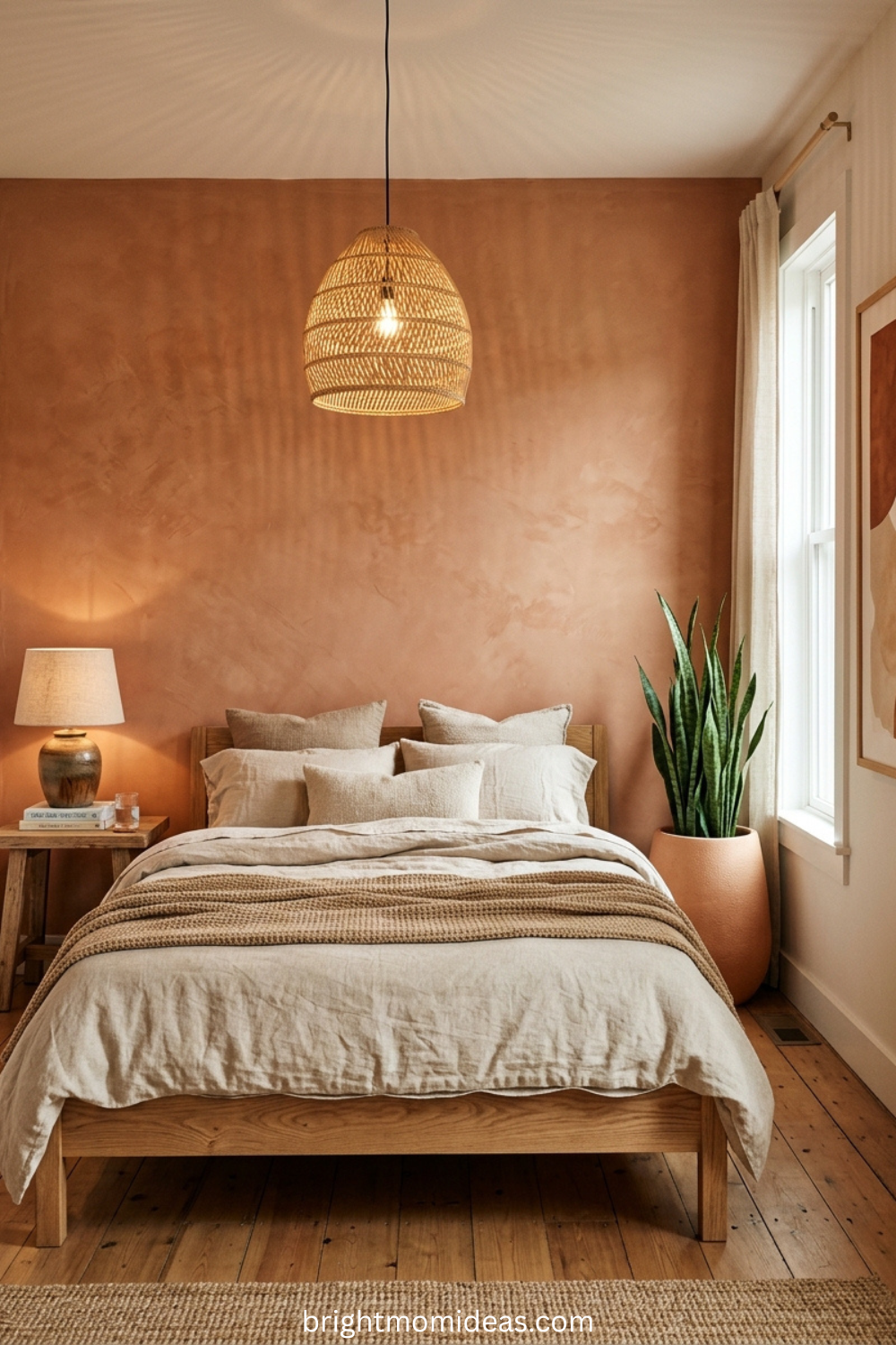
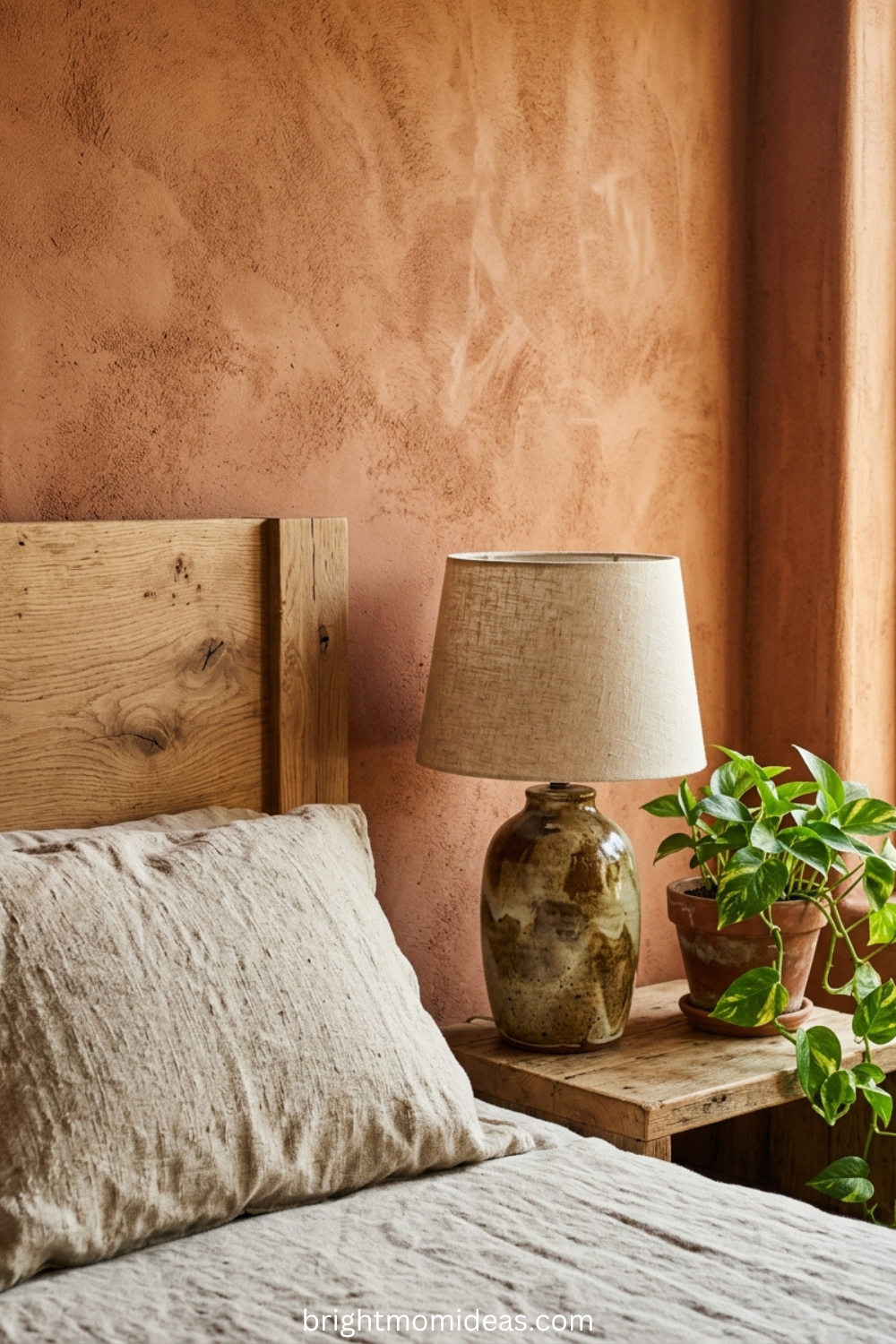
1970s retro colors go deeper and earthier — terracotta, avocado green, harvest gold, warm chocolate brown, and burnt sienna. These are colors that feel enveloping and warm, like the room itself is wrapping around you. They work best with more textured furniture and layered accessories.
The mistake most people make is mixing colors from both families without intention. A mustard yellow mid-century sofa beside harvest gold 1970s throw pillows creates a color clash that reads as random rather than retro. Choose your decade — or if you want to blend, use one family as the dominant palette and pull one or two tones from the other as accent colors only.
Mid-Century Modern Retro Living Room Ideas
Mid-century modern is the entry point for most people’s retro style living room journey, and for good reason. It is the most versatile of the retro aesthetics — the one that works in the widest range of home styles, from a 1920s craftsman bungalow to a modern apartment to a traditional colonial.
The defining characteristics of MCM design are tapered wooden legs on every piece of furniture, low profiles that keep the visual weight of the room close to the ground, clean unornamented surfaces, and a color palette that mixes warm neutrals with one or two deliberate accent colors.
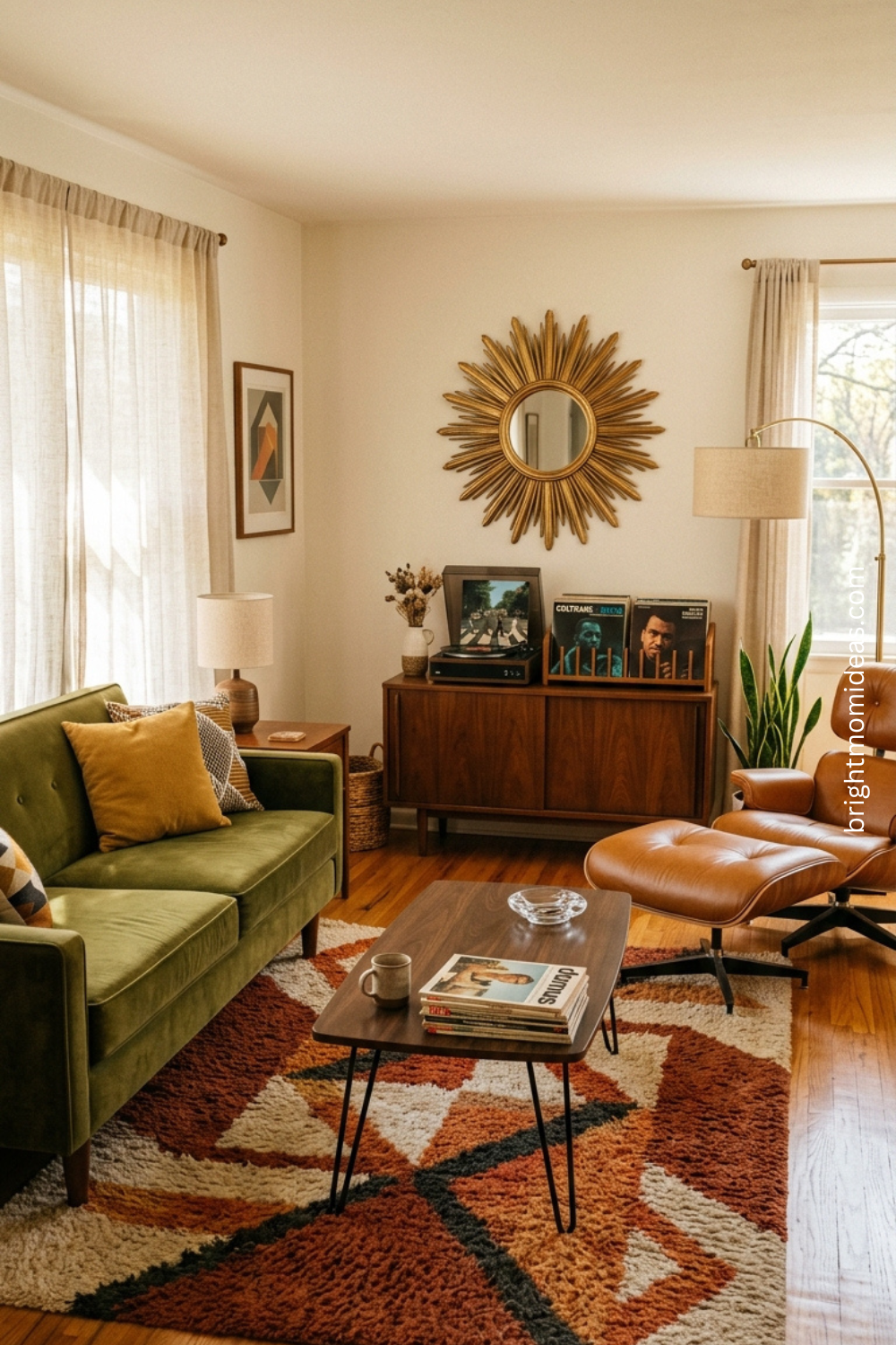
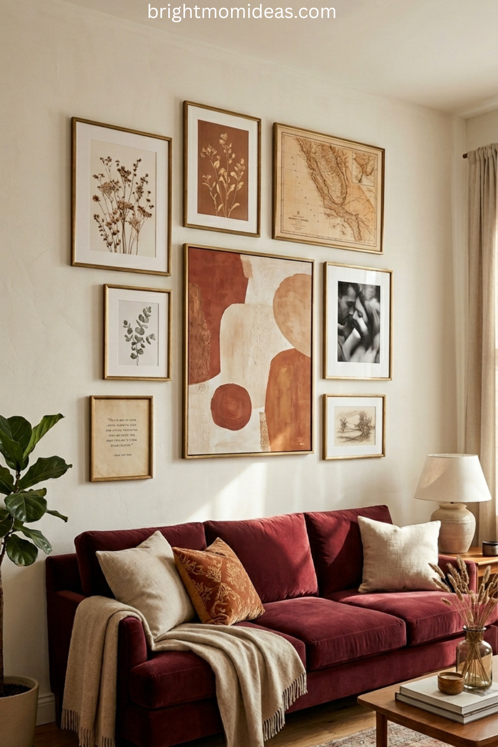
The MCM Sofa — Start Here
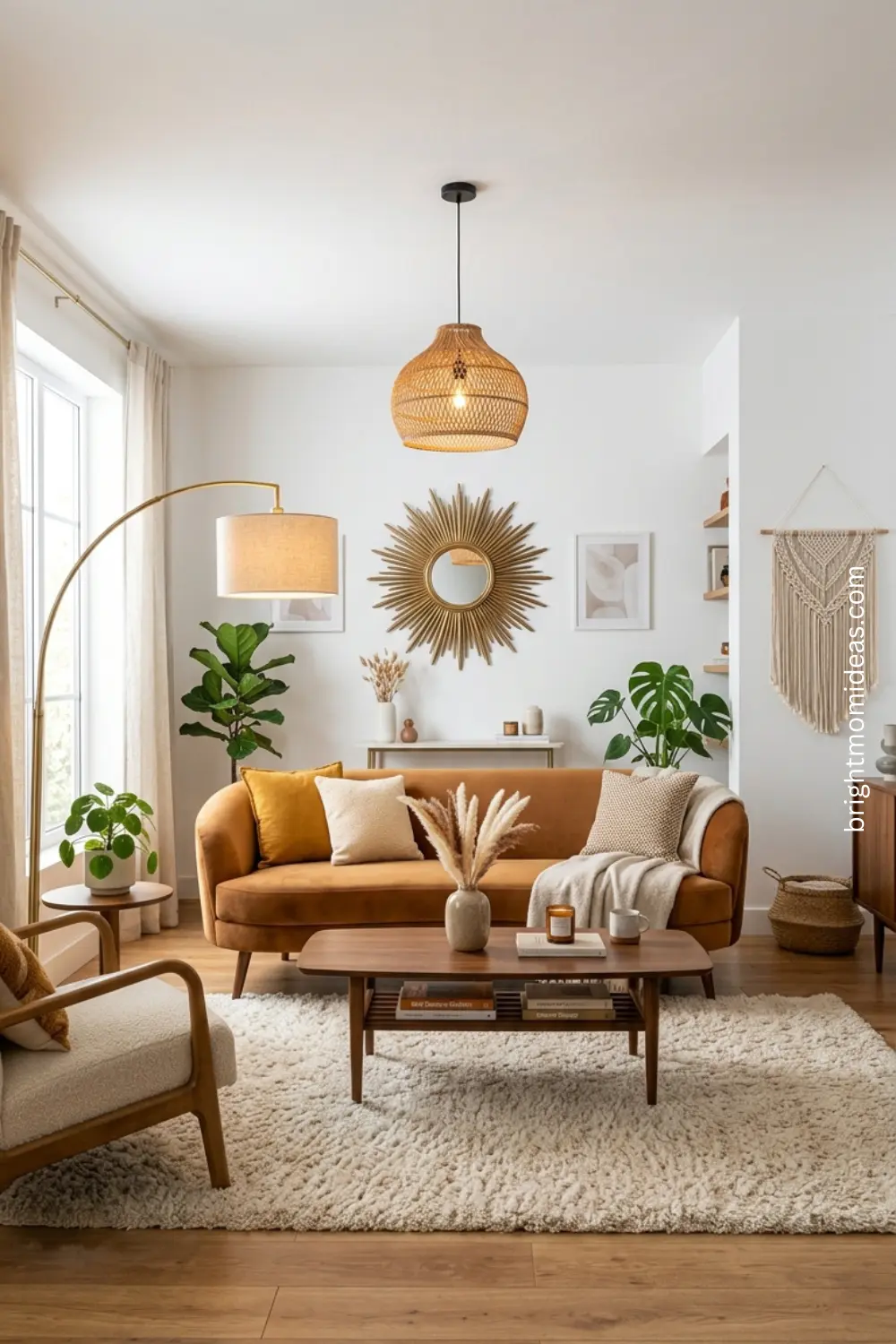
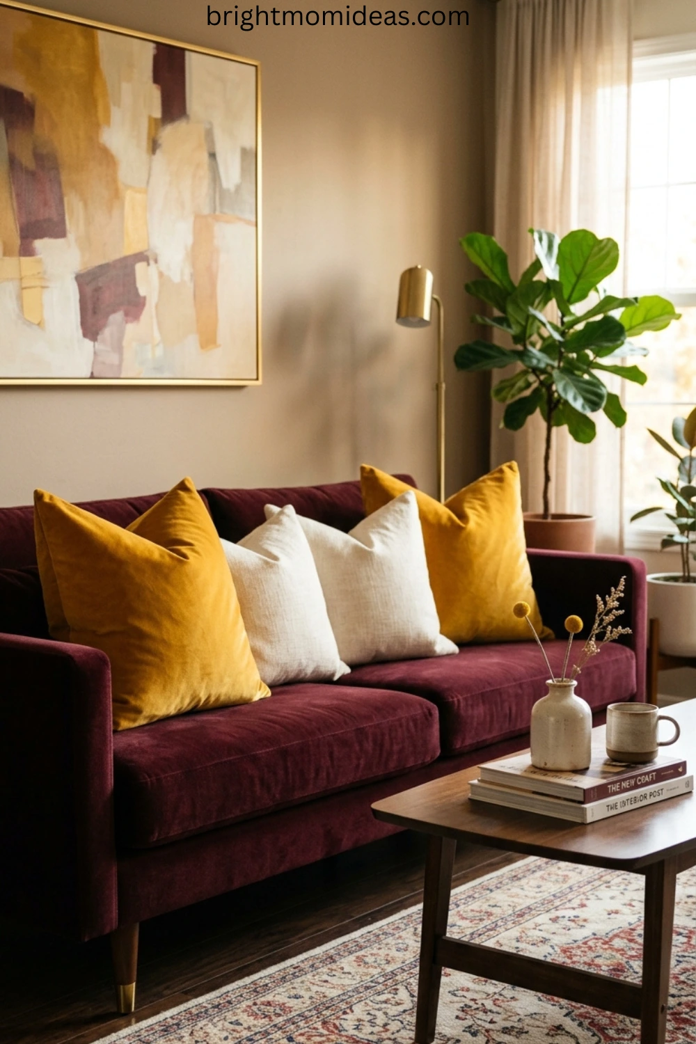
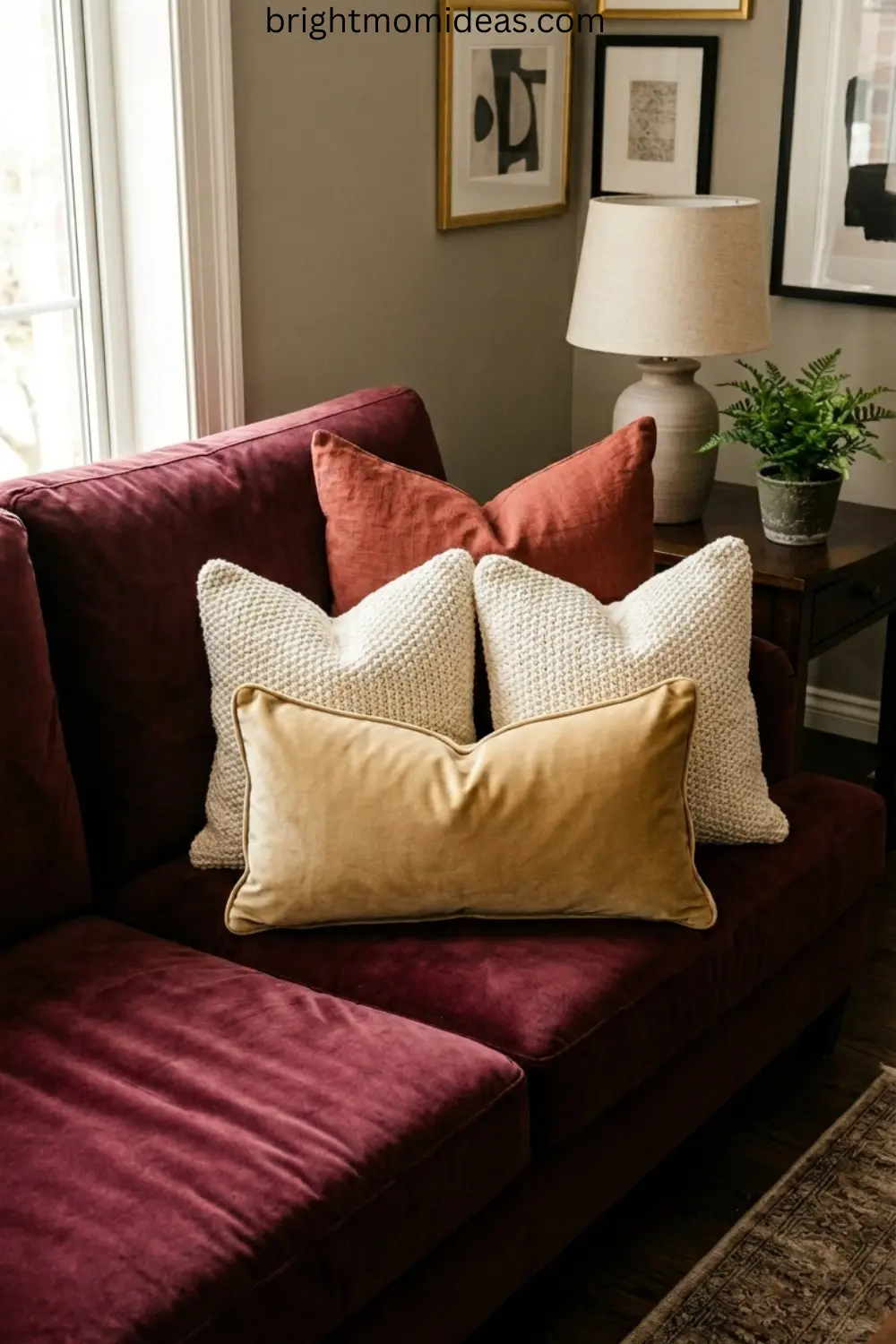
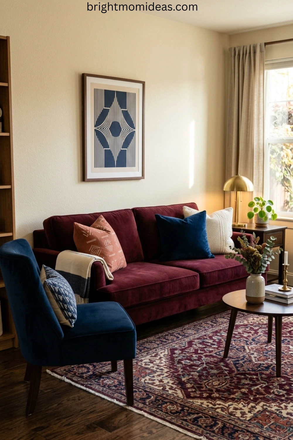
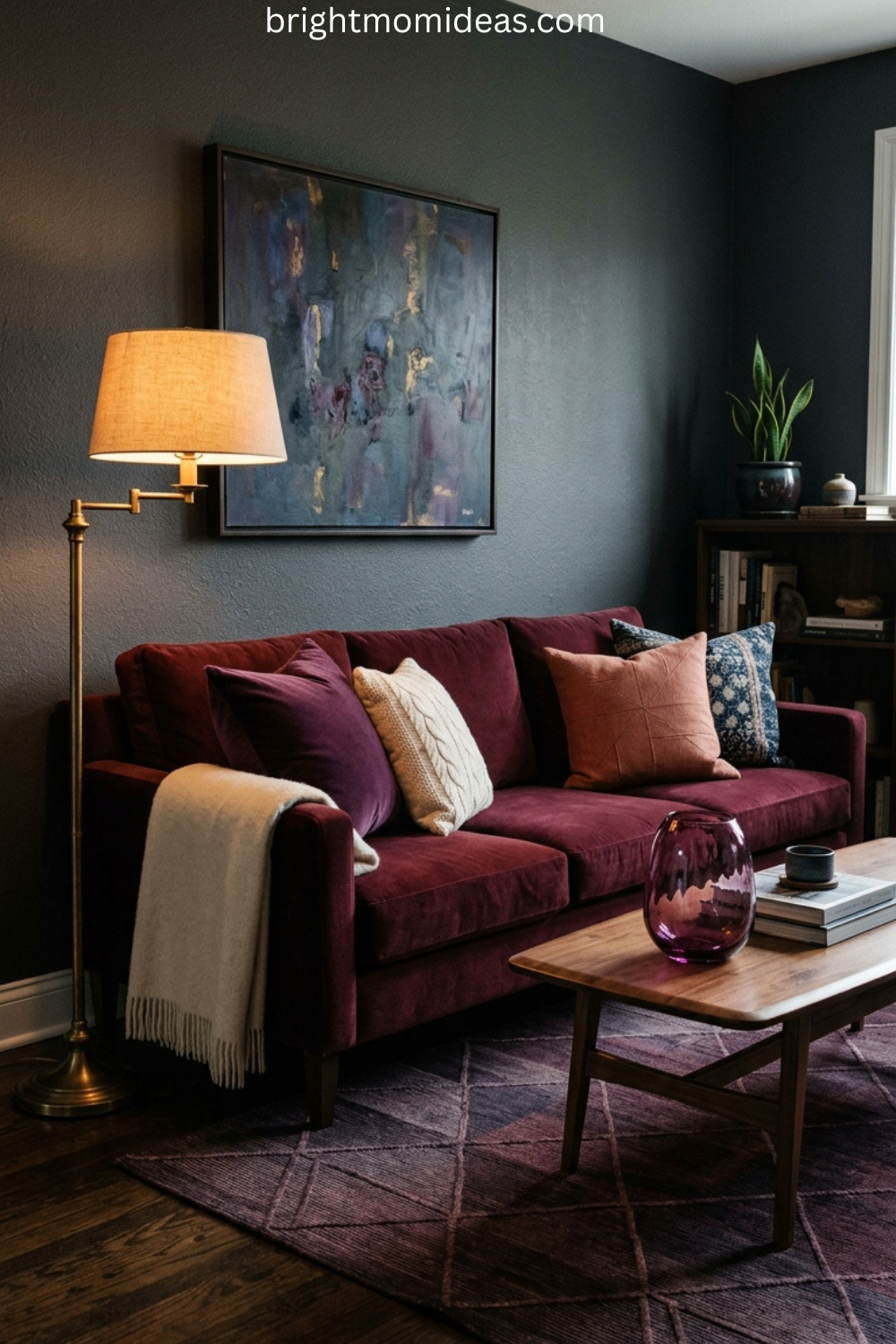
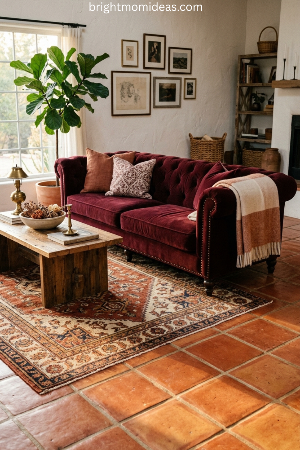
The sofa is where the entire mid-century modern retro living room begins. You are looking for a low-slung profile — ideally no higher than 32 inches from floor to top of back. Clean straight or gently curved arms. Tapered wooden legs visible below the sofa skirt. And upholstery in a color with actual conviction — mustard yellow, olive green, warm caramel, or burnt orange.
The most common MCM sofa mistake is choosing a piece that is too large. Mid-century modern furniture tends toward compact and deliberate proportions. An oversized sectional with tapered legs is not a mid-century sofa — it is just a large sofa with tapered legs. Scale matters as much as silhouette.
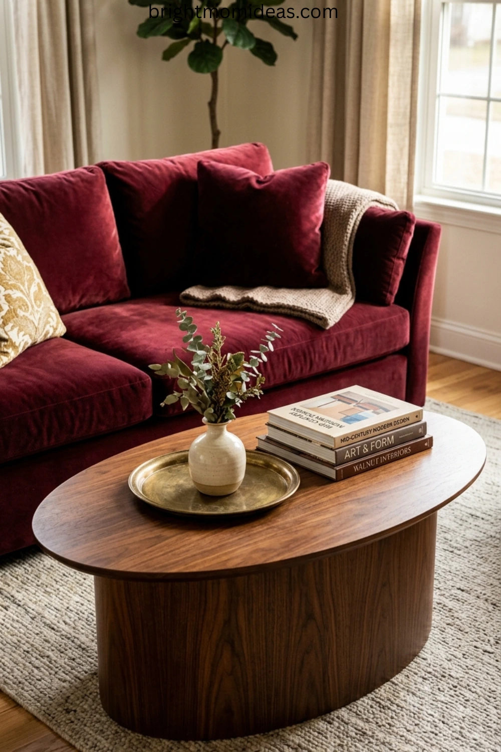
The Walnut Wood Foundation
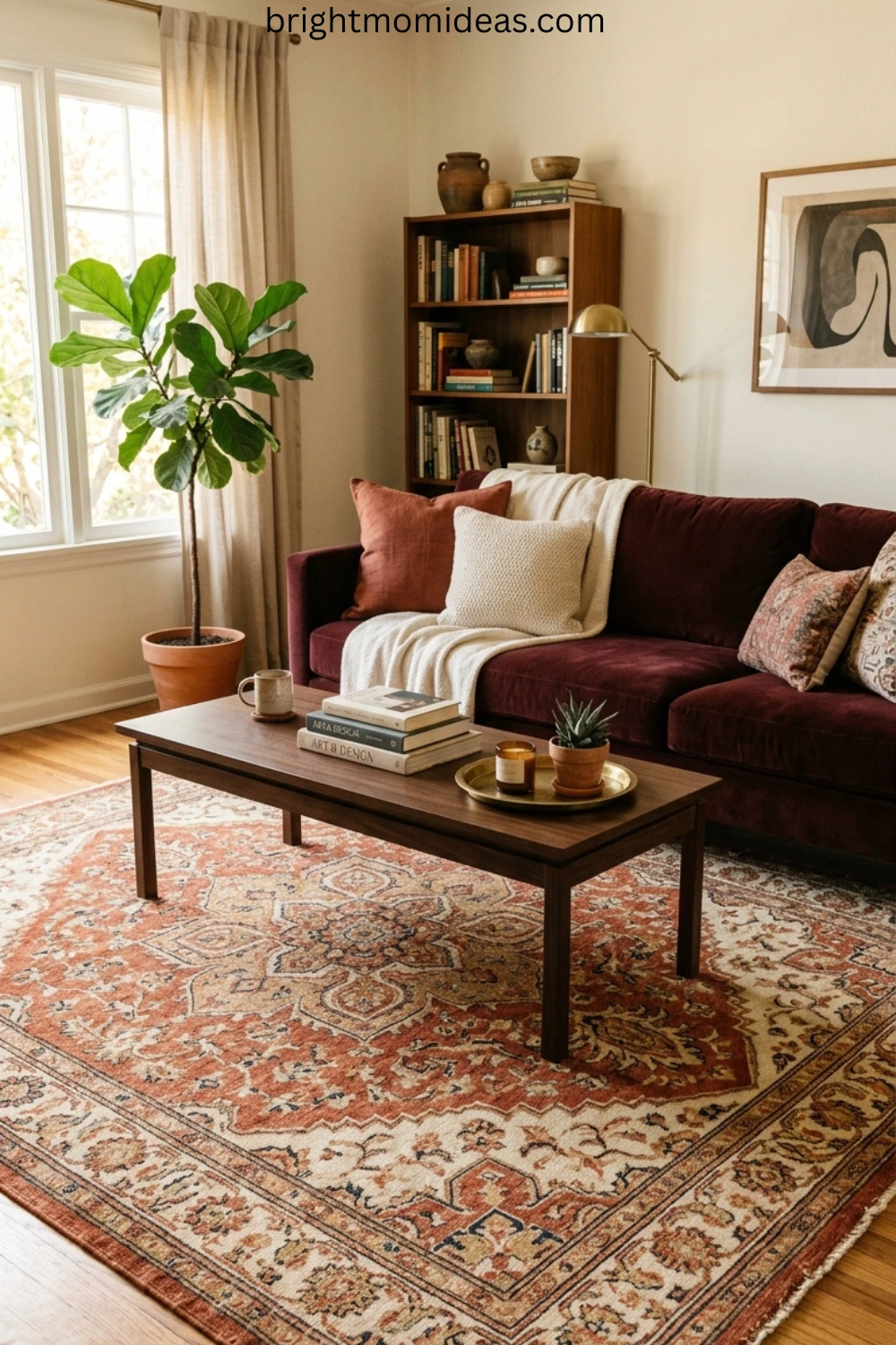
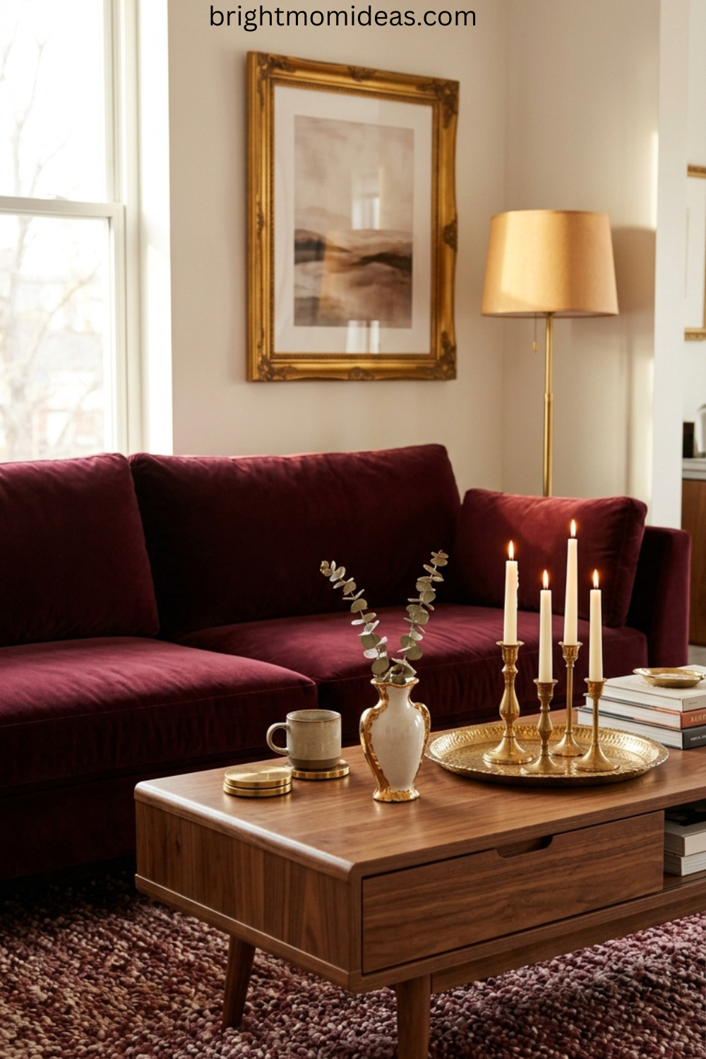
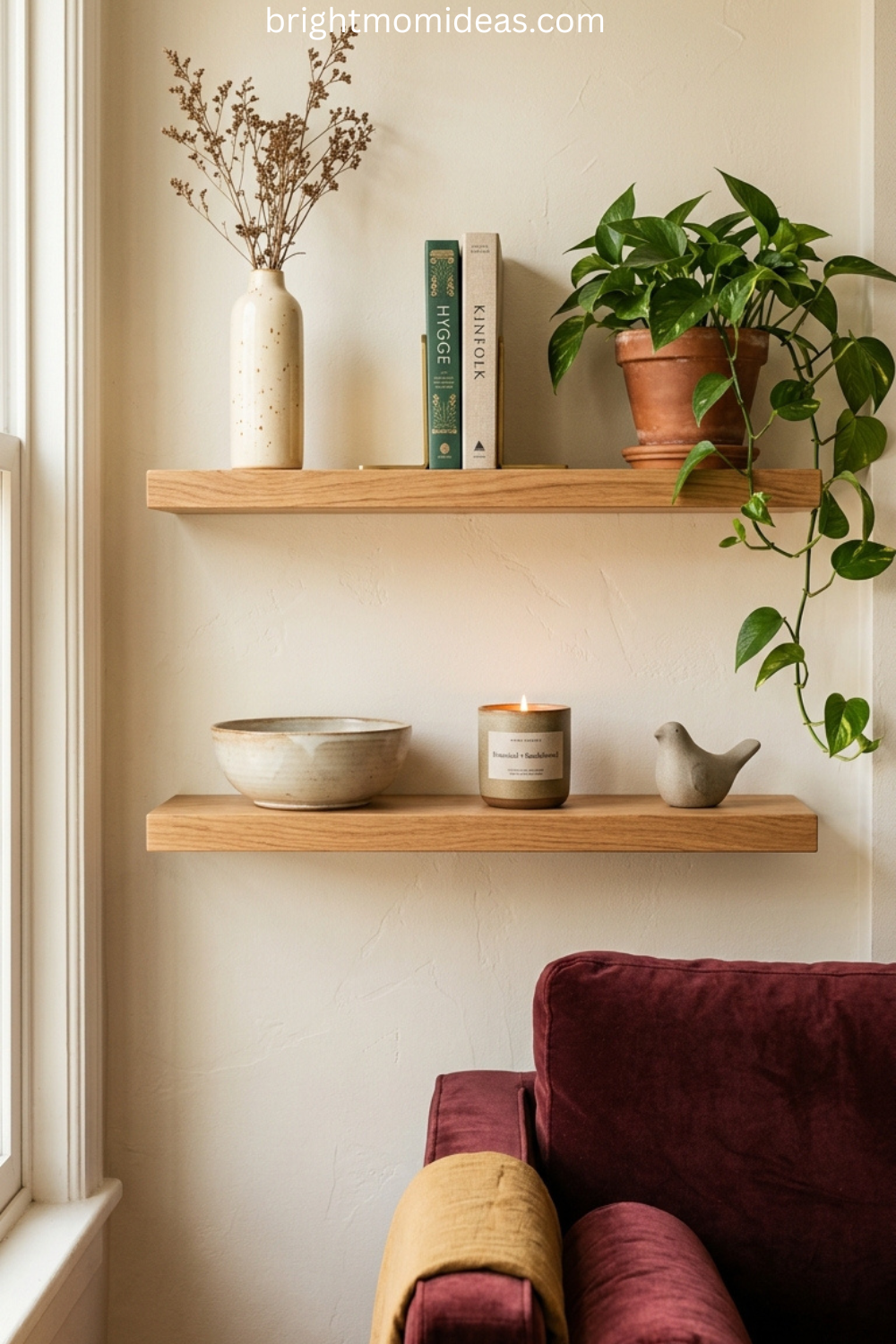
Dark walnut wood is the defining material of mid-century modern interiors. A walnut coffee table with hairpin legs, a walnut credenza against the wall, a walnut side table beside the sofa — these pieces create the warm material foundation that makes every other MCM element feel at home.
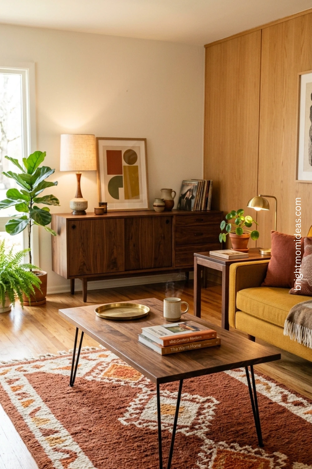
The credenza or sideboard is particularly important in a mid-century modern retro living room because it serves as a display surface, a storage solution, and an anchor for the longest wall of the room simultaneously. Style it with a record player, a few curated objects in earthy tones, and a simple lamp — and it becomes the most interesting wall in the space.
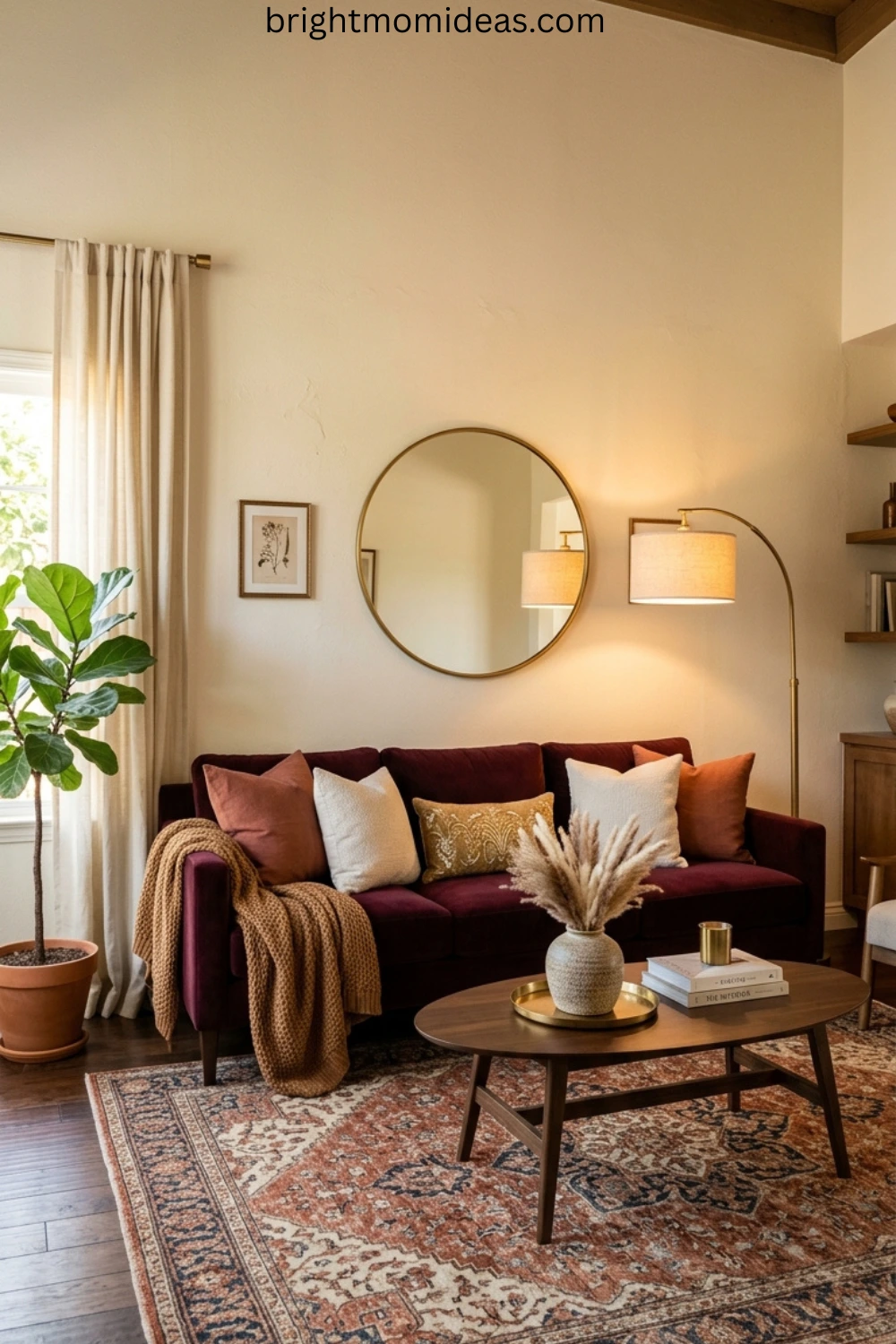
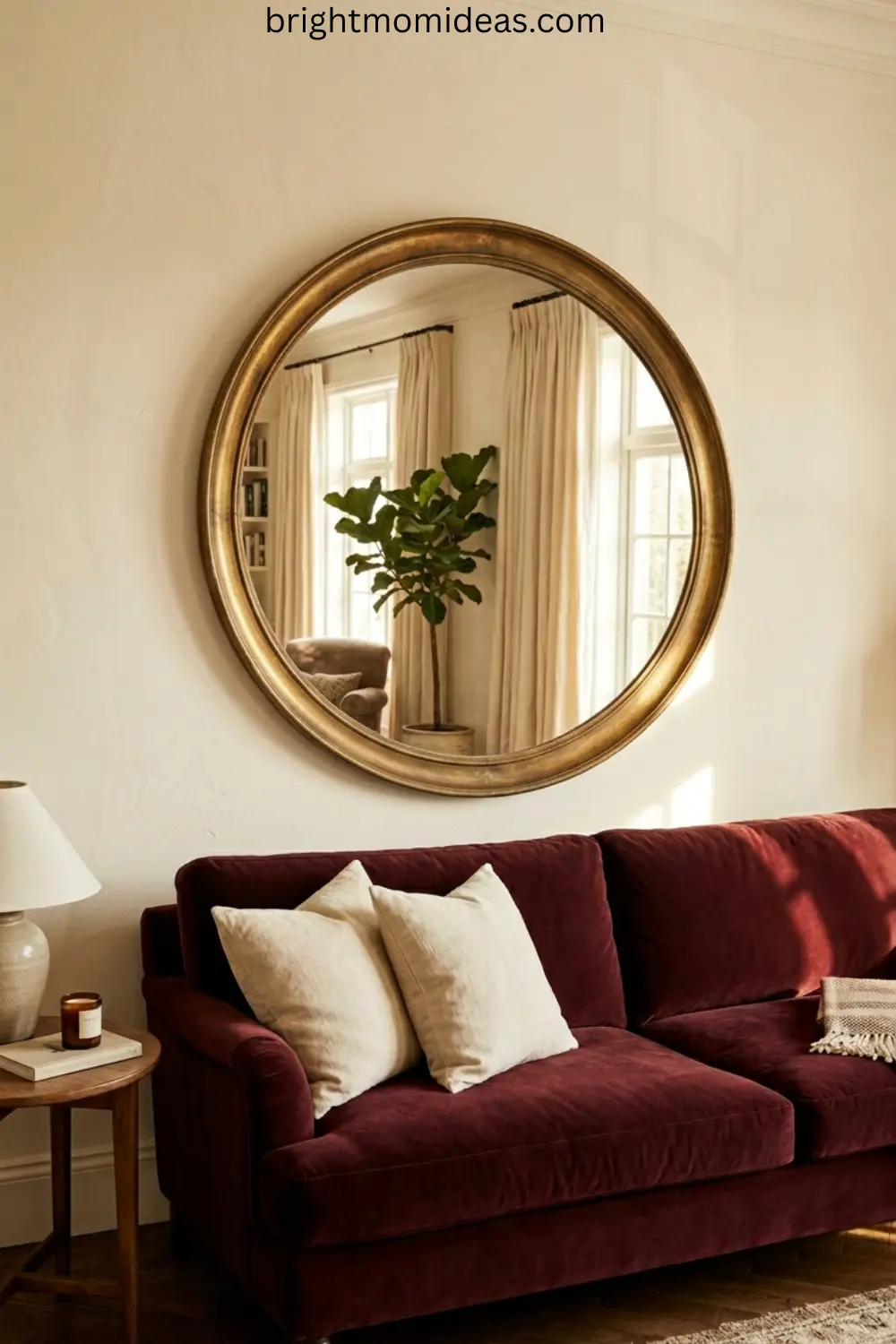
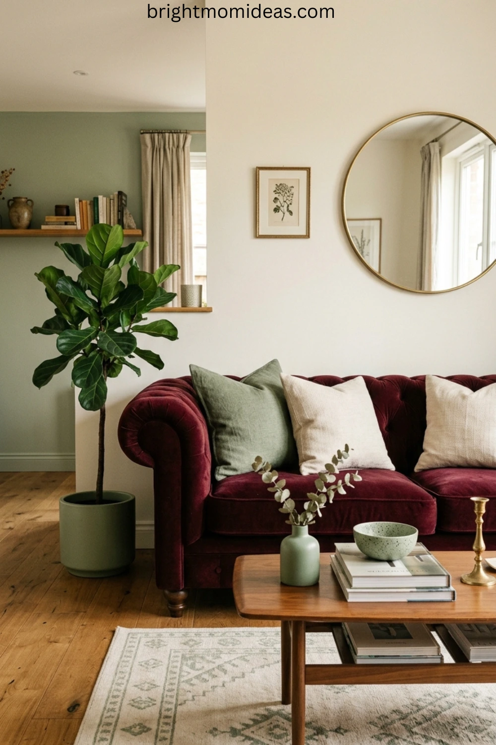
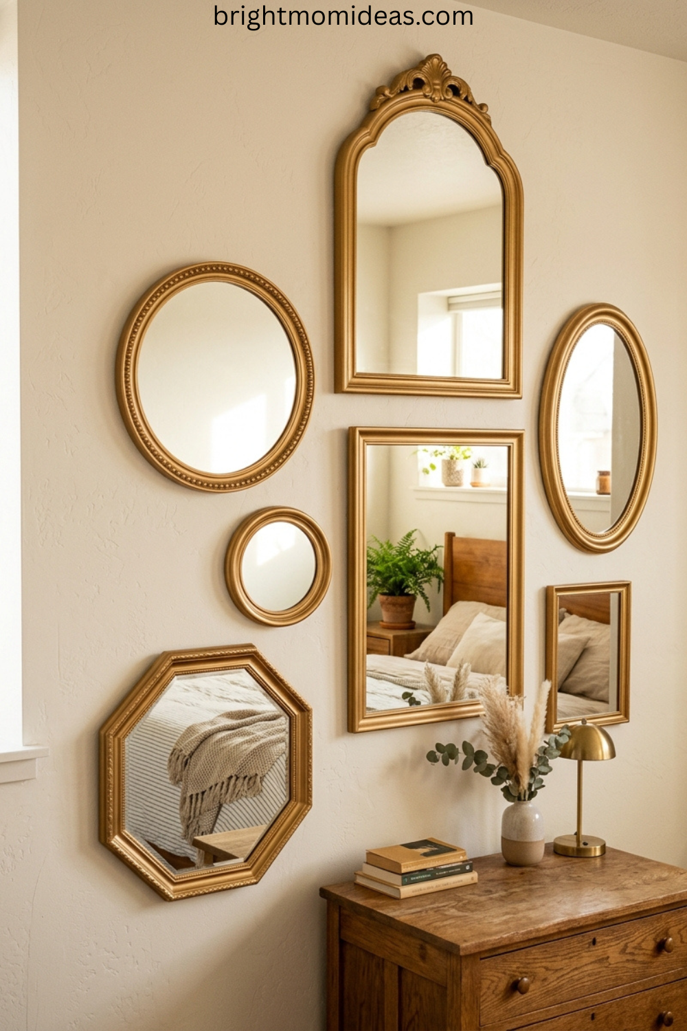
The Sunburst Mirror — Non-Negotiable
If there is one single accessory that most clearly communicates mid-century modern retro style in a living room, it is the sunburst mirror. This iconic piece has appeared in virtually every decade of design inspiration since the 1950s for a very simple reason — it works. It adds warmth through its gold or brass finish. It adds light by reflecting it throughout the room. And it adds a sculptural quality that no other wall-hung piece can replicate at a similar price point.
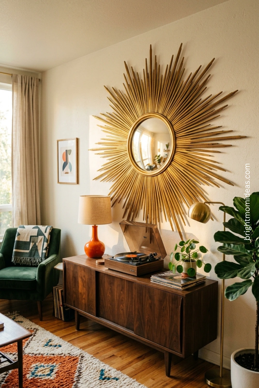
Mount it above the fireplace or above the credenza, never above the sofa where a heavy piece creates a safety concern. Size up — a sunburst mirror that is too small for the wall it hangs on loses its impact entirely.
👉 Large Gold Sunburst Mirror — Shop Here 👉 Mustard Yellow MCM Sofa — Shop Here 👉 Dark Walnut Wood Credenza — Shop Here
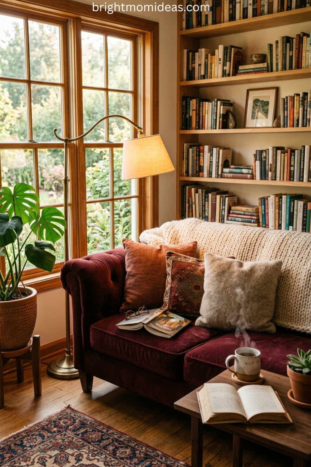
1970s Retro Lounge Ideas
If mid-century modern is the clean, architectural side of retro design, the 1970s aesthetic is the warm, textured, deeply human side — and it is arguably the more compelling of the two right now.
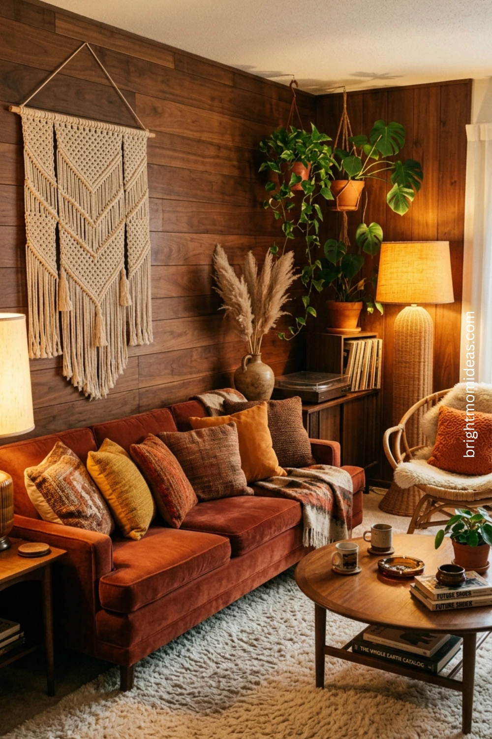
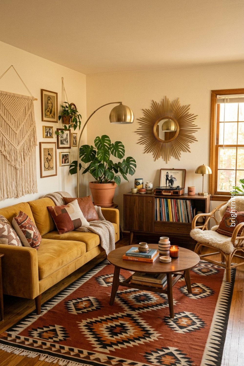
A genuine 1970s retro lounge feels like it was built for people rather than photographs. The furniture is low and comfortable. The colors are earthy and warm. The textures are thick and layered — shag rugs and velvet upholstery and macrame wall hangings and rattan that brings the organic warmth of the natural world indoors. Everything about a well-designed 1970s retro living room communicates that this is a room where people actually sit, actually talk, and actually feel at ease.
The 70s Color Palette Done Right
The 1970s palette is the one that most intimidates people, and understandably so. Avocado green and harvest gold and burnt orange in their most literal forms can feel dated rather than retro. The key is using the right versions of these colors — the deeper, more complex, more sophisticated versions rather than the flat bright versions that characterized the cheaper end of 1970s design.
Avocado green should lean toward sage or olive — muted and earthy rather than yellow-green. Harvest gold should lean toward a deep warm ochre rather than bright yellow. Burnt orange should be genuinely dark and warm rather than anything approaching neon. These deeper, more considered versions of the 1970s palette create rooms that feel intentionally retro rather than accidentally dated.
The Shag Rug — The Fastest 70s Transformation
Nothing communicates 1970s retro lounge more immediately and more affordably than a shag rug. The thick high pile, the warmth underfoot, the way it makes the entire seating area feel more enclosed and inviting — a good shag rug in a warm neutral or an earthy tone transforms a living room into a retro lounge in a way that almost nothing else can achieve for a similar investment.
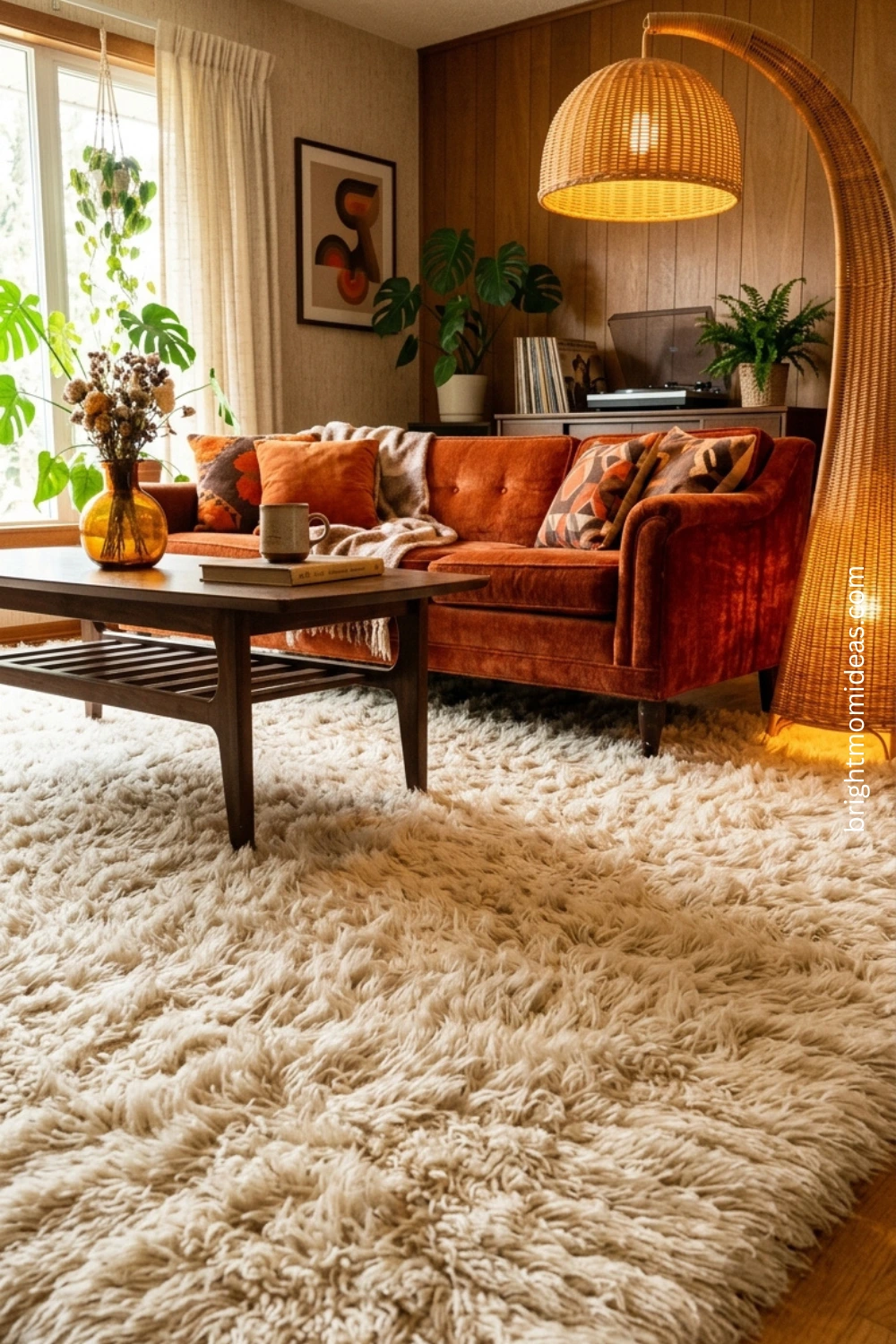
Position it so that the front legs of every piece of seating in the arrangement sit on the rug. This grounds the furniture into the rug rather than leaving pieces floating independently on the floor — a common arrangement mistake that makes a living room feel scattered rather than cohesive.
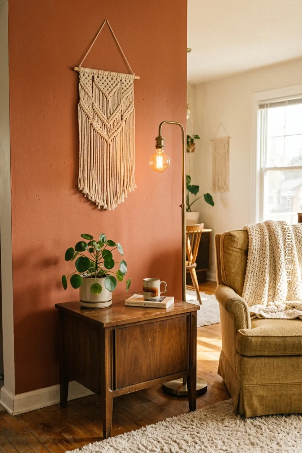
Macrame and Rattan — The Essential 70s Texture Layers
The 1970s interior aesthetic is built on natural texture in a way that no other design era quite replicates. Macrame wall hangings bring handmade warmth and dimension to walls that would otherwise be flat. Rattan chairs add natural organic material that relates to plants and wood in a way manufactured materials cannot. Wicker lampshades diffuse light through their weave and create warm patterned shadows on the walls behind them.
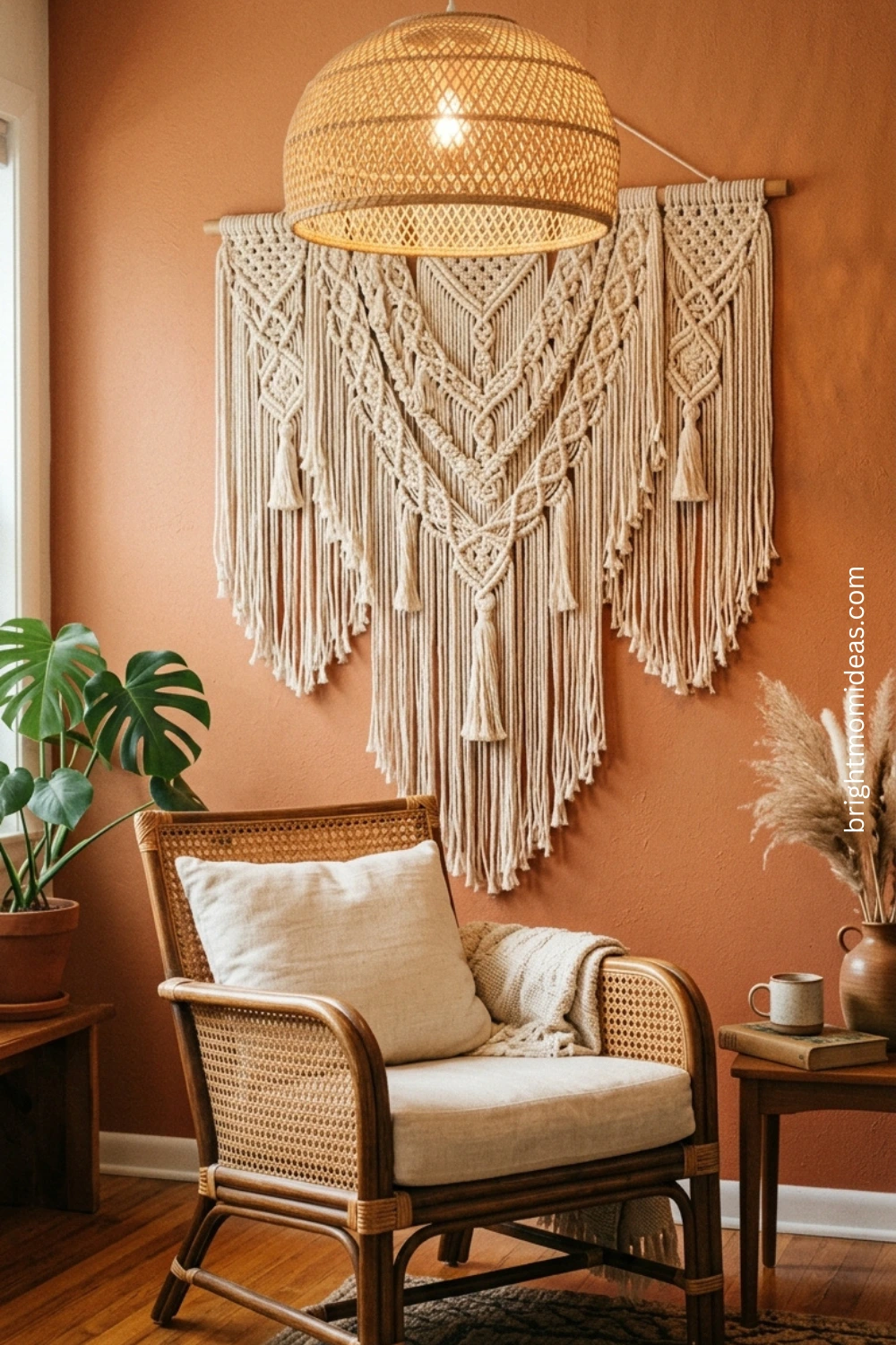
You do not need all of these at once — in fact, using all of them at once creates exactly the kind of overwhelming retro costume that most people want to avoid. Choose two or three natural texture elements and let them do the work. One macrame wall hanging as a significant feature. A rattan accent chair. A wicker pendant above the seating area. That combination is enough to create the 1970s atmosphere without making the room feel like a themed restaurant.
👉 Cream Shag Area Rug Large — Shop Here 👉 Natural Rattan Accent Chair — Shop Here 👉 Large Macrame Wall Hanging — Shop Here
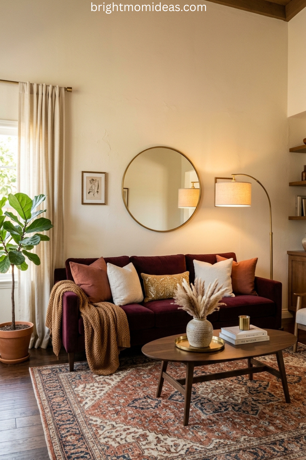
Modern Retro Living Room Ideas for Today’s Homes
Modern retro is the aesthetic that has the most traction right now with USA homeowners, and it is exactly what it sounds like — retro design sensibilities applied with contemporary restraint and modern comfort standards.
The defining quality of modern retro living room design is that it never tips into costume. It never makes you feel like you have walked onto the set of a period drama. It takes the warmth, the personality, and the material richness of retro design and filters it through a contemporary lens that keeps everything feeling fresh rather than recreated.
How Modern Retro Differs From Traditional Retro
In a traditional retro living room, you might have a fully committed 1970s room — shag rug, harvest gold sofa, macrame wall hanging, rattan furniture, the whole picture. In a modern retro living room, you take two or three of those elements and place them in a contemporary context.
A clean-lined contemporary sofa in a warm caramel leather. A vintage-inspired sunburst mirror on a white wall. A single shag rug. A macrame piece on one wall. The retro elements stand out because everything around them is contemporary — and that contrast is what gives them their power. They are not competing with each other for attention. Each retro piece has space and context.
Curved Furniture — The Modern Retro Signature
Curved sofas are one of the defining elements of modern retro design in 2026 — rounded sectionals and chairs create a soft futuristic feel rooted in 70s design.
This type of furniture is perhaps the single clearest expression of modern retro style right now. The rounded sectional sofa — with its organic curved form and often bold upholstery color — reads as both contemporary and deeply retro simultaneously. It is a piece that would have been completely at home in a 1970s interior and looks completely at home in a 2026 one.
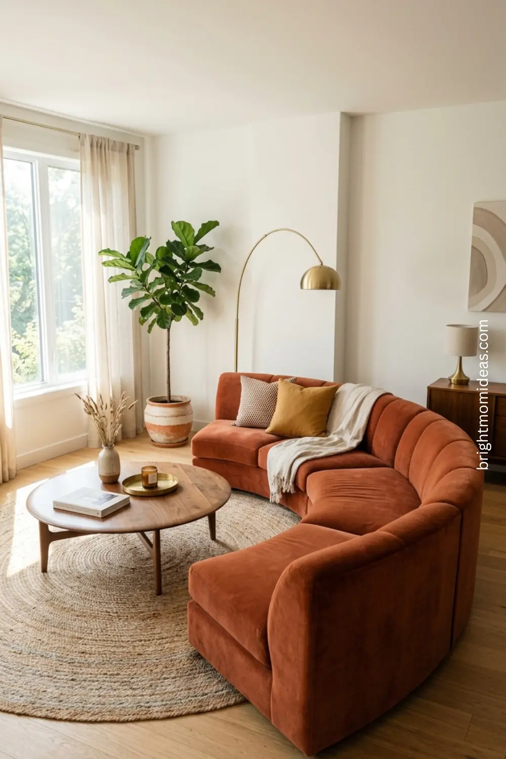
If you can only make one furniture investment toward a modern retro living room, a curved sofa or a rounded accent chair is the piece with the highest impact. It changes the silhouette of the entire room instantly and communicates the retro aesthetic more clearly than any accessory can.
Layered Vintage-Inspired Lighting
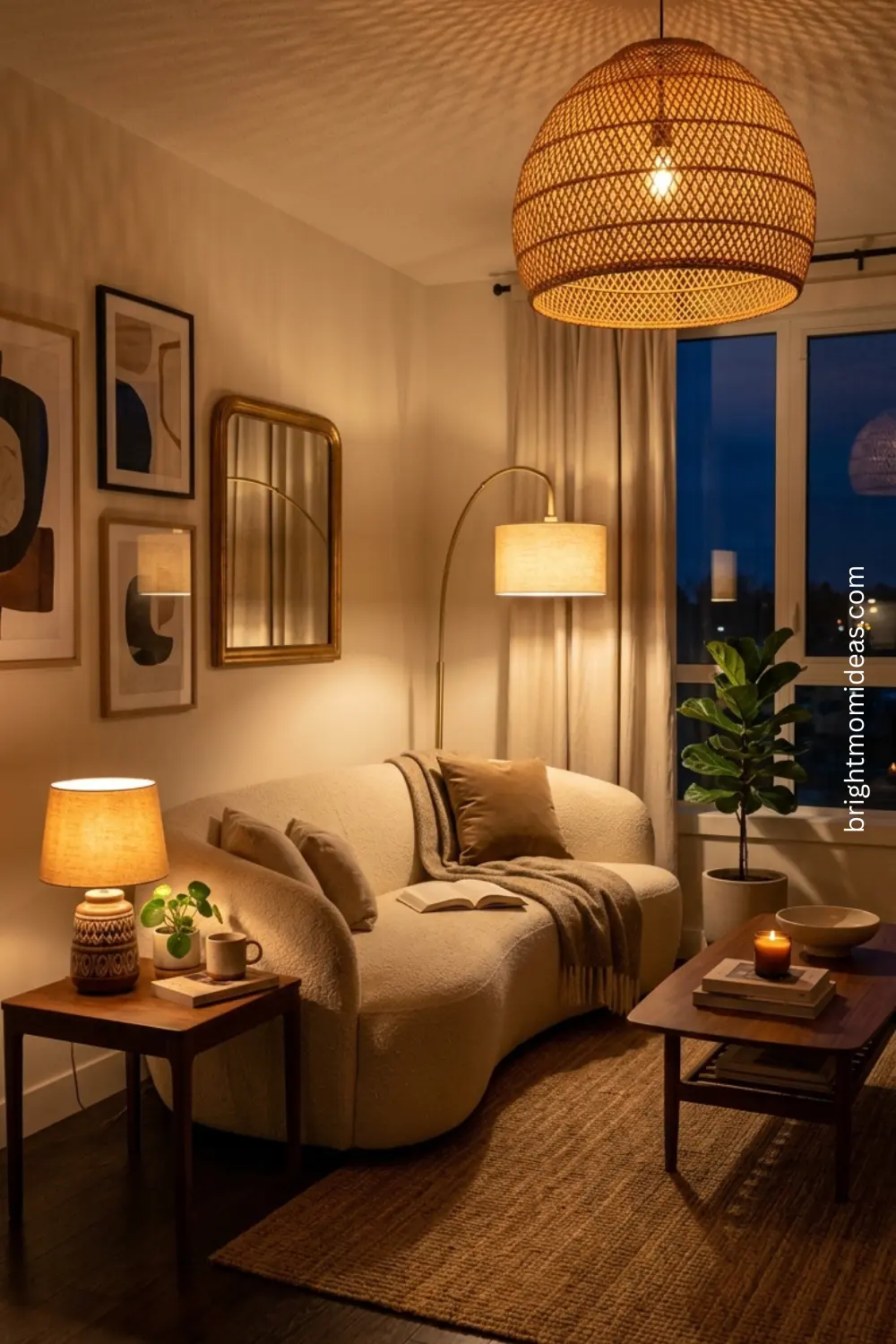
Retro living room trends in 2026 feature prominent lighting as an architectural element — statement pendants, arc lamps, and warm-toned bulbs that create mood rather than just illumination.
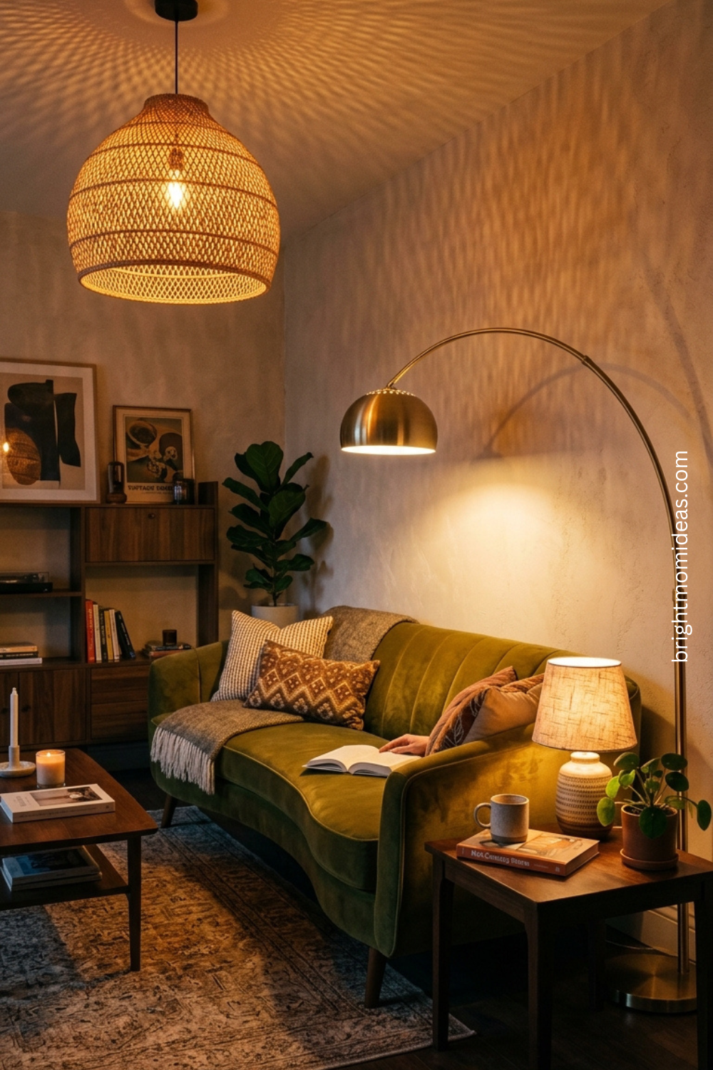
Lighting in a modern retro living room should always come from multiple sources at different heights. A statement pendant above the seating area — in rattan, wicker, or a retro-inspired globe shape. An arc floor lamp beside the sofa in brushed brass. A small table lamp on the credenza with a warm-toned bulb. These three sources together create the layered warm atmosphere that is central to the modern retro aesthetic and impossible to achieve with overhead lighting alone.
👉 Globe Pendant Light Retro Style — Shop Here 👉 Brushed Brass Arc Floor Lamp — Shop Here 👉 Curved Velvet Accent Chair — Shop Here
The Retro Style Living Room Furniture Guide
Furniture is the foundation that everything else in a retro style living room builds on — and getting it right means understanding a few specific principles that apply across all retro eras.
Low profiles are essential. Retro furniture from every decade between the 1950s and the 1970s sits lower than contemporary furniture. Sofas with seat heights around 16 to 17 inches rather than the 19 to 20 inches of most modern sofas. Coffee tables that sit just below the sofa seat height rather than at it. This lowness is what gives retro living rooms their characteristic grounded, relaxed quality.
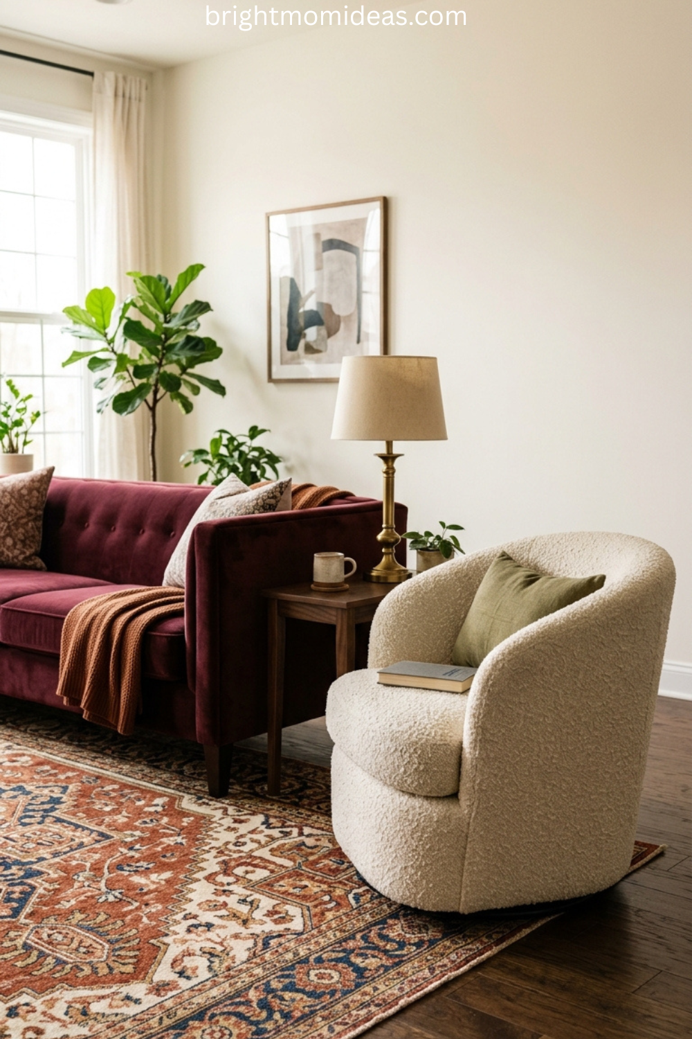
Visible legs are equally important. Furniture that sits directly on the floor — particularly sofas and chairs with no visible leg — reads as contemporary. Furniture with tapered wooden legs, hairpin metal legs, or splayed legs reads as retro immediately. The legs are a small detail with an enormous aesthetic impact.
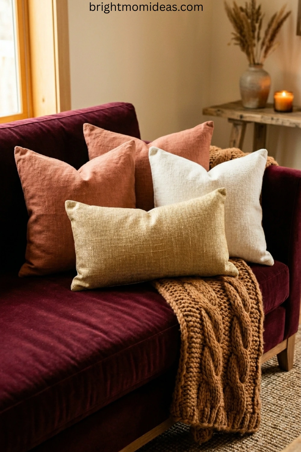
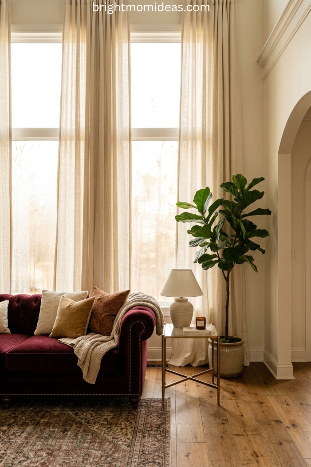
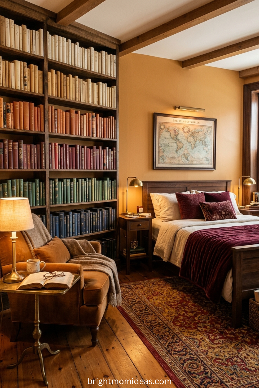
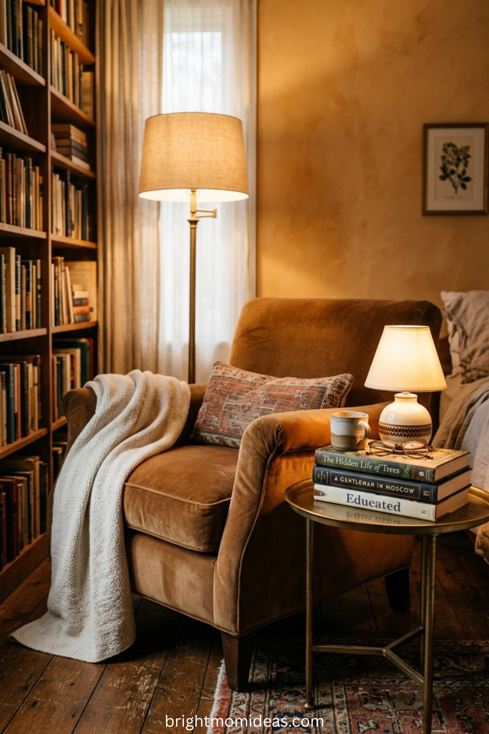
Warm materials over cool ones. Velvet, corduroy, leather, and bouclé over microfiber and polyester blends. Walnut and teak over lacquered white or grey painted wood. Brass and bronze over chrome and stainless steel. Every material choice in a retro style living room should lean toward warmth rather than coolness.
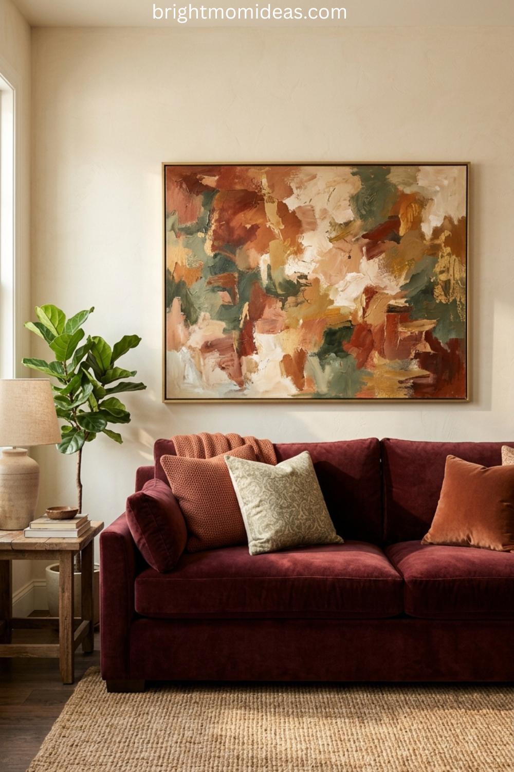
Bold upholstery colors rather than neutral ones. The single most common mistake people make when trying to create a retro living room is buying a beige or grey sofa and then attempting to create the retro feeling through accessories alone. It does not work. The sofa is too large and too visually dominant to be neutral in a retro room. Commit to the mustard, the olive, the caramel, the burnt orange — whichever color you choose, choose it with conviction.
Retro Living Room on a Budget
One of the most genuinely wonderful things about retro style living room design is how accessible it is at every budget level. The aesthetic rewards thrift store finds, estate sale discoveries, and careful shopping in a way that few other design styles can match.
Start With Paint
The single highest-impact, lowest-cost change you can make in a living room is the paint color. A warm terracotta, a deep olive green, or a rich warm cream on a single accent wall immediately shifts the entire atmosphere of a room toward the retro aesthetic — before you have bought a single piece of new furniture.
Paint a single wall behind the sofa or television — the one that draws the eye when you first enter the room. Use a muted earthy tone from the retro palette. That one wall, at the cost of a single can of paint, will do more for the retro atmosphere of your living room than any accessory purchase.
Thrift and Estate Sale Shopping
Retro furniture is genuinely abundant at thrift stores, estate sales, and on Facebook Marketplace — because the generation that originally purchased it is downsizing, and their children often do not want the pieces that are now the most coveted finds in interior design.
Look specifically for pieces with tapered wooden legs that need reupholstering. The bones of mid-century and 1970s furniture are often completely sound — what makes them look dated is worn or stained upholstery in an era-specific color. A solid MCM frame recovered in a fresh mustard yellow or warm olive green velvet is indistinguishable from a new piece costing ten times the total investment.
Layer Inexpensive Accessories With Intention
A shag rug from Amazon. A macrame wall hanging from Etsy. A set of warm-toned throw pillows. Edison bulbs replacing whatever bulbs you currently have. These four changes together cost a fraction of any furniture purchase and create an immediate and genuine shift toward the retro lounge atmosphere.
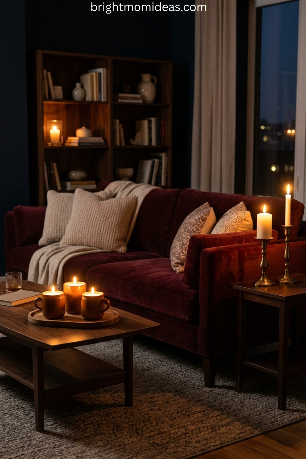
How to Create a Retro Lounge Atmosphere
The retro lounge is a specific subset of retro style living room design that is worth addressing on its own — because it is the most searched version of this aesthetic and the one that most people are imagining when they picture their ideal retro room.
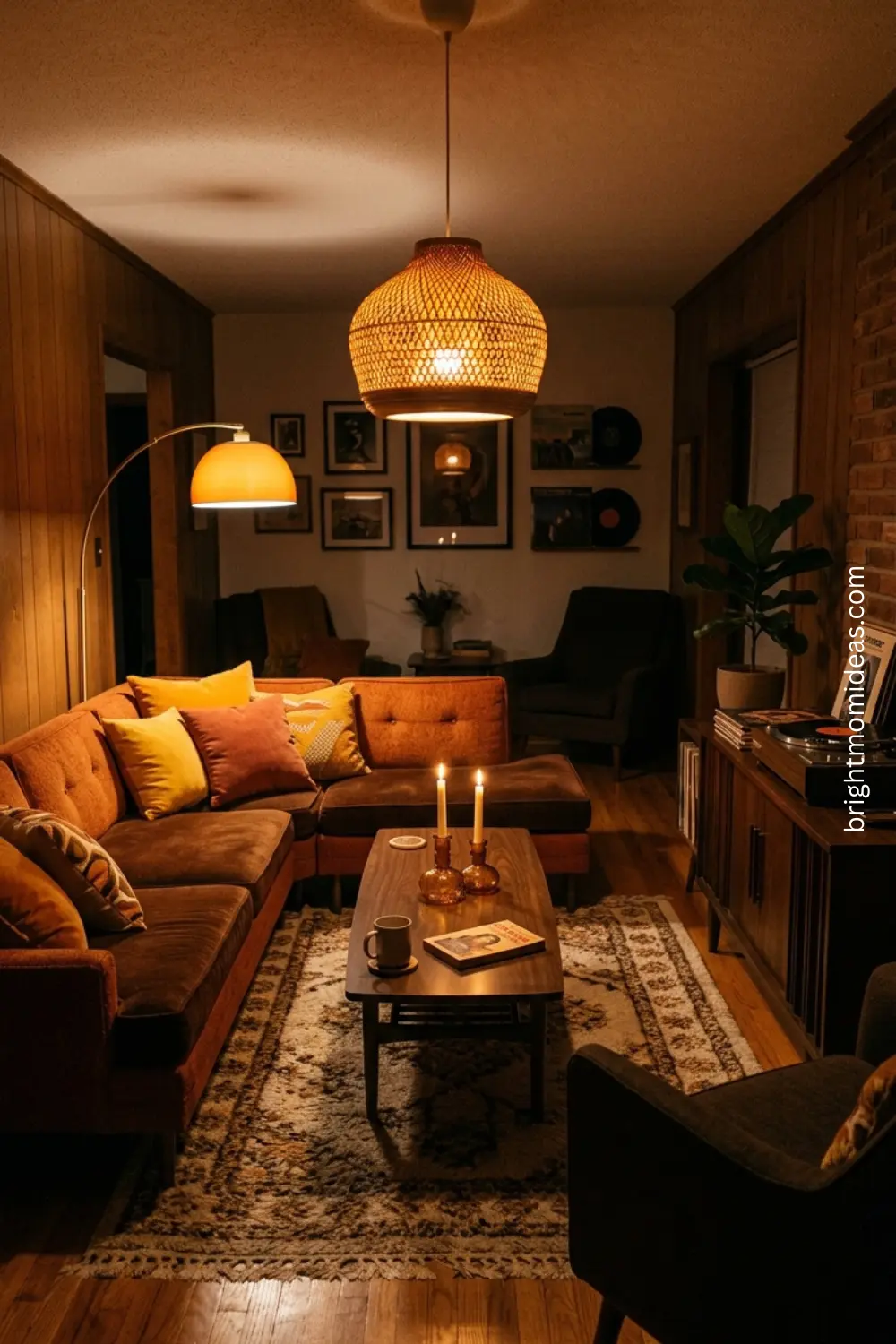
A retro lounge has a specific quality that goes beyond furniture and color. It feels like a room where the evening is the main event. Where the record player is not decorative — it actually gets used and the lighting is warm enough that overhead lights are not just dimmed but turned off entirely by 8pm. Where the seating arrangement faces a conversation rather than a screen.
The Conversation Pit Feeling Without the Actual Pit
The conversation pit was the ultimate 1970s living room status symbol — a sunken seating area built directly into the floor, surrounded by wraparound low sofas that created an enclosed social space entirely separate from the rest of the room.
You cannot install an actual conversation pit in most homes without structural renovation. But you can absolutely create the feeling of one with arrangement and furniture choices. Place your seating in a U-shape or square rather than facing a television. Use a large low ottoman as the coffee table centerpiece. Add floor cushions around the edges. Lower the overall height of everything in the seating area. This arrangement creates the same enclosed, intimate quality of a conversation pit and communicates the retro lounge atmosphere immediately.
Vinyl and the Record Player as Decor and Function
The record player is perhaps the single object most associated with the retro lounge aesthetic — and it earns its place in the room as both a genuine lifestyle object and an incredibly effective piece of decor.
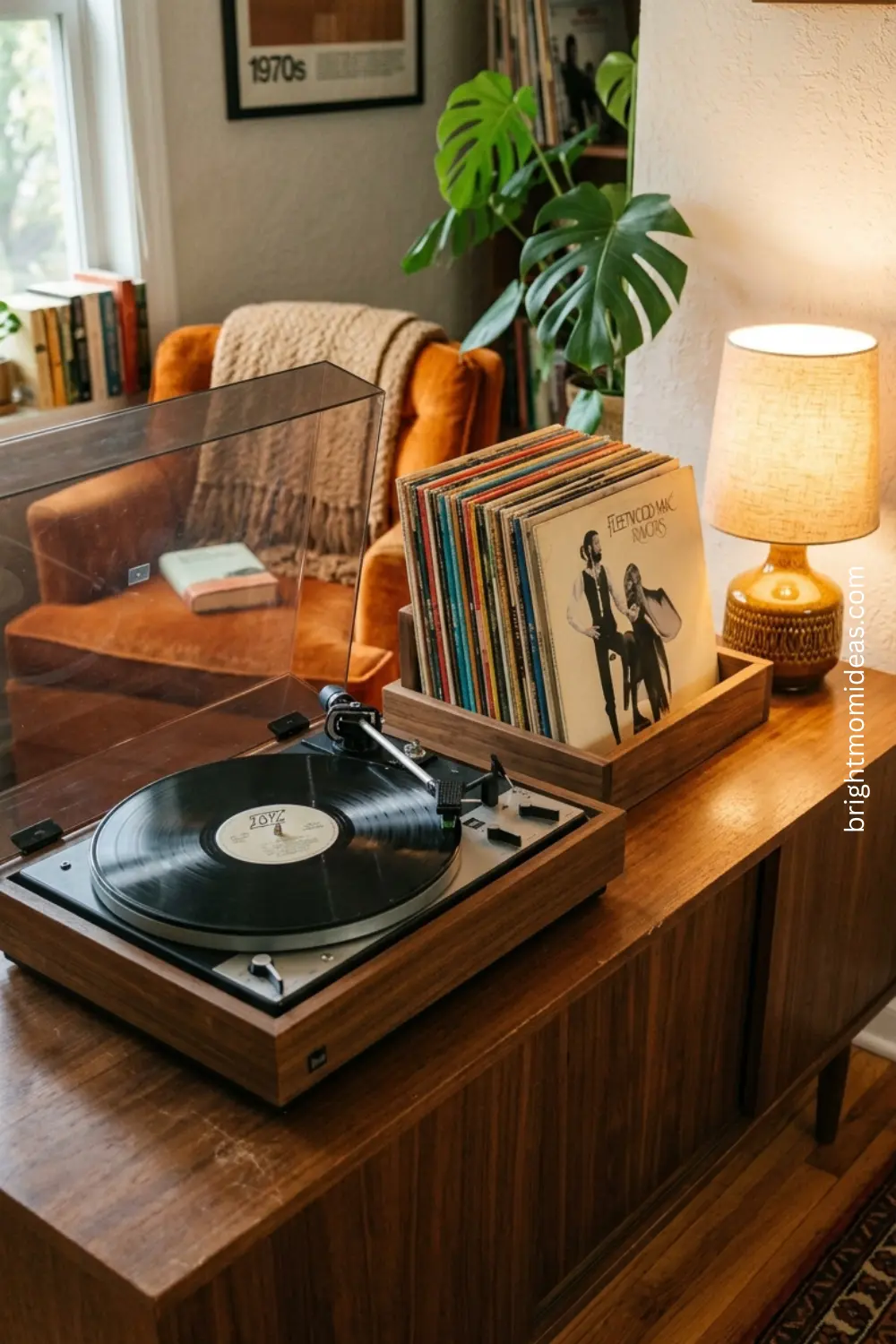
A vintage-style turntable on a walnut credenza, surrounded by displayed vinyl records with their album artwork facing forward, creates a vignette that immediately communicates the retro aesthetic while also being a genuine invitation to engage with music in a more intentional way than a playlist ever quite achieves.
Common Retro Living Room Mistakes to Avoid
Going too literal with the decade produces a room that feels like a museum exhibit rather than a home. Pick elements from a retro era rather than attempting to recreate it completely. One or two strongly retro pieces in a more contemporary context creates far more impact than a room where every single element is period-specific.
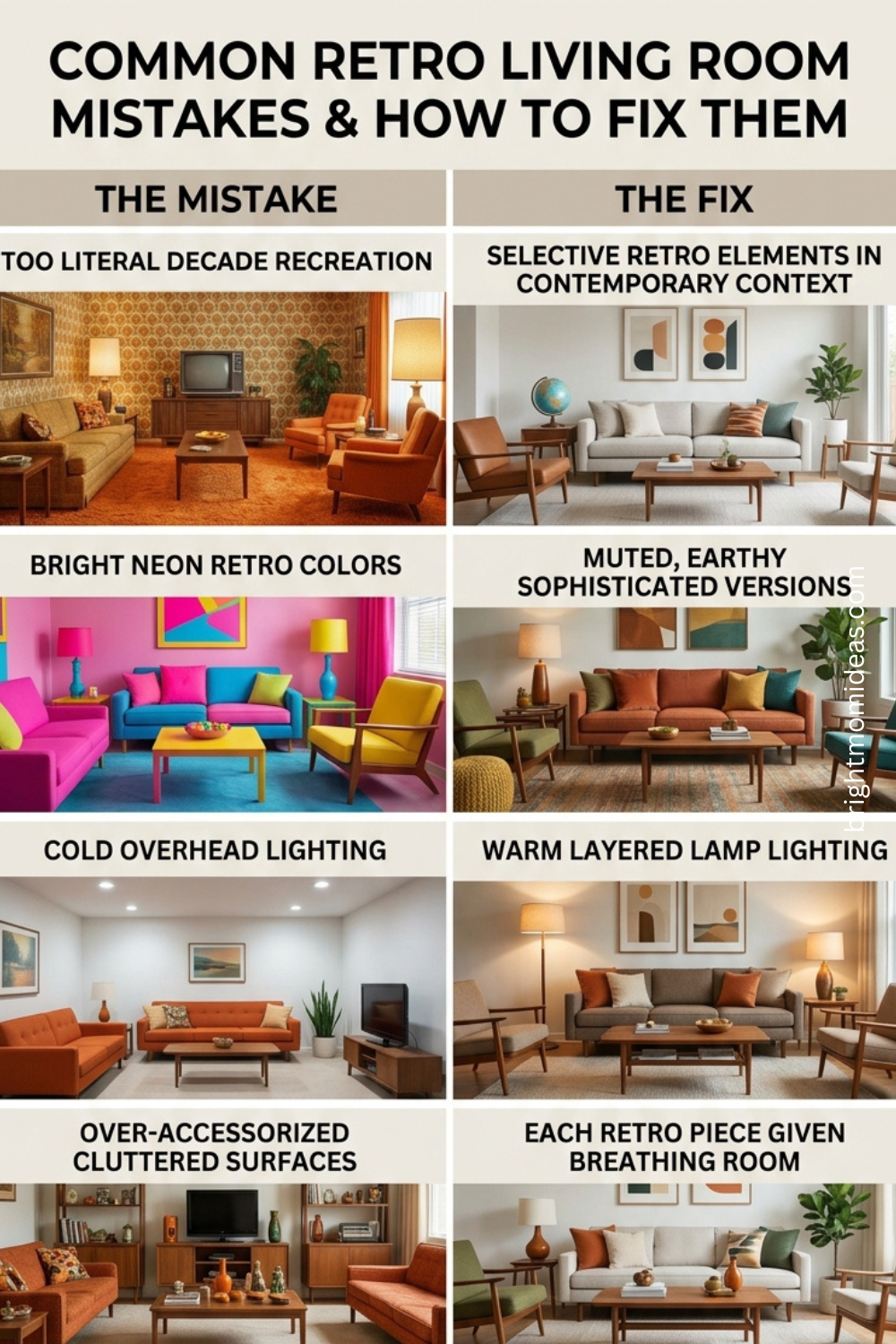
Using the wrong versions of retro colors is the most common mistake after going too literal. Bright cherry red is not retro. Neon orange is not retro. The colors that define genuinely beautiful retro style living rooms are the deeper, more complex, more earthy versions — burnt orange rather than bright orange, olive rather than lime green, harvest gold rather than bright yellow.
Ignoring the importance of warm lighting undoes every other good retro decision you make. A beautifully furnished retro living room under flat cool overhead lighting looks wrong in a way that is hard to articulate but immediately felt. Warm bulbs, multiple light sources, lamplight rather than ceiling light — these are non-negotiable in a retro style living room.
Over-accessorizing turns retro into clutter. The warmth and layering that defines retro style is not the same thing as having objects on every surface. Each retro piece needs space around it to register. A sunburst mirror on a clean wall has enormous impact. A sunburst mirror competing with twelve other wall-hung objects loses its power entirely.
FAQ Section
What is a retro style living room?
A retro style living room is a space that draws inspiration from past decades — typically the 1950s through the 1970s — without attempting to perfectly recreate them. It uses the characteristic shapes, colors, and materials of those eras interpreted through a contemporary lens. Tapered wooden legs, warm earthy color palettes, layered natural textures, statement lighting, and bold upholstery colors are all defining elements of retro style living room design.
What colors do you use in a retro style living room?
Retro style living rooms use warm, earthy, deeply saturated colors rather than the cool neutrals of contemporary design. Mid-century modern retro palettes favor mustard yellow, burnt orange, olive green, and warm walnut brown. 1970s retro palettes favor terracotta, harvest gold, avocado green, and warm chocolate brown. In both cases the key is using the deeper, more complex versions of these colors rather than bright or neon versions which read as dated rather than retro.
How do I make my living room look retro without it looking dated?
The key is restraint and contemporary context. Choose two or three strongly retro pieces — a curved sofa, a sunburst mirror, a shag rug — and let everything around them be more contemporary and neutral. When retro elements have space and a clean backdrop they read as intentional design choices. When every element in a room is equally retro the effect tips from styled into dated. Also pay close attention to the version of retro colors you use — muted earthy tones read as sophisticated while bright primary versions of the same colors read as costume.
What is the difference between a retro and a vintage living room?
Retro design draws inspiration from past eras but uses contemporary or newly made pieces with retro-inspired aesthetics. A new sofa with 1960s proportions and mustard upholstery is retro. Vintage design refers specifically to actual objects from a past era. A genuine 1968 credenza found at an estate sale is vintage. In practice most beautifully designed retro style living rooms mix both — using a few genuine vintage finds alongside contemporary pieces with retro sensibilities.
What furniture do I need for a retro lounge?
A genuine retro lounge feeling requires low-profile seating — sofas and chairs that sit closer to the ground than contemporary furniture. Visible tapered or hairpin legs on every piece. A low coffee table or oversized ottoman as the center of the seating arrangement. A credenza or sideboard for display and storage. And at least one statement light fixture — an arc floor lamp, a rattan pendant, or a globe pendant — that provides warm atmospheric light rather than bright overhead illumination.
Can I create a modern retro living room on a budget?
Absolutely. Start with paint — a single earthy accent wall costs very little and immediately shifts the entire atmosphere of the room. Then layer in inexpensive retro accessories — a shag rug, a macrame wall hanging, warm Edison bulbs. Shop thrift stores and Facebook Marketplace for MCM furniture frames that need reupholstering — the bones of retro furniture are almost always structurally sound and a fresh fabric transforms the piece completely. A full modern retro living room transformation can happen for a few hundred dollars if you are willing to do a little hunting and a little DIY.
What makes a retro lounge feel different from a regular retro living room?
A retro lounge is specifically designed for evening atmosphere and conversation rather than daytime function. It has warmer, more layered lighting with no bright overhead lights. The seating arrangement faces inward — toward conversation — rather than toward a television. There are tactile comfort elements like floor cushions, throws, and layered textiles that invite people to settle in. And there is usually one lifestyle object — a record player, a bar cart, a bookshelf — that communicates something about how the room is actually used rather than just how it looks.
Save this post to your Pinterest living room boards and share it with someone who is finally ready to give their living room a personality. 📌
Disclosure: This post contains affiliate links. If you purchase through these links I may earn a small commission at no extra cost to you. Thank you for supporting brightmomideas.com.


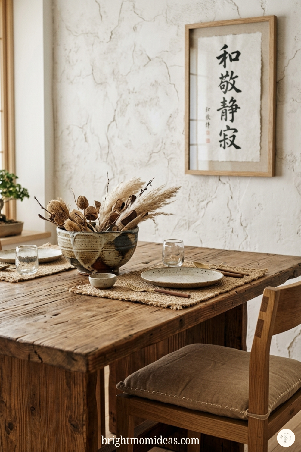
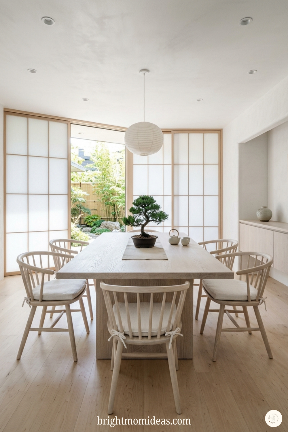
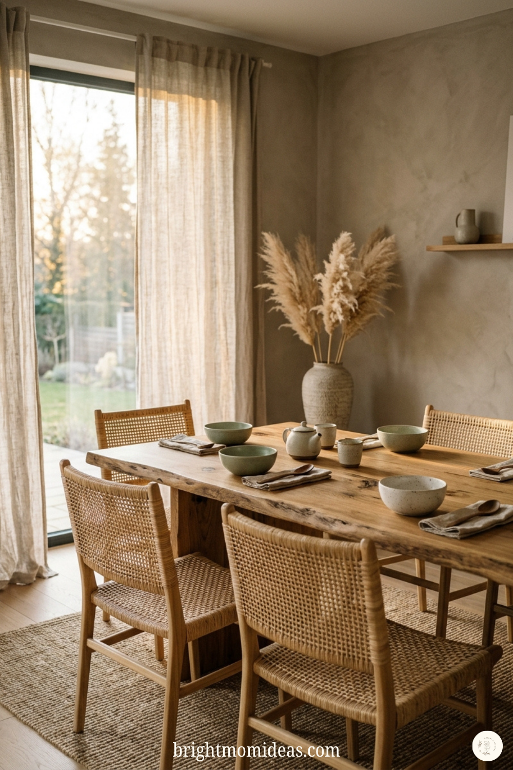
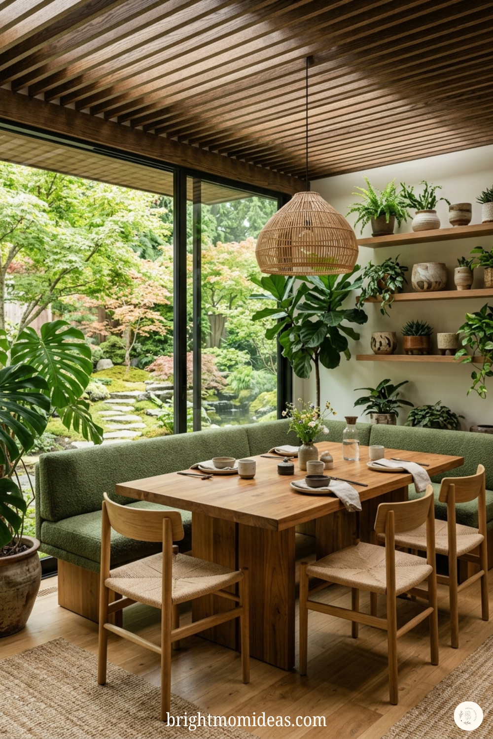
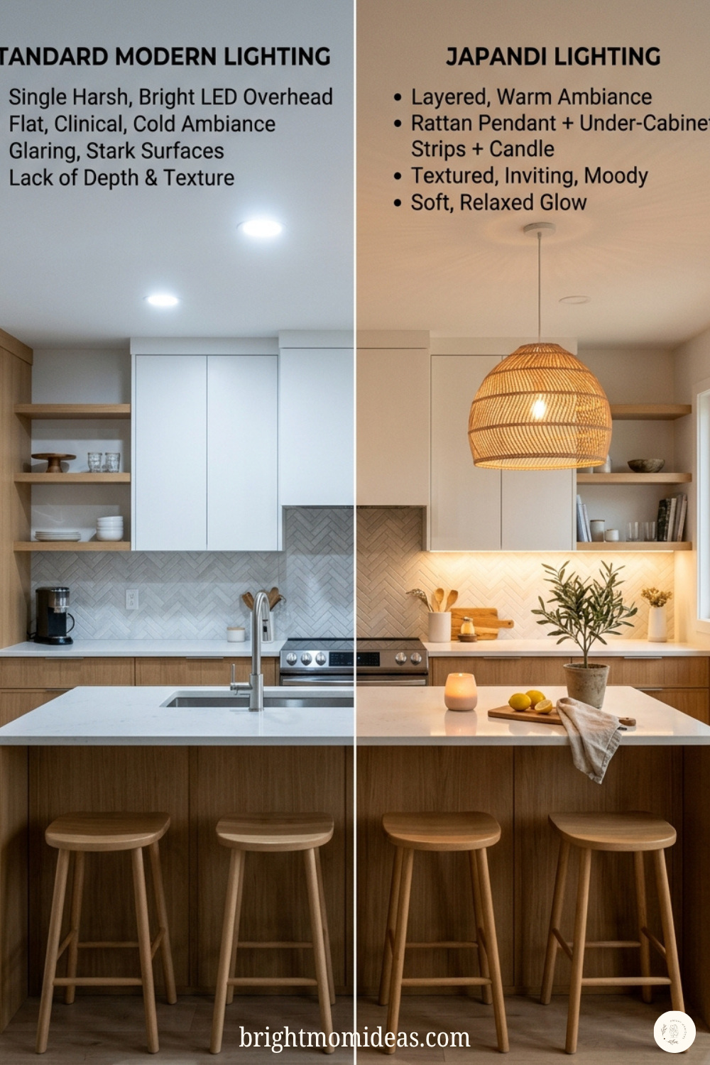
 Round tables work beautifully in smaller Japandi dining rooms because they encourage intimate gathered conversation. Rectangular tables work in longer rooms where a simple bench on one side adds an informal warmth that matching chairs alone cannot deliver.